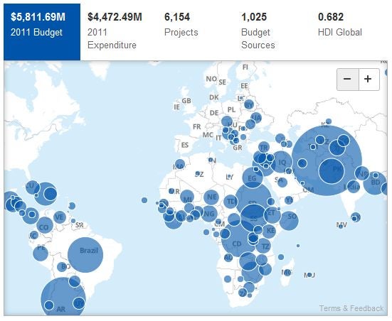
The UNDP just launched open.undp.org. The site details information on their 6,000+ projects in 177 countries and territories worldwide and lets you search and browse by location, funding source, and focus areas.
I think it’s really good and I’m most impressed by three features:
1) APIs, bulk downloads and IATI data
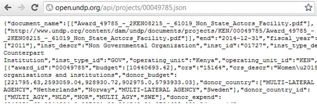
I’m always pleased to see a clean interface for development and financial information, but the first thing I check for is access to raw data - it’s essential for doing anything serious and it immediately adds credibility to this kind of initiative.
UNDP have delivered well here and as far as I can see, offer simple API access to the data that builds the site, as well as a bulk download, and a link to the same data published on the IATI registry. And well done on every page having a unique and sensible URLs for each page.
2) Speed
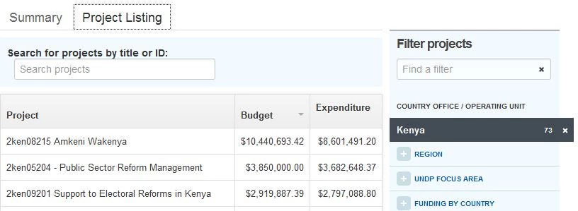
This thing is fast! The maps work smoothly and when I wanted to see what the largest project UNDP funds in Kenya is - I just clicked the “Project Listing” tab, filtered on the right for Kenya and sorted on the left by budget. The first link takes me to the Amkeni Wakenya project focussed on democratic governance.
The site’s also quick to load (on my computer here at the World Bank) and looking at the page size (about 1Mb total, under 200kb once cached) it should work well on slower connections too.
You should never underestimate the importance of speed on a website - it’s often the difference between someone using it and not.
3) Simplicity
The individual project pages are clear and display the essentials like key funding sources, and the latest budget and expenditure information.
It’s also easy to embed some or all of the elements of these project pages (as I’ve done above - note it doesn't seem to work in IE7 if you're still using that) This is useful for quickly using data in online communications.
What could they do next?
UNDP are interested in hearing your ideas and comments - I think they should be congratulated on a job well done here. What might I want to see next?
Disaggregated data and locations - it’s useful to know there was $8.6M spent in 2011 but what was it spent on? Disaggregating data can make aid more traceable and linking it to things like contracts and procurement awards makes it easier for people to use and understand it. It would also be useful to see individual projects and their components geo-coded sub-nationally.
More data documentation - it’s great to have the downloadable CSV file but for someone not familiar with the UN system or development data more generally, it might be a little tricky to understand. They’ve got some good high level FAQs, and publishing to IATI really helps, but what do the codes in the “bureau” column stand for? What’s the difference between “awardid” and “projectID”?
Better use of development indicators - I thought the one part of the site that could work better is the HDI numbers. The only way I can see them is by hovering over country dots on the map. It’s a fine way to present the number for a country but I don’t get a quick sense for what that number means, how other countries compare and how it relates to what work happens in a country.
These are just my immediate reactions - apologies if I’ve missed something obvious.
Well done again to UNDP on open.undp.org - I’m looking forward to seeing how it progresses.
Edit: Matt Greene also writes about the above and I missed some of UNDP's plans for 2013.

Join the Conversation