World Bank researchers have been trying to assess the extent of extreme poverty across the world since 1979 and more systematically since the World Development Report 1990, which introduced the dollar-a-day international poverty line. From the beginning, the idea was to measure income poverty with respect to a demanding line which, first, reflects the standards of absolute poverty in the world’s poorest countries and, second, corresponded to the same real level of well-being in all countries. The first requirement led researchers to anchor the international poverty line on the national poverty lines of very poor developing countries. And the second requirement led them to use purchasing power parity exchange rates (PPPs) – rather than nominal ones - to convert the line into the US dollar and, more importantly, into the currencies of each developing country.
Although both requirements are sensible, they do have some troublesome implications… In particular, they have led us to adjust the line every time a new (and hopefully improved) set of PPPs is produced. PPP exchange rates are currently produced by an independent consortium called the International Comparison Program (ICP), which periodically revises its estimates – reflecting both changes in relative price levels across countries and methodological changes. The dollar-a-day line, created by Ravallion et al. (1991), used 1985 PPPs. When a new set of PPPs was published in 1993, the line changed to $1.08 per day. PPPs were revised again in 2005, and the line was correspondingly upped to $1.25. Every time this happened, there were real comparability challenges, and international poverty rates were revised for individual countries and for the world.
Last year, the ICP published yet another new set of PPPs, for prices collected in 2011. Though there was some disagreement among scholars, the dominant view is that these new PPPs represent an improvement over the 2005 set, creating the need for another revision to the Bank’s international poverty line. The challenge was: over time, the Bank’s international poverty line had begun to serve as a benchmark for the definition of high-level policy goals for the international community, such as the first Millennium Development Goal. More recently, the first overarching goal of the World Bank itself - reducing the global incidence of extreme poverty to 3% by 2030 – was set in terms of “those living under $1.25 per person per day, at 2005 PPPs”. The same is true of the first Sustainable Development Goal, to which world leaders signed up at the UN just over a week ago.
So, if the 2011 PPPs provide a more accurate description of the real cost of living in different countries, our measures of global poverty should incorporate them. But that had to be done in a way that avoided moving the goalposts set for the Bank’s own goals, as well as those enshrined in the UN’s Sustainable Development Goals. In fact, we felt we had to follow three basic principles for setting the new line:
- Use the most accurate and recent set of prices available to compare the real standards of living across countries.
- Minimize changes to the goalposts: keep the definition of the line unchanged, and its new value as close as possible to the $1.25 line in real terms.
- When defining “real terms”, the price levels that matter most for measuring global poverty are those faced by the world’s poorest people.
Those principles led to a very simple decision rule for updating the line:
- The $1.25 line was originally defined as the simple average of the national poverty lines for fifteen very poor countries (see Ravallion et al. 2009). We take those same exact lines (expressed in local currency units at 2005 prices), and inflate them to 2011 using each country’s own consumer price index.
- Then, once they are in 2011 prices, we convert them to the US dollar using the 2011 PPPs, and take a simple average (as before).
The result of those two very simple operations yields $1.88 per person per day, which we round up to $1.90 – the World Bank’s new international poverty line. There are, of course, a number of methodological details: some countries have more than one CPI available for use – which one should be chosen? There are differences in the costs of living within countries – which in some cases are not fully captured by the ICP price surveys. How should these differences be dealt with? How do we deal with countries for which PPP and CPI data suggest very different changes in prices between 2005 and 2011? We document our methodological choices on these – and other – matters in (possibly excruciating) detail here , so others can replicate our results. The paper also reports on a number of “robustness checks”. For example, if we took all 101 countries for which we have the necessary information, converted $1.25 into their local currency units in 2005 (using the 2005 PPPs), inflated those values to local 2011 prices using domestic CPIs, then converted them back to the US dollar using the 2011 PPPs, and finally took a simple average, what would we get? You guessed it: $1.90.
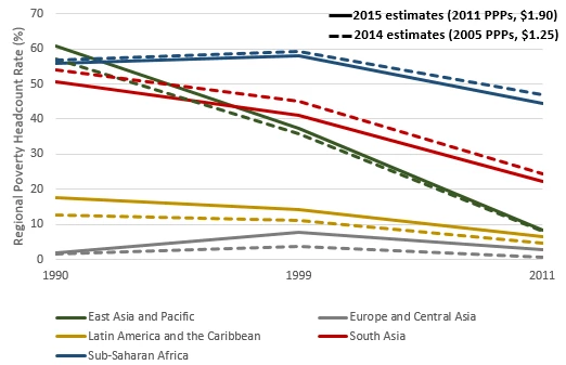
Now, once income and consumption distributions (which we have for 132 countries in PovcalNet) are compared to the new line (using, evidently, 2011 PPPs), global poverty is re-estimated. Bank reports released on October 4th list the global and regional incidence of poverty for 2011 and 2012, as well as projections for 2015. For the purposes of gauging the effect of the change in PPPs (and the corresponding update in the poverty line), it is best to focus on 2011, a year for which we have estimates using both $1.90 (at 2011 PPPs) and $1.25 (at 2005 PPPs). For that year, our estimate of global poverty incidence falls from 14.5% of the world’s population (or 1,011 million people) under the old method, to 14.2% (or 987 million) under the new. A comparison of levels and trends - for the five regions for which we are confident enough to report results - is shown in the Figure below.
The main take-away from these numbers is that changes in the incidence of poverty are relatively small, with poverty being a little lower in the poorest regions (particularly Africa and South Asia), and a little higher in the middle income regions (particularly Latin America, the Caribbean and Europe and Central Asia). Trends over time are rather robust to the change in PPPs.
This is not really that surprising when you think about it: we updated the line so as to keep its real value constant, in terms of the purchasing power of the poorest countries. Since the real poverty line has not changed much in real terms, overall poverty levels (for a given year) don’t change much either.
But wait a second, didn’t the line go up to $1.90 – a nominal increase of 52% relative to $1.25, and much higher than US inflation between 2005 and 2011? How is that consistent with “keeping the line constant in real terms”, and with no change – or even a small decline – in poverty? The answer lies – as often with global poverty mysteries – with the new PPPs… The 2011 ICP price surveys revealed price levels in poor countries that were considerably lower – relative to those in the US – than those used for the 2005 PPPs. Remember that PPP exchange rates are calculated so as to offset differences in absolute price levels: one PPP dollar should buy the same basket of goods in Kenya, India or the US. If prices in poor countries are lower, their currencies are stronger in purchasing power terms: the Kenyan shilling or the Indian rupee buy more (in their respective countries) than we used to think, relative to what one dollar buys in the United States. In other words, the US dollar’s purchasing power (in the US) in 2011 PPPs is lower relative to the purchasing power of the currencies of most poor countries (in those countries). The new PPPs effectively reflect a weaker dollar, relative to the currencies of most poor countries. This is why a poverty line that is constant in real terms in poor countries, is now higher in US dollars. $1.90 in 2011 buys approximately the same things as $1.25 did in 2005 in poor countries, which is why poverty has changed very little. That the value is higher in US dollar terms is merely a reflection of a ‘weaker” dollar in PPP terms!


Join the Conversation