Over the past few weeks, we’ve both spent a fair amount of time at conferences. Given that many conferences ask researchers to summarize their work in 15 to 20 minutes, we thought we’d reflect on some ideas for how to do this, and – more importantly – how to do it well.
- You have 15 minutes. That’s not enough time to use the slides you used for that recent 90-minute academic seminar. One recent presentation one of us saw had 52 slides for 15 minutes. No amount of speed talking will get you through this in anything resembling coherence. (And quit speed talking, anyway. This isn’t a FedEx commercial!) There is no magic number of slides since the content you’ll have and how you talk will vary. But if you have more than 15 slides, then #2 is doubly important.
- Practice. This is the great thing about a 15-minute talk: You can actually afford to run through it, out loud. Running through it once in advance can reveal to you – wow! – that it’s actually a 25-minute talk and you need to cut a bunch. Of course, the first time through the presentation it may take a bit longer than you will when you present, but if you have any doubts, practice again (bringing your prep time to a whopping 30 minutes plus a little bit).
- You need a (short) narrative. What is the main story you are trying to tell with this paper? Fifteen minutes works better for communicating a narrative then for taking an audience through every twist and turn of your econometric grandeur. Deciding on your narrative will help with the discipline in the points that follow.
- A model or results? Even if your audience is all academics, you don’t have academic seminar time. So the first thing to do is to figure out which is more important to get across – your model or your empirical results. Then trim the other one down to one slide, max. If the results are your focus (usually the case for us), give the audience a sense of how the model is set up, and what the main implications are as they pertain to the results you will show. Conversely, if it’s the model that’s more important, the empirical results will come later and you can just give the very brief highlights that bolster the key points.
- The literature. Really, really minimal. If you do it at all, choose only the papers that you are either going to build on in a major way or contradict. For some types of discussants, it may help to include them, even if they don’t meet the other criteria. Marc Bellemare takes an even stronger stance: “Never, ever have a literature review in your slides. If literature reviews are boring to read in papers, they are insanely boring to listen to during presentations.”
- Program details. Here it’s a bit of a balance. The audience needs a flavor for the program, they need to understand what it did and how it’s different from other things (particularly other things with some kinds of evidence). But only in exceptional cases (as in, it’s a really different program for theoretical reasons, or you don’t have more than process results yet) do you want this to eat up a lot of your time.
- You don’t have time to go through the nitty gritty of the data. We get that every detail about the survey was fascinating (we spend a lot of our lives thinking about this). But if it’s not key to the story, save it for a longer presentation (or another paper). And if you’re doing a primarily theoretical paper, this is a bullet on one slide.
- Balance and summary stats. Key summary stats that tell the audience who the people are might make the cut, but 3 slides of every variable that you’ll use are going to be slides you either rip through (telling the audience nothing) or waste most of your time on. Summarize the summary stats. On balance tests: you are either balanced or not. If you are, this gets a bullet at most (you can also just say that). If you’re not, tell us what’s up and why we should or should not worry.
- Pre-analysis plan. If you had it, mention it (quickly). If not, don’t. It’s not critical here.
- A picture may be worth 1,000 numbers. Sometimes, taking that really packed table which is currently in 12 point font and turning it into a graph is going to help you with self-control and help your audience with comprehension. Put the significant results in a bar chart, and use asterisks to tell folks which are significant.
- A special warning about presenting your job market paper. When I (Markus) submitted my job market paper to a journal, the referee report came back noting that this was surely a job market paper since it had 40(!) tables. Key example of how everything matters when you just spent four years of your life collecting each observation. Discipline. You have (or will have) an elevator pitch from the job market – use this to trim your presentation.
- Marc Bellemare has a great series of “22 tips for conference and seminar presentations,” many of which apply to short presentations: “Always provide a preview of your results. This isn’t a murder mystery: it’s only when people know where you’re taking them that they can enjoy the scenery along the way.”
- Jeff Leek has a great guide to giving presentations of different lengths, and what your goal should be: “As a scientist, it is hard to accept that the primary purpose of a talk is advertising, not science.” This is doubly true for a 15-minute talk.
- The AEA Committee on the Status of Women in the Economics Profession has a top 10 list. “Never cut and paste a table from your paper onto a slide. These tables are never easy to read and only irritate your audience. Instead, choose a few results that you want to highlight and present them on a slide in no smaller than 28 font.” We’ve pretty much all done this. It’s bad practice. (“I’m sorry you can’t read this table.” “Oh really, then why did you cut and paste that giant table from your paper into the presentation?!”)
- I (Dave) go back and re-read Jesse Shapiro’s guide on “How to Give an Applied Micro Talk” from time to time. It’s more geared toward a full-length seminar, but the advice is so good I can’t resist plugging it here.
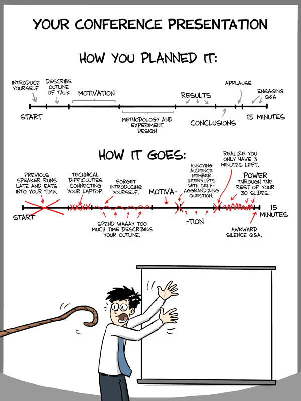
from “Piled Higher and Deeper” by Jorge Cham
http://www.phdcomics.com/comics.php?f=1553
(used with permission)


Join the Conversation