"The World By Income"
We’ve just released a working paper reviewing the Bank’s classification of countries by income. As Tariq Khokhar and Umar Serajuddin pointed out in their recent blog about whether we should call countries developing or not, there’s a strong appetite for classifying and ranking countries. Where is the best country to live, according to the OECD? (it depends, but it might be Australia, Norway or Sweden.) Which are making the most social progress, according to the Social Progress Imperative? (Norway and Sweden again.) Where is it easiest to do business, according to the World Bank? (Singapore.) Which countries have highest or lowest human development, according to the United Nations Development Program? (that’s Norway once more, and Niger is lowest.).
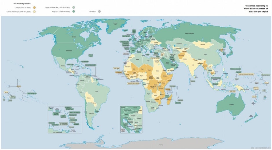
Using GNI per capita
The World Bank has used a specific measure of economic development - gross national income (GNI) per capita - for the purpose of ranking and classifying countries for over 50 years. The first compendium of these statistics was called the World Bank Atlas, published in 1966 - it had just two estimates for each country: its population, and its per capita gross national product in US dollars, both for 1964. Then, the highest reported average income per capita was Kuwait, with $3,290. In second place was the United States, with $3,020, third was Sweden, a fair way behind, with $2,040. The bottom three were Ethiopia, Upper Volta (now Burkina Faso), and Malawi, with GNP per capita estimates of $50, $45 and $40 respectively (GNI used to be called GNP). It probably comes as no surprise that today Norway is top. Malawi is still bottom.
Grouping countries
In 1978, the first World Development Report went a step further. It introduced groupings of “low income” and “middle income” countries, which were those countries that were not industrialized, surplus oil producing, or centrally planned, and had 1976 per capita incomes lower and higher than $250, respectively. In the 1983 WDR, the middle income grouping was split into “lower” and “upper” bands around a cutoff of $1,670, and in 1989 a “high income” threshold of $6,000 was introduced. This system has remained in place since then, by adjusting the thresholds for inflation each year. Over time the terms have become a regular part of the development discourse, and many practitioners even just refer to the shorthand: LICs, MICs, and HICs.
This chart shows the GNI per capita of any country against the three thresholds, using the latest data from World Development Indicators.
Of course, the world has changed since 1989. Back then, well over half of all people on earth lived in countries classified as LICs - two thirds of them in just two countries, India and China. In 2014, some 25 years on, the effect of economic growth has meant that some countries have moved to a higher classification, from LIC to MIC, or from MIC to HIC, and less than 10% of the world lived in 31 LICs in 2014. 70% of those living in extreme poverty now live in MICs, although the extreme poverty rate in LICs is extremely high, at around 50%. So we’ve been taking a closer look at the the income classification. Our working paper was published recently - in it, we’ve attempted to review whether it is still relevant for its original analytical purpose.
The income classification is still useful
Our general finding is that using fixed thresholds that are held constant over time, adjusting only for price inflation, provides an absolute method of assessing change that many still find appealing. Other methods seem to have more limitations. For instance relative thresholds, such as those purely based on rankings (such as quartiles), are attractive but they have the inherent limitation that the target is constantly moving.
GNI per capita also continues to be a reasonable choice for a classifying variable. While clearly not perfect, GNI correlates well with several other indicators commonly used to assess the progress of countries. There is also an important practical advantage of data availability - for the most part, there are enough data, and estimates of both GNI and population size are available in time to update the classification each year.
Both measures are subject to difficult-to-qualify error, especially in countries with weak statistical capacity. This can be a source of volatility in the classification (i.e. sudden changes from one classification to the next), since GNI per capita estimates are occasionally revised when methods or source data improve - a new census is conducted, for example, or GDP estimates are “rebased”. You can see this effect for yourself, by taking a look at our archive database - we’ve selected GNI per capita for three April releases of the WDI six years apart: 2003, 2009, and 2015).
A further source of unwanted volatility is the conversion of GNI to US dollars, since standard market rates can fluctuate in the short term. However the smoothing “Atlas” method works largely as intended. The use of purchasing power parity exchange rates would likely be a further improvement that would provide a better basis for cross-country comparisons of GNI. But data availability and reliability continues to limit their use for this particular purpose - the sizeable revisions at each “benchmark” round of the International Comparison Project make PPP estimates currently unsuitable for an annual classification system (see this selection of GNI per capita estimates using PPPs to see the impact of PPP revisions from the last three benchmark years of the ICP: 1993, 2005, and 2011.)
Suggestions for further study
Some aspects of the methodology might still warrant further examination. There are alternative choices for the measure of inflation used to the adjust the thresholds, for example. And, while the general conclusion is that using the absolute thresholds continues to be the most useful approach compared to a relative classification, and that there is value in maintaining them, alternatives could be considered. One relatively simple and attractive adjustment would be to align the low income threshold with the cutoff used as one of the inputs to determine eligibility for the World Bank’s concessional lending arm (IDA) - currently set at $1,215, compared to the $1,045 LIC cutoff. This is a source of confusion for many users, who tend to equate the two already. Another option might be to define an additional set of thresholds based on the relative ranking of countries, say quartiles, and then hold these thresholds constant in real terms going forward, perhaps as a pilot system in parallel with the existing one. There are many other options and possibilities, and we welcome your views.


Join the Conversation