Note: This is the second blog of a series of blog posts on data availability within the context of TCdata360, wherein each post will focus on a different aspect of data availability. The first blog post can be viewed here.
With open data comes missing data. In this blog series, we hope to explore data availability by looking at it from various perspectives within the context of the TCdata360 platform[1]: by country, dataset, topic, and indicator.
In our previous blog post, we took a look at the country-level data availability over time through an interactive motion bubble plot inspired by the famous Gapminder visualization. In this follow-up post, we’ll still look at data availability from a geographical lens – but now looking into country classifications and other details that aren’t evident in a bubble plot, as well as the data availability leaders and laggers over time.
Overall Data Availability Leaders and Laggers
First, let’s focus on comparing individual countries to get a better sense of country-level differences in data availability. We computed for each country’s overall data availability by taking the median data availability across all years (1955-2016). Looking at the top 20 and bottom 20 countries in terms of overall data availability generates a few interesting patterns.
Top and Bottom 20 countries based on median annual data availability. The top 20 countries are made of primarily of high and upper middle income countries. The bottom 20 countries with median annual data availability are made up mostly of small island developing states (SIDS), territories of high income countries, and countries which are newly independent. It’s worth noting that the median data availability for the bottom 10 countries are all zero — an evidence of either their “youth” or the difficulty to collect data from these areas.
Comparing country-level attributes. To easily compare the attributes of the top 20 against the bottom 20 countries, we’ve plotted the distribution per attribute below for each set as a percent, together with the corresponding distribution for all countries to serve as a baseline comparison. We used percent to allow an easier comparison across attributes and country sets.
You can toggle between the different attributes in the embedded chart below using the dropdown box. Again, what’s notable here are the differences in income level, landlocked, and SIDS (small island developing states) distributions.
Providing context on variability of data availability. To give you a better sense of the variability of annual data availability across all years (1955-2016) on the country level, we plotted the kernel density estimator per country in the chart below, wherein 1 line is 1 country.
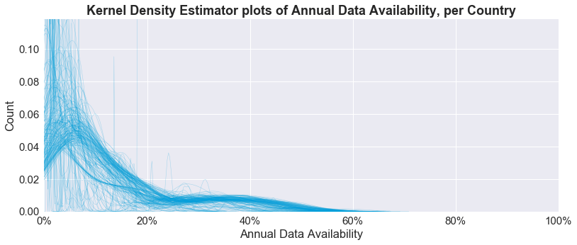
As you can see, most of the data availability country-level distributions are skewed to the left, owing to the generally low data availability in the early decades followed by faster growth in the 2000s. There are also a handful of countries characterized by consistently low data availability—as evidenced by the high “peaks” at the upper left corner of the chart—of which the bottom 20 countries are a part.
If you want to see the distribution of a specific country, we made a handy interactive plot which shows the boxplot per country below. To select a specific country, either click on a particular boxplot or type the country name in the search box above the chart. To zoom in on a particular country, use your mouse to select the rectangular area which bounds your country of interest — the plot will then readjust and zoom in based on your selection.
To interact with this plot as a full page on your browser, go to this link: https://mrpsonglao.github.io/tcdata360-data-census-bycountry/bycountry-availability-boxplot-html.html
Data Availability Leaders over Time
In our previous blog post, we saw that El Salvador took the lead in data availability for 2016, and that the leader has always been different for the past several years. But which country grabbed the lead for the highest number of years? Are there countries who persisted as the data availability leader over a long consecutive period in the past?
To answer these questions, we first summarized the number of years as data availability leader per country in the bar chart below. We determine the data availability leader by country by getting the country with the highest number of available TCdata360 indicators for that year, and then breaking ties by getting the country with the highest number of available TCdata360 subtopics for that year.
The bar chart shows that:
- United States and Korea are the leaders among leaders. United States had the highest number of years as data availability leader with 13 years total from 1955 to 2016, which is 21% of all years. In close second is France with 11 years total.
- Recent leaders are new faces. The recent leaders from 2015-2016—El Salvador, Vietnam, and Philippines—are neophyte leaders with only 1 year as leader.
Now let’s visualize which countries took the lead for which periods through a heatmap. Note that you can hover over each square to see the corresponding leader and year labels, or use the time slider at the bottom to zoom in on particular time ranges for the heatmap.
What can we take away from this heatmap?
- 1955-1959: Early leaders are from Europe. The early leaders from 1955-1959 were United Kingdom, France, and Luxembourg — all European countries.
- 1960-2004: Leaders stay as leaders for a few consecutive years. From 1960 onwards, several countries switched places in taking the lead, usually for a few consecutive years — starting with Canada, followed by Netherlands, Sweden, France, Tunisia, Korea, Brazil, and United States.
- 2005 onward: Leaders always change, and high chance for a new face. Since 2005, the leader has changed every year and often a neophyte — that is, taking only the lead for that specific year. The frequent change in the leader position for the past decade is good news for open data, as it shows the dynamic, fast-changing nature of data availability and collection across different countries from varying regions.
Data Availability, by country classification
Last, we wanted to get a better sense of data availability using different country classifications — specifically, we grouped and visualized countries using the traditional World Bank classifications of region, income level, and lending type. For each classification type in each visualization, we computed for the median trend to represent each classification type.
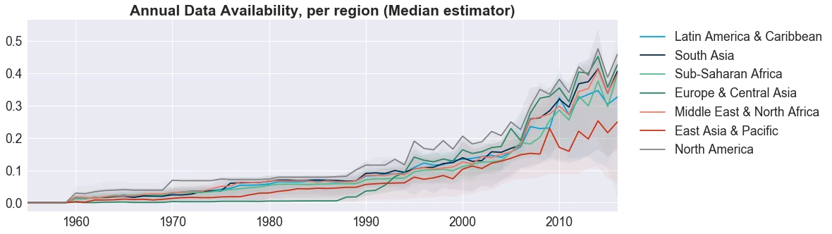
By Region. When grouped by region, we see little difference among the data availability pattern. East Asia & Pacific region stood out as having the least amount of data available, but the line is fairly consistent.
We tried shading the upper and lower limits of the regional groups with transparent colors. Can you see the difference?
Neither can we! Within regions, there’s some variance among the country-level availability, but because the data availability follows the same pattern, the shaded areas overlap, so… no real surprises!
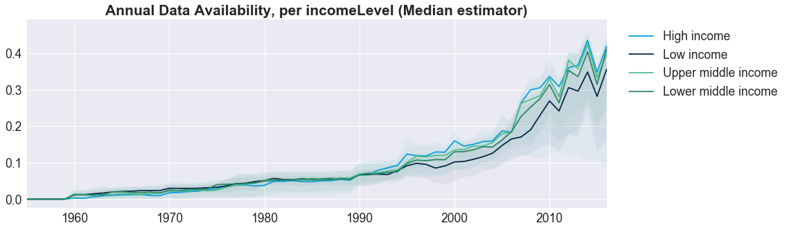
By Income Level. Countries split by income level also follow a similar pattern. Lower Income Countries tend to produce less data for various reasons (here’s a perspective), so again, no unexpected results.
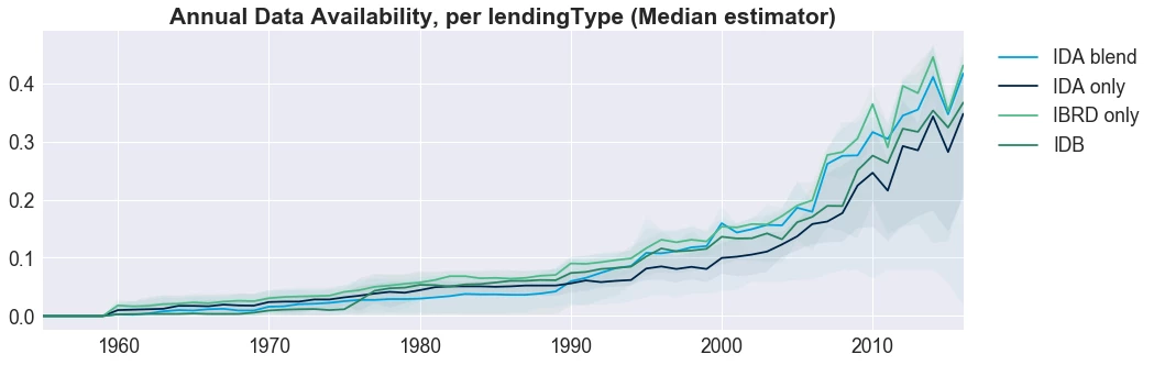
By Lending Type. When we looked at countries grouped by lending type—those who qualify for IDA funds, those who borrow from IBRD funds, and those with portfolios with a blend of lending—we found IBRD countries have consistently high median data availability, IDA countries have consistently lower data availability, but the general trend across countries remains consistent.
While country data availability is mostly homogeneous within the context of TCdata360, it’s worth noting that a few outliers do exist (we identified outliers using clustering methods, but we won’t go into detail on how we did that here):
- South Sudan, which in 2011, became the world’s newest country, and has suffered from internal conflict since.
- Somalia, while independent since 1960, has endured a civil war since 1992.
- Saint Marteen and Curacao are both former Dutch territories and became island countries in 2010, upon dissolution of the Netherland Antilles.
The above countries’ “youth” means that data is just not available and the internal conflict faced by Somalia and South Sudan, create environments where data is difficult to collect.
Overall, it’s interesting to see how data availability is homogeneous (or not) for different geographic slices within the context of TCdata360. But with the amount of information we have, there’s still a lot to be explored.
Stay tuned for our upcoming blog posts — we’ll be launching a Data Availability Explorer in our TCdata360 Data Science corner! We’ll also be sharing more insights on data availability from the perspective of topic trends and dataset archetypes.
In the meantime, tell us if you find anything interesting through interacting with the charts in our blogs! Email us at tcdata360@worldbank.org or tweet us with the hastag #tcdata360.
The conclusions and opinions expressed in this blog do not represent the views of the World Bank Group.
- Not all indicators of a dataset are ingested into TCdata360, especially if these are not relevant to the topics covered by TCdata360. As much as possible, we try to ingest all indicators relevant to Trade, Innovation, Sectors, Investment, and Economy when a dataset is ingested based on feedback from subject matter experts and data owners.
- Not all years with data available for an indicator are ingested into TCdata360. As much as possible, we try to ingest all years available for any ingested indicator; however, some factors may lead us to partially ingesting available time series data for that indicator, such as — if there are years where the indicator data is not readily available in a structured format, we opt to prioritize ingesting years whose structured data is available; if there are years where the dataset underwent methodological changes, we opt to ingest the most recent data of the dataset since presenting the indicator data as a time series may be misleading.

Join the Conversation