Last month, while World Bank President Jim Yong Kim launched the gender data portal, U.S. Secretary of State Hillary Clinton remarked that “data not only measures progress, it inspires it”. Indeed when data is both relevant and effectively communicated, it can help to inform policies, identify challenges, and catalyze changes and innovations that deliver development results.
With that goal in mind, we started an Open Data Lab. One of our objectives is to help the development community become more effective data communicators by experimenting with different data visualization techniques and tools. The human brain finds it easier to process data and information if it is presented as an image rather than raw numbers or words. And visualizations that let and encourage users to interact with data can deepen their understanding of the information presented.
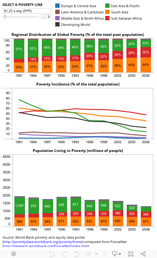
We decided to begin with data that defines our challenging work and mission: poverty reduction. Over 20 years ago Martin Ravallion and Shaohua Chen with various collaborators along the way developed the now widely used methods, tools and indicators to monitor the population “living on less than $ a day”. Earlier this year they released the latest update of the World Bank’s global poverty monitoring data along with a re-vamped version of PovcalNet: an interactive on-line computational poverty analysis tool. We downloaded the table with regional poverty estimates and used PovcalNet to calculate the results for additional poverty lines. We then combined all the data in the three-panel visualization embedded below.
Global poverty trends
Click here for a guide on using this data visualization.
You probably already know that the global incidence of extreme poverty (defined as living on less than $1.25 a day) has fallen from 52 percent in 1981 to 22 percent in 2008. And three regions in particular – East Asia and the Pacific, South Asia and Sub-Saharan Africa – have experienced very different poverty trends over this period. But did you know that:
• Between 1981 and 2008, three regions (East Asia and Pacific, South Asia and Sub-Saharan Africa) have together consistently accounted for over 95 percent of the developing world’s population living on less than $1.25 a day?
• Even if we doubled the extreme poverty line to $2.5 a day, these three regions would still account for 93 percent the poor in the developing world?
• Even if we doubled the poverty line further to $5 a day, 88 percent of the developing world’s poor population would be still found in these regions.
You can explore more interactive country and regional data dashboards with the latest World Bank poverty statistics here: http://povertydata.worldbank.org/poverty/home
What do you think? Did you learn or discover something new about global poverty data? Did it help improve your understanding of these data?


Join the Conversation