If a child is born today in a country where the life expectancy is 75, they can expect to live until they are 75… right?
Not exactly.
The statistic “Life expectancy at birth” actually refers to the average number of years a newborn is expected to live if mortality patterns at the time of its birth remain constant in the future. In other words, it’s looking at the number of people of different ages dying that year, and provides a snapshot of these overall “mortality characteristics” that year for the population.
Why do things this way? The limitations of cohort data.
Consider what we’re actually trying to measure. Imagine if we went back to a country in 1900, and for every child born that year, tracked them throughout their lives and recorded when they died. We’d know the lifespan of every child born that year and calculating the life expectancy for those born in 1900 (a group called a “birth cohort”) would just mean finding the average of all their lifespans.In practice, we can’t often do this because cohort data might be outdated, unavailable or incomplete. Crucially, the cohort data only become available when most of the newborns born in the same year have completed their lives. Right now, The Human Mortality Database shows cohort life tables are available only up to the birth cohort of around 1920 for several countries in Europe.
So if we wanted to know the life expectancy of a newborn in 2013 using this technique, we’d likely need to wait over 100 years for the answer.
Fortunately, there are some statistical techniques that can offer good estimates of life expectancy for both whole populations and cohorts.
Using Period Life Tables
A period life table reflects a snapshot of a population’s mortality pattern at a given time and it shows various pieces of information about the dying out of a birth cohort. For example, here is the top of the period life table for the whole population of United States using mortality rates from 2008: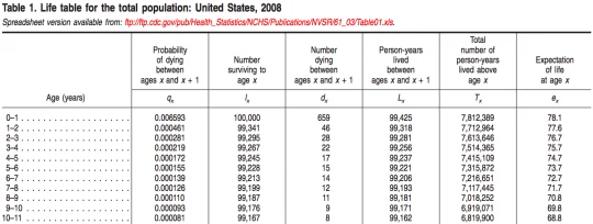
Typically period life tables are constructed applying age-specific death rates of a given population for a given year to a hypothetical cohort of 100,000 newborns.
These age-specific death rates are transformed into other columns of the table, by 1- or 5-year age group. The USA above uses 1-year groups. As you can see, these columns include age-specific figures for the probability of dying, the number of survivors out of the 100,000 newborns up to an exact certain age x (surviving to an x-th birthday), the number of the newborns who die in the age groups, the person-years lived in the age group, and the total person-years lived by the cohort beyond an exact age x.
From this life table, we can now calculate both life expectancy at a certain age, and life expectancy at birth:
Life expectancy at age x can be obtained by dividing the total person-years lived beyond exact age x (column 5 - Tx) by the number of survivors at exact age x (column 2 - Ix).
Life expectancy at birth is the total person-years lived beyond exact age 0 (newborns - column 5 - Tx) divided by the number of newborns (100,000).
Chart: Life Expectancy At Birth (Both Sexes, 1960 - 2011)
If you plot the “number of survivors out of the 100,000 newborns to an exact age x” - column 2 Ix above, you’ll see the survival curve for a population.
The interactive chart below shows the survival curves for females in period life tables from 2005-2010. You can see that in Japan about 78% (78,000 out of 100,000 female newborns) survive up to age 80, whereas about 7% (6,500 out of 100,000 female newborns) survive up to that age in Sierra Leone. Life expectancy at birth for females was 47 years in Sierra Leone and 86 years in Japan for the same period. You can select or type the names of other countries in the box below the chart to see the corresponding survival curves.
Interactive: The Number of Female Life Table Survivors by Age (2005 - 2010)
But again this is for a hypothetical cohort who has mortality patterns of a given time period throughout their lives and it does not show actual mortality risks that the actual newborns born in 2005-2010 are going to experience throughout their lives. The newborns would go through these mortality risks only if the mortality patterns of 2005-2010 pertained throughout their lives. In the real world, a child born today in a country where the life expectancy is 75 is likely to live longer than 75 as the mortality level continues to fall in the future.


Join the Conversation