This week I finally got around to learning how to make a graph which displays the means of different treatment groups for a range of outcomes, along with standard error bars to show whether there is a significant difference between groups. Here is an example:

The context here is an experiment I am currently writing up in which there are two treatments, along with a control group, and I am looking at several binary outcomes as my main outcomes of interest. I’ll discuss the actual experiment in a future post. But for now the point is that I want to visually summarize the main results (no significant impacts) in a single graph. This is the sort of thing that is very standard to do, but somehow I never got around to learning how to do it easily until now, so thought I’d share how to do it, and see if anyone has a better way.
Approach One: Doing this in Excel
My co-authors who have done this have used Excel to do so. To do this, first run your treatment regressions, and enter them into Excel like this:
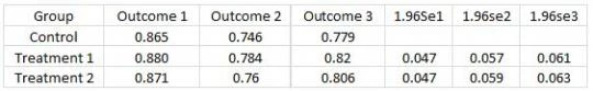
Here I am showing the mean for the control group, and then the treatment groups have the control mean plus the estimated treatment effect in the outcome columns. The column marked 1.96se1 then contains 1.96 times the standard error for the treatment effect on outcome 1.
Steps:

Approach Two: Doing this in Stata
The UCLA Stat Consulting Group has a step-by-step guide which shows how to do this. It is very thorough, but as a result, looks a little long and daunting when you first examine it. So here’s my attempt to make it reasonably simple code you can adapt – see the UCLA guide for more details.
First, you need to get your data in Stata in a format like this:
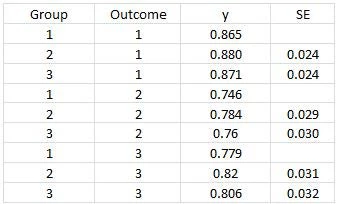
Here Group denotes the treatment status, and outcome denotes the outcome you are interested in plotting. I found it easier just to get this step done in Excel by rearranging coefficients from one of my regression tables. Then use the following Stata code:
*** First generate high and low points for bars
gen hiy=y+1.96*se
gen lowy=y-1.96*se
*** Then create a new group variable
*** This puts spaces in between outcomes (so with 3 treatment groups, add 4)
gen outcomegroup=group if outcome==1
replace outcomegroup=group+4 if outcome==2
replace outcomegroup=group+8 if outcome==3
sort outcomegroup
*** Set it to black and white
set scheme s1mono
*** Graphing command
graph twoway (bar y outcomegroup if group==1) ///
(bar y outcomegroup if group==2) ///
(bar y outcomegroup if group==3) ///
(rcap hiy lowy outcomegroup), ///
legend(order (1 "Control" 2 "Treatment 1" 3 "Treatment 2")) ///
xlabel(2 "Outcome 1" 6 "Outcome 2" 10 "Outcome 3", noticks) ///
ytitle("Proportion of Individuals") ///
yscale(range(0 1)) ylabel(0 0.2 0.4 0.6 0.8 1) xtitle("") ///
title("Graphing Impacts with Standard Error Bars")
This produces a graph like the one used to open this post. You can then of course play around with Stata’s graphics editor to edit further as you like.
Anyway, at the very least this will serve as an aid to my memory when I invariably forget how to do this by the next time I need to. But hopefully it is also useful to others. If anyone has a faster/better way of creating these graphs, it would be great to hear from you – for example there are Stata commands serrbar and barplot2 which don’t quite produce graphs like the above, but perhaps there is another command that does?
The context here is an experiment I am currently writing up in which there are two treatments, along with a control group, and I am looking at several binary outcomes as my main outcomes of interest. I’ll discuss the actual experiment in a future post. But for now the point is that I want to visually summarize the main results (no significant impacts) in a single graph. This is the sort of thing that is very standard to do, but somehow I never got around to learning how to do it easily until now, so thought I’d share how to do it, and see if anyone has a better way.
Approach One: Doing this in Excel
My co-authors who have done this have used Excel to do so. To do this, first run your treatment regressions, and enter them into Excel like this:
Here I am showing the mean for the control group, and then the treatment groups have the control mean plus the estimated treatment effect in the outcome columns. The column marked 1.96se1 then contains 1.96 times the standard error for the treatment effect on outcome 1.
Steps:
- Highlight the first four columns, then go to Charts -> Column->2-D Column to draw a bar graph.
- Then to add error bars for Treatment 1, click on the Treatment 1 bar somewhere on the graph, then go to ChartTools->Layout-> Error Bars ->More Error Bar options ->Custom->specify value. Then where it says “Positive Error Value”, highlight the three cells with 1.96*Std Error for Treatment 1 (row 2, columns 5-7 in the table above). Highlight the same three cells for where it says “Negative Error Value”.
- Do the same as step 2, but for Treatment 2
- This will give you the basics of the graph you are after, you can then edit colors, axis titles, fonts, etc. to end up with something like the below:
Approach Two: Doing this in Stata
The UCLA Stat Consulting Group has a step-by-step guide which shows how to do this. It is very thorough, but as a result, looks a little long and daunting when you first examine it. So here’s my attempt to make it reasonably simple code you can adapt – see the UCLA guide for more details.
First, you need to get your data in Stata in a format like this:
Here Group denotes the treatment status, and outcome denotes the outcome you are interested in plotting. I found it easier just to get this step done in Excel by rearranging coefficients from one of my regression tables. Then use the following Stata code:
*** First generate high and low points for bars
gen hiy=y+1.96*se
gen lowy=y-1.96*se
*** Then create a new group variable
*** This puts spaces in between outcomes (so with 3 treatment groups, add 4)
gen outcomegroup=group if outcome==1
replace outcomegroup=group+4 if outcome==2
replace outcomegroup=group+8 if outcome==3
sort outcomegroup
*** Set it to black and white
set scheme s1mono
*** Graphing command
graph twoway (bar y outcomegroup if group==1) ///
(bar y outcomegroup if group==2) ///
(bar y outcomegroup if group==3) ///
(rcap hiy lowy outcomegroup), ///
legend(order (1 "Control" 2 "Treatment 1" 3 "Treatment 2")) ///
xlabel(2 "Outcome 1" 6 "Outcome 2" 10 "Outcome 3", noticks) ///
ytitle("Proportion of Individuals") ///
yscale(range(0 1)) ylabel(0 0.2 0.4 0.6 0.8 1) xtitle("") ///
title("Graphing Impacts with Standard Error Bars")
This produces a graph like the one used to open this post. You can then of course play around with Stata’s graphics editor to edit further as you like.
Anyway, at the very least this will serve as an aid to my memory when I invariably forget how to do this by the next time I need to. But hopefully it is also useful to others. If anyone has a faster/better way of creating these graphs, it would be great to hear from you – for example there are Stata commands serrbar and barplot2 which don’t quite produce graphs like the above, but perhaps there is another command that does?

Join the Conversation