Image via Borkin et al
It may surprise some readers that’s there’s a thriving academic discipline concerned with quantifying the effectiveness of information visualization techniques. As John Wihbey notes, “by applying some cognitive and behavioral science”, we can get beyond some of the “rules”, and often subjective criticisms of visualization to see what works in an experimental setting.In a fascinating paper , Michelle Borkin asked subjects to look at a selection of visualizations from the Massviz corpus while tracking their eye movements, and then later asked them to describe in detail what they recalled of the visualizations.
So what did the study find?
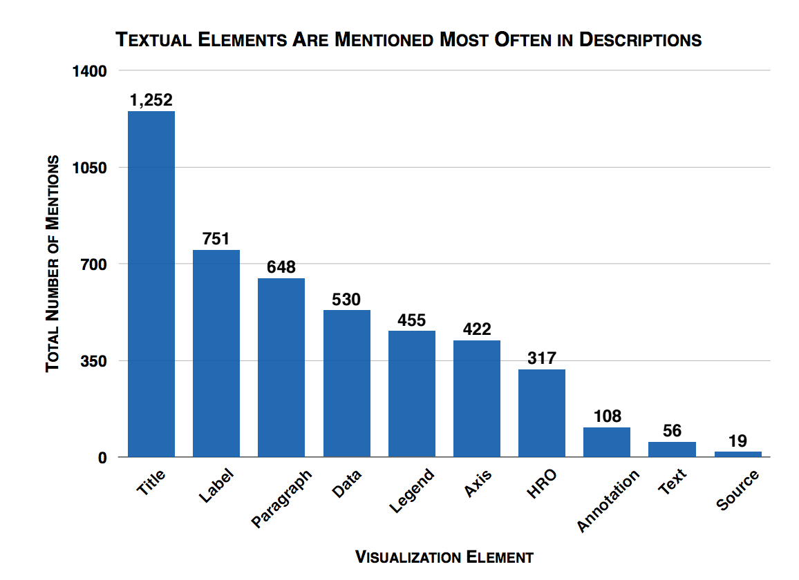
Image via Borkin et al
1) Visualizations that are memorable “at-a-glance” have memorable content.A visualization that can be quickly taken in and understood (and with little eye movement) also appears to be easiest to recall later on.
2) Titles and text are key elements in a visualization and help recall the message.
The study found that titles attract people’s attention, and that people spend most of the time looking at the text in the visualization. It suggests that readers dwell upon the content of the title / text while taking in the visual and it helps with recognition and recall. In fact, you can see in the chart above, that the title was the most often mentioned aspect of a visualization during recall.
3) Pictograms do not hinder the memory or understanding of a visualization.Pictograms or “human recognizable objects” (think icons representing water, education, food etc.) can act as “visual hooks” into the memory and aid recall in addition to or instead of text. The study does note however that pictograms that are unclear or don’t relate to the visualization’s message “produce confusion and misdirect attention”
4) Redundancy helps with visualization recall and understanding.Including redundancy or repetition of data and messages in a visualization contributed to a better understanding of the visualization during recall.
What should you do differently when visualizing data?
What’s interesting is that these findings “quantitatively support many conventional qualitative design guidelines” so if you’re already on top of these - good news - you can keep on doing what you’re doing!
I often help out colleagues with making charts, graphics and data visualizations for the web and my first piece of advice is always to start with a great title or headline. There’s a lot to take away from Michelle’s work but if you take just one thing, take this.

Join the Conversation