 'Favela' in Salvador de Bahia, Brazil
It has recently become fashionable to trash the world’s (hitherto) most popular measure of income inequality: the Gini Coefficient. Some of world’s best economists – including those leading the study of inequality today – are enthusiasts of the sport. Take for example, Anne Case and Angus Deaton’s January 27 column in Prospect. The characteristically well-written piece makes various excellent points. It notes that no single statistic can convey a full picture of inequality: “By collapsing the whole rainbow of the income distribution into a single statistical point of white light, it necessarily conceals much of great interest.” It notes that income is merely one of many ingredients into well-being and argues that in present-day US – for example – inequalities in mortality trends, and how they interact with unequal educational achievement, matter a great deal more.
The column briefly summarizes the sordid role played by the US pharmaceutical industry in the recent opioid epidemic; reflects on the huge toll taken by the broader epidemic of “deaths of despair”; and denounces the “iniquity of running health-care as a profit-making enterprise”. They note that how inequality arises “matters a great deal for fairness” – a point often ignored by other leading scholars of inequality today, but with which I very much agree. This is all great stuff: deep insights eloquently presented by two of the greatest living scholars of economic well-being.
My only disagreement is with the authors’ decision to pick, not on exclusive reliance on a single measure of inequality, whichever it is, but specifically on the Gini coefficient as the target for their critique. In this post, I will take up the old-fashioned, unhip and uncool position of defending the poor old Gini coefficient: not as the single or even the best scalar measure of inequality. But as a perfectly valid one that is, in important ways, far superior to frequently-used alternatives.
After describing the perverse interaction between wealth gaps, education, mortality trends and political economy, Case and Deaton note that “You could crunch the Gini coefficient to as many decimal places as you like, and you’d learn next to nothing about what’s really going on here.” Quite so, but surely it is unreasonable to demand of one measure of inequality along one dimension that it shed light on complex social interactions or detect causal relationships.
That would be like urging us to abandon the Centigrade scale as a measure of temperature because it so badly fails to inform us about how climate change plays havoc with rainfall patterns, the incidence of extreme weather events, or the extent of sea level rises. You could calculate average global temperature increases to as many decimal places in degrees Celsius as you liked, and you would be none the wiser about the diversity of consequences of climate change around the world.
To be fair, the Prospect column does also raise some narrower criticisms of the Gini index as a summary measure of inequality – which are more pertinent to its purpose – notably that the effect of individual income observations on the overall index depends on ranks, rather than on income levels. This property makes the index rather insensitive to very large income (or wealth) gaps at the top of the distribution. This point is well-taken: as Tony Atkinson taught us in the sixties and seventies, because inequality indices aggregate income differences along the distribution with different weights, they implicitly embody value judgements about which gaps matter most. Atkinson (1970) argued that such judgments should be made explicit in terms of the social welfare function underpinning each index. Indeed, he too criticized the indiscriminate use of the Gini coefficient, absent an understanding of its implicit social welfare weights. He proposed his own class of indices, members of which are explicitly associated with different values of an “inequality-aversion” parameter.
But Atkinson’s work contained another, even more fundamental contribution to the modern practice of inequality measurement. In the face of a multiplicity of plausible scalar measures, he asked, can we ever make robust comparisons between distributions? Can we say: inequality this year is unambiguously higher than ten years ago? Or would the answer always depend on the observer’s value judgments and on the specific index they lead her to choose?
It turns out, Atkinson showed, that as long as we require our inequality measures to satisfy a few basic properties, then robust comparisons between distributions A and B are possible – but only in some cases. Moreover, the cases where such unambiguous rankings are possible are precisely those where the Lorenz Curves for distributions A and B do not cross. A Lorenz curve is simply the plot of a population’s income share against its population share, once people have been ranked in ascending order of income. To illustrate, the figure below shows three Lorenz curves for Brazil: the actual Lorenz Curve for 2007 lies everywhere above that for 1995, so inequality unambiguously declined in Brazil over this period. (Ignore the other curve...)
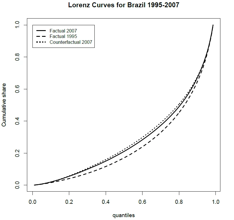
Source: Actual and counterfactual growth incidence and delta Lorenz curves: Estimation and inference
The “few basic properties” mentioned above are symmetry; the Pigou-Dalton transfer principle; scale invariance and population-replication invariance. Readers unfamiliar with these axioms, the Lorenz Curve, and the relationship between them have many sources they can consult. One particularly clear and concise summary can be found in James Foster and Nora Lustig’s Spotlight 3.2 in the Human Development Report 2019 (beginning on p. 136).
This result was a big deal. It meant there was hope for robust assessments of changes (or differences) in inequality over time (or across countries). But only so long as we use inequality indices that satisfy those four axioms and are, therefore, consistent with the Lorenz ranking criterion – or Lorenz-consistent for short. Lorenz-consistence has therefore been treated as an essential property for any inequality index. Using a Lorenz-inconsistent measure means that we might conclude that inequality is higher in (say) Brazil in 2007 than in 1995, even though 2007 Lorenz dominates 1995, and all Lorenz-consistent measures would yield the inverse ranking!
Now, the much-maligned Gini coefficient – along with many other commonly used measures, such as the two Theil indices, their cousins in the Generalized Entropy class, and the related Atkinson measures – are all strongly Lorenz consistent. Beyond other technicalities, the key reason is that these measures satisfy the strong Pigou-Dalton transfer principle (mentioned approvingly in Case and Deaton’s column): If a poorer person makes a transfer to a richer person, then the measure should record a rise in inequality, regardless of where A and B are in the distribution. This would seem like a pretty basic requirement for a useful inequality index.
Yet, many other frequently-used “indicators” of inequality are not (strongly) Lorenz-consistent. Offenders come in two grades: First, there are measures that are weakly Lorenz-consistent. Here, when a poorer person makes a transfer to a richer person, the inequality indicator need not rise. All that is required is that it should not fall. You might say “weak” is something of an understatement. You could have everyone in the bottom 90% of the distribution making transfers to people between the 90th and 95th percentiles, and all we require of the measure is that it does not fall! This group includes the so-called Kuznets ratios: share of the top x% over the bottom y%, including their limiting cases, such as the income share of the top 1%, 10%, and so on.
The worst offenders are just plainly Lorenz-inconsistent. These measures may rank inequality in 1995 as lower than in 2007, even though the 2007 Lorenz Curve dominates the one for 1995. This means that these measures may rank inequality in A as lower than in B, even though one gets from B to A by a sequence of regressive transfers. Surely, measures in this group should give us pause. Yet, the group includes a number of widely used indicators – mostly by labor economists, as it turns out... – such as quantile ratios (p90/p10, p75/p25, etc.) and the variance of logarithms (see Foster and OK, 1999). To see why quantile ratios are Lorenz-inconsistent, consider a regressive transfer from the 5th to the 10th percentile, for example. Or a progressive transfer from the 95th to the 90th.
Where does this leave us with respect to Case and Deaton’s arguments on inequality analysis? Three concluding points: First, they are absolutely right that one should not narrowly obsess about wages, incomes or wealth alone. Other aspects of well-being, such as mortality, education, or political influence may matter a great deal more to certain societies or at certain times. Second, they are also right that – even when one happens to be concerned with assessing changes in the distribution of incomes, narrowly defined – one should not rely on a single summary statistic. One should plot Lorenz curves and check for dominance. One should use many alternative indices and be mindful of the welfare judgments built into their mathematical formulae. But third, the Gini coefficient is a perfectly reasonable candidate for inclusion among such indices. In important ways, it is superior to other “simpler” measures, that are “easier to understand”. It should not be the inequality analyst’s only tool, but it certainly still belongs in the toolkit.

Join the Conversation