I’ve been in quite a few meetings recently and read quite a lot of documents where people have made claims about the relative sizes of the public and private sectors in health care delivery. A recent report from the World Bank Group on the private sector in Africa claims that “the private health sector now provides half of all health services in the region.” A document I reviewed recently claimed that “much” of medical care is provided by the private sector – an assertion I hear quite often.
As far as I can make out, the data underlying such claims reflect a very partial picture. The Africa data are from the Demographic Health Survey which captures only treatment for (outpatient) maternal and child health services (MCH); it also covers only the developing world, and only the poorer part of it. Some claims reflect data for just one country. I’ve heard a lot about India, but these data (obviously) cover just India, and only outpatient visits.
WHS to the rescue
To get the big picture, I thought it might be useful to crunch some numbers from the World Health Survey. (Actually, to be completely honest, I crunched some numbers from a dataset that some coauthors and I have constructed from the WHS for a paper that we’re nearly done writing.)
The WHS was fielded in the early 2000’s in 70 countries – spanning the World Bank’s lower-, middle- and high-income categories. The WHS enumerators asked a randomly-selected adult in each household about his or her use of inpatient care and outpatient care; in the numbers that follow I’ve focused on use in the last 12 months. For both types of care, the enumerator also asked whether the last facility visited was public or private.
The WHS has some drawbacks. The regional coverage varies: it was implemented in most of South Asia, but much more sparsely in Latin America. It is ten years old. We can tell only whether inpatient or outpatient care was received, not the number of contacts. And the public-private information is for the last facility visited only.
Still, it gets us much closer to the big picture than if we focus on MCH outpatient treatment in the world’s poorest countries, or on outpatient care in just one country.
The picture’s actually rather different from what we often hear
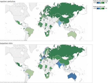
The numbers in the maps below show the share of inpatient admissions and outpatient visits delivered in public facilities. Green means mostly public – the darker the shade, the larger the public share. Blue means mostly private – the darker the shade, the larger the private share.
On the inpatient admission map, there’s just one country that’s blue – India. There’s not even much light green on the map. In the developing world, 81% of inpatient admissions are in a public facility. Even in South Asia, the figure is 63%. Globally, the public sector’s share of inpatient admissions is 82%.
There’s more blue on the outpatient visit map. South Asia stands out: in this region, the majority (66%) of outpatient visits are in the private sector, and in all countries except Sri Lanka, the private sector delivers the majority of outpatient care. In other regions – including the OECD – it’s the public sector that delivers most outpatient care: the private sector’s share is just 33% in these countries. Globally, the public sector’s share of outpatient visits is nearly two thirds (62%).
And the Africa report?
What then of the Africa report’s claim? Well, it turns out that in sub-Saharan Africa just 25% of outpatient visits are in the private sector, and only 16% of inpatient admissions are. Both figures are rather a long way from the report’s claimed “half”.


Join the Conversation