How do we get inspiration for cool impact evaluation visuals? For R users, there are quite a lot of good resources for producing data visualizations in R, like the R Graph Gallery and the book Data Visualization with R. However, since R is widely used across different disciplines, it’s difficult to find resources specific to economics. Stata, on the other hand, is not as popular outside the realm of microeconometrics. So there are not as many data visualization resources available. Bottom line: both R and Stata users are hard pressed to find a good source of econ visals.
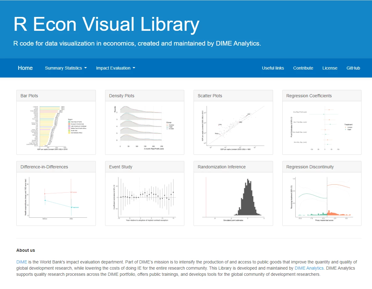
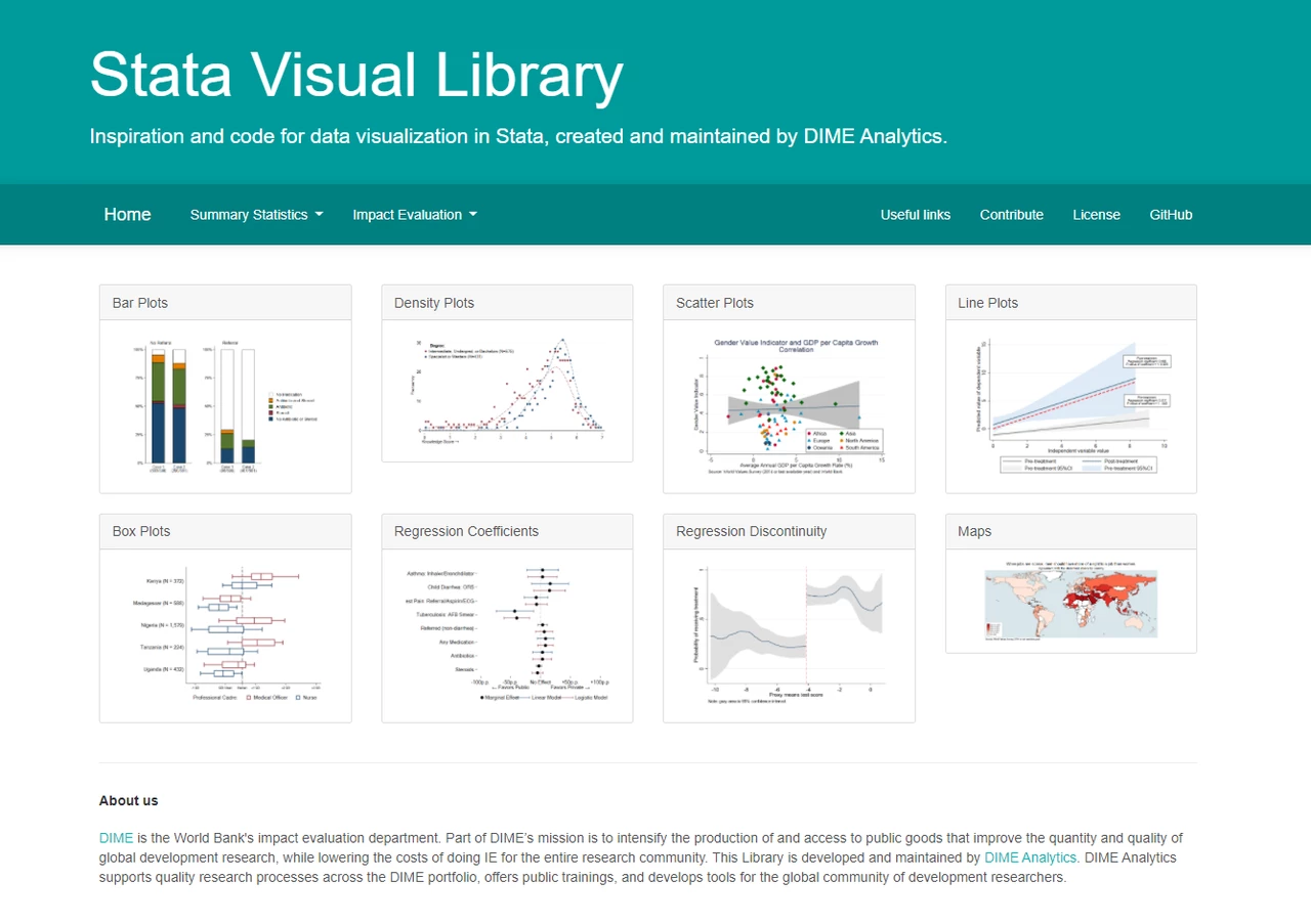
Now enter DIME Analytics's Stata Visual Library and R Econ Visual Library! In this short blog post we provide three main reasons why you need and will come to love these visual libraries.
Reason #1: More time for other things
Who hasn't spent hours trying to create a graph but ended not getting the syntax right to show confidence intervals in a scatter plot, and had to settle for an inferior product on the eve of a talk? (We see you, manual edits in Paint ;) The two libraries have a curated selection of data visualizations, each linked to a GitHub repository with the source code to allow for easy replication. The hope is that less time fussing with syntax == more time to think critically about data analysis.
Reason #2: Reproducible graphs
Another big reason not to resort to edits in Paints is that this is hardly a reproducible workflow. Graphs that are done by hand are error-prone (e.g., easy to forget to update that one graph when re-running results because it is not part of your automated workflow), and others will not be able to replicate.
A related point: Working with a lot of different projects, we’ve found that in many cases, the most challenging part of creating excellent data visualizations is getting the data in the right format, so for every graph we’ve also provided the dataset used to create it.
Reason #3: Impactful, good-looking graphs
Finally, these graphs are quite nice to look at. Too often quick turnaround presentations end up having unpleasant visuals, and this actually matters quite a bit in a research group such as ours: the quick outputs often target busy, overwhelmed policy-makers. Ugly graphs are definitely not helping get the main messages through to that crowd…
tldr; just say no to #UglyGraphs! Check out our libraries, and please contribute your own visualization code (contributor instructions are posted in each library). These are super young, living resources: they will need proper care to develop into mature tools. In this spirit, we will keep adding examples, and curating what you send us. If you don’t see what you’re looking for, email us or, better still, make your request in a GitHub issue, and we will try to solve it.


 San Martin")
Join the Conversation