
Here are some (of the many) things that caught our attention last week:
-
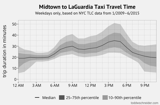
“Analyzing 1.1 Billion NYC Taxi and Uber Trips, with a Vengeance” is a masterclass in hands-on reproducible analysis of open data by Todd Schneider who finds all sorts of interesting trends and patterns. Jake Vanderplas did a similar, smaller-scale, exercise in Seattle with data on bicycle commutes, again making all the data and methods openly available.
-
The Economist writes that “The open-data revolution has not lived up to expectations. But it is only getting started." It’s a good piece highlighting the progress that’s been made in the last 5 years and they speak to a number of leaders in the field who point to skills gaps, data quality and accessibility, and privacy being important issues to tackle.
-
Randall Munroe of XKCD has a new book out in which he uses his characteristic line drawings and only the thousand (or, rather, “ten hundred”) most common words to provide simple explanations for interesting things. To get a flavor of this utter brilliance, I recommend reading his piece in the New Yorker: “The Space Doctor’s Big Idea” which explains both the special and general theories of relativity. My takeaway? There is no idea so complicated that it can’t be faithfully explained to a wide audience in an understandable manner
-
“Y-Axes don’t lie to people, people do” - Vox have apparently had enough of dataviz dogmatists emailing them every time they use a non-zero y-axis on a chart so made a very entertaining video justifying their editorial decisions. David Yanofsky over at Quartz also weighed in back in June.
-
“The challenges of maintaining digital archives are as much social and institutional as technological.” writes the Atlantic in a timely piece on how easily information is lost on the web. We take archives pretty seriously at the Bank and if you’ve not already checked it out, we recently launched the Open Archives site here at the Bank which offer a broad perspective of the Bank’s activities over the last 70 years, and the Oral History Program which capture history through interviews with former staff. Our Chief Archivist reminded me the other day to think about information in the long term with the memorable line - “data needs to be born with a pension fund.”
-
The “Scientists with reasons to be cheerful” sees the Guardian profiling folks like Max Roser and Hans Rosling who do a lot to counter the doom and gloom in the news by focusing on the facts that show the world to be a happier and healthier place than ever before.
-
Finally, if you’re after an easy way to plot interactive graphics on the web directly from your programming environment, Plot.ly has been a strong choice for a number of years. I was pleased to see that they’ve open-sourced their core charting layer which among other things mean making fast offline interactive charts much easier.

Join the Conversation