Don’t worry, this is not a complicated post on yet another of the expanding set of theory papers on difference-in-differences. Instead, I want to offer my heuristic thoughts on when I find graphs illustrating parallel trends to be more or less informative, and on what, in my mind, makes the parallel trends assumption more plausible. If you take anything from this post, it should be:
· Plot the raw treatment and control series, not just their difference; and
· The longer and squigglier your pre-treatment trends, the more plausible I find the parallel trends assumption.
To do this, I am going to consider the classic difference-in-differences case with no staggered timing, with a group that gets treated after time 0, and where the treated group trend jumps up by 2 units immediately after treatment. I will show four cases A, B, C and D that plot the treatment means and the means for a control or comparison group, and argue that the parallel trends assumption seems more and more plausible to me as we move from one case to the next – and then draw out the lessons we learn from this. While this post is about difference-in-differences, the same ideas apply to synthetic controls.
Recall that the parallel trends assumption is that the untreated units provide a good counterfactual of the trend that the treated units would have followed if they had not been treated. This is ultimately an untestable assumption, but there is a long tradition of viewing this assumption as being more plausible if the trends are parallel in the pre-treatment period. In a couple of previous posts I discuss formal approaches to pre-trend testing, and robustness approaches that allow for some deviations from parallel trends.
Case A vs Case B: Parallel Trends with and without level differences.
Let’s start by considering the following two cases. Both have three rounds of data pre-treatment, and show parallel linear trends with the exact same slope for the treatment and control groups pre-treatment. The only difference between the two cases is a level difference, and so the event study plot would be identical in both cases. But yet if you gave me a choice between these two control groups and asked whether I had a preference, I would always want Case B over Case A – and think almost all applied researchers would agree.
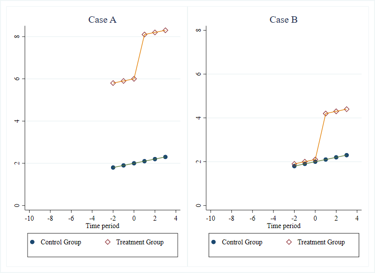
This point that the parallel trends assumption will be more plausible if the treatment and control groups are more similar in levels to begin with, and not just trends, is one made in Kahn-Lang and Lang (2019), and discussed in my previous post. They discuss it with regard to the concern that whatever led to the initial difference in levels in case A could very much also lead to future differences in trends.
Suppose the outcome here is income. Then your adversarial referee might ask what sort of process would lead us to think income would grow by a constant amount in levels year after year? Maybe it makes sense to think instead of a constant percentage growth in the absence of the intervention, and look at log incomes. Then in Case A, the control group is having faster percentage income growth pre-treatment than the treatment group, and so parallel trends is not holding. While the log mean and mean of the logs will differ unless the distributions are also the same, the percent growth rates are going to be much closer to parallel in Case B than Case A.
Case B vs Case C: more or less pre-treatment data
Let’s keep Case B, and compare it to a new Case C, which differs in having 10 periods of pre-treatment data compared to Case B. Again, if given the choice, I would always prefer to have the data in Case C than that in Case B. From a statistical viewpoint, you might want to do this because it gives you more power for testing for a parallel trend in the pre-treatment period, or because it gives you narrower confidence intervals for your bounds if you make assumptions on how sharply any differences in trends can evolve (as in the approach of Rambachan and Roth (2019)). But the reason I find it more comforting is that Case C offers a lot more time periods for a difference in trends to have emerged. It also helps in ruling out the possibility of Ashenfelter dips or anticipation effects that might not get caught with only a few rounds of pre-treatment data.
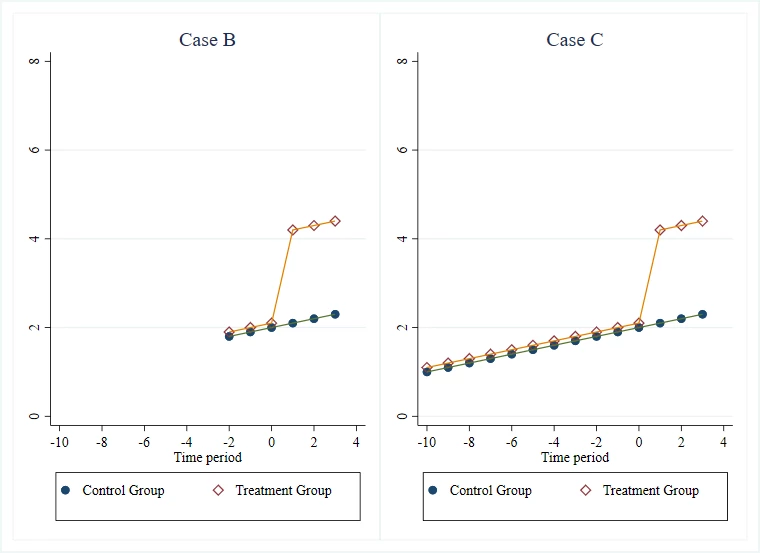
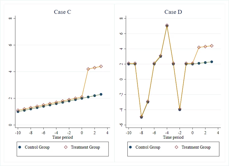
Case C vs Case D: more or less “squiggly”
Finally, let’s compare Case C to another case that also has 10 periods of pre-trend data (Case D). The treatment-control difference is exactly the same in the two cases, so in an event study plot that just plots the treatment-control difference against time, you would not be able to tell these two cases apart. But I think case D gives me a lot more confidence in the plausibility of parallel trends than case C. It is often quite easy to mimic a linear trend. That is why we have fantastic websites that show lots of ridiculous associations like the strong association between per capita cheese consumption and the number of people who died by becoming tangled in their bedsheet. What we want to do is put the parallel trends assumption under stress. We want a bunch of shocks to have hit the treatment group before the intervention, and see whether the comparison group also trends in the same way during these shocks. So in Case D, we see that when the treatment group had a sudden decline in periods -8 and -2, so did the comparison group, and when it had a sudden increase in period -4, so did the comparison group. This will be even better if we can bring in some outside knowledge and understand whether these are simply seasonal patterns or actually reflect some shocks, but both are useful to observe.
Putting all this together, I am going to find parallel trends more convincing if the treatment and control series are similar in levels, track one another over a long number of periods before treatment, and the pre-trend lines that track one another are really squiggly. Plotting the raw data for the two series is crucial for being able to judge this – so don’t just plot the difference in means over time as in a standard event study plot.
In practice, using matching to help identify a subset of the observations that look more similar on levels and pre-trends will often increase plausibility according to these criteria.
A couple of practical examples
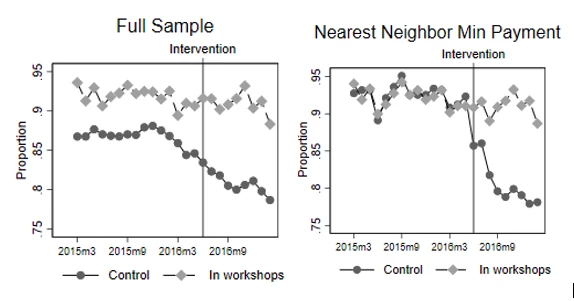
A first example comes from a paper I have forthcoming in the WBER with Gabriel Lara Ibarra and Claudia Ruiz Ortega. This evaluates the impact of financial literacy workshops given to credit card clients of a Mexican bank who are starting to run into difficulties with repayment. Clients were randomized to treatment or control, but take-up of the workshop was very low. Those who took it up were already more likely to be paying more than the minimum payment to begin with than the full control group (the level difference seen in the left panel of Example 1 below), but we cannot reject that both have a common linear trend before the intervention. Nevertheless, we would be nervous about relying on the parallel trends assumption and DiD with this full sample. Using nearest neighbor matching, we instead match the treatment group to a subset of the control group that had similar repayment behavior in terms of both levels and trends for a full 16 months pre-intervention (right panel). This includes a reasonable amount of squiggliness, with both series showing a drop together in mid-2015, then recovery. Assuming these two groups who had tracked each other so closely for 16 months would continue to track each other for a few more months at least had the workshops not happened then seems a lot more plausible than making this assumption for the full sample.
Example 1: Making more than the minimum-payment on their credit card
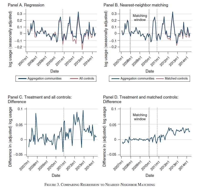
A second example comes from a paper (ungated version) published last year in the AEJ Applied by Tatyana Deryugina, Alexander MacKay and Julian Reif. Their goal is to examine how the price elasticity of demand for electricity evolves over time, using a policy in Illinois that generated shocks to residential electricity prices – treated communities are ones in which a referendum was passed on whether to participate in an aggregation program that affected the price of electricity, and control communities were ones were this was not passed. They note that electricity usage is highly seasonal, and the degree of seasonality varies widely across different communities. Comparing all treated communities to all control communities then might be problematic. They then use nearest neighbor matching, matching each treated community to its nearest five neighbors.
Example 2 (figure 3 in their paper) illustrates the trends. Panel A shows the full sample. Unfortunately, they have already done some form of seasonal adjustment and removed level differences, so we cannot see how similar or dissimilar the communities are on levels. We see that the (adjusted) treatment and full control communities track each other still reasonably well in the pre-treatment (pre-2011/12) period, but panel C shows that in any given month the deviation can be quite large. Panel B shows the matched series (again, unfortunately, not showing the levels). A nice feature is that they use only the 2008 and 2009 data for this matching, so can show that the two series continue to track each other nicely in 2010 and early 2011, with panel D showing an almost zero difference – and then after treatment the two series start to diverge a bit. The series is long, and encompasses some big spikes/shocks (the authors note events like heatwaves can cause spikes).
The treatment effect is pretty small here, so having this exact tracking of treatment and control over so many months is essential for helping to convince us that the post-treatment divergence is a real treatment effect and not just the type of pre-treatment spike seen in panel C.

Join the Conversation