I’ve been struck recently by how little we (or at least I) seem to know about variations in use of health services across the world, and what drives them. Do people in, say, India or Mali use doctors “a lot” or “a little”. Even harder: do they “overuse” or “underuse” doctors? At least we could say whether doctor utilization rates in these countries are low or high compared to the rate for the developing world as a whole. But typically we don’t actually make such comparisons – we don’t have the numbers at our fingertips. Or at least I don’t.
I’m also struck by how strongly people feel about the factors that shape people’s use of services and what the consequences are. There are some who argue that the health problems in the developing world stem from people not getting care, and that people don’t get care because of shortages of doctors and infrastructure. There are others who argue that doctors are in fact quite plentiful – in principle; the problem is that in practice doctors are often absent from their clinic and people don’t get care at the right moment. There are others who argue that doctors are plentiful even in practice and people do get care; the problem is that the quality of the care is shockingly bad. Who’s right?
WHS to the rescue – again
As in a recent post of mine on Let’s Talk Development, I thought the World Health Survey might shed some light on these issues. The WHS was fielded in the early 2000’s in 70 countries – spanning the World Bank’s lower-, middle- and high-income categories. The WHS enumerators asked a randomly-selected adult in each household about his or her use of inpatient care and outpatient care; in the numbers that follow I’ve focused on use in the last 12 months. As I said in the earlier blog post, the WHS does have some drawbacks: it covers some regions fairly fully, other much less fully; it’s 10 years old; and all we can tell is whether inpatient or outpatient care was received, not the number of contacts. But despite these problems, the WHS gets us quite a long way.
A lot of variation – but not necessarily what you’d expect
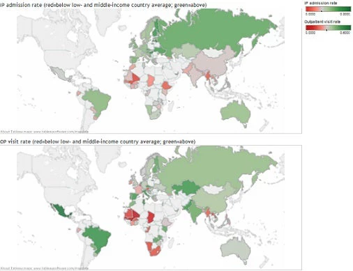
The maps below show the inpatient admission and outpatient visit rate – actually the fraction of people who had at least one admission or visit in the last 12 months. Green countries are above the developing-country average; red countries are below it.
For IP admissions, most of the OECD countries are above the developing-country average (6.98%). Brazil, Namibia and the European and central Asian countries are also above it. African and Asian countries are mostly below or close to the developing-country average.
The picture is different for outpatient visits. Several OECD countries are actually below the developing-country average (27.52%). And for the most part, the countries below the developing-country average are in Africa: many are considerably below it (Mali stands out dramatically); only a few are above it (Kenya and Zambia stand out). By contrast, several countries in Asia are above the developing-country average: India and Pakistan are dramatically above it, but China and Vietnam are also above it; a few Asian countries are below it – Laos and Myanmar are considerably below it, Malaysia and the Philippines less so.
Do variations in doctor numbers and infrastructure explain variations in utilization?
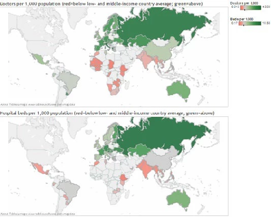
The maps below show data on doctors and hospital beds per 1,000 persons. I got the data from the World Development Indicators, and took the country averages for the first half of the 2000s. As before, green countries are above the developing-country average; red countries are below it. The countries above the developing-country averages are mostly those in the OECD and Europe and central Asia, though in the case of doctors per 1,000 some of them are also in Latin America and the Caribbean. Except for China, most of Asian countries fall below the developing country average.
Correlating the WHS utilization data with the WDI doctor and beds data shows that doctors and beds per 1,000 persons are positively associated with outpatient visit and inpatient admission rates. A lack of doctors and beds looks like it could indeed be part of the explanation for low utilization rates, though of course we haven’t established causality.
But a lack of doctors and hospital beds is only part of the story. Together they “explain” only 60% of the cross-country variation in inpatient admission rates, while doctors “explain” an even smaller 20% of the cross-country variation in outpatient visit rates.
Some countries – India and Pakistan are examples – are below the developing-country average on doctors per 1,000 persons, but above the developing-country average on the outpatient visit rate. Doctors and hospitals in these countries treat far more patients than one would expect given the number of doctors and hospital beds in these countries. In these countries, it doesn’t look like accessibility is the pressing issue; as research by my colleague Jishnu Das confirms, at least in India, poor quality is the bigger problem.
By contrast, much – but not all – of Africa is in the opposite camp: these countries have inpatient admission and outpatient visit rates that are below what would be expected on the basis of their doctor and beds per 1,000 figures. So it’s not just that these countries lack doctors and beds; it’s also that people are not getting the level of contacts you’d expect from the existing staff and infrastructure. Here it looks like absenteeism could well be part of the story; recent research from my colleague Markus Goldstein confirms it – pregnant women whose first clinic visit coincided with a nurse’s attendance were found to be 46 percent more likely to deliver their baby in a hospital.
Two take away messages
Message #1 is that countries differ considerably in their utilization rates. Much of Asia visits doctors more regularly than both the developing world and the entire world; India’s consultation rate is a third higher than the global average. Africa stands out as the continent where outpatient visits and inpatient admissions lag behind the rest of the world.
Message #2 is that these variations are partly explained by differences in doctors and hospital beds per capita, but only partly. The problem goes deeper than hiring more doctors and building more hospitals. Africa has lower outpatient visit rates than its doctors per 1,000 figures would suggest, while the opposite is true of India and Pakistan. In Africa, it looks like the binding constraint may well be absenteeism, while in S Asia it looks like the first-order problem is the poor quality of care that’s actually delivered.


Join the Conversation