While education is one of the cornerstones of development and is enshrined in the Millennium Development Goals, the pay-offs from a Bachelor’s degree or higher do not enjoy the same confidence. In the wake of the global financial crisis, for some, a college degree is a “lousy investment.” (Read the Daily Beast article to know why). But new data prove otherwise. Adam Looney and Michael Greenstone at the Hamilton Project, through chart illustration, show that “the more income you earn, the more likely you are to have gone to college.” To find out more, read the post “College, still worth it” on the Economix blog here. While we are still discussing education, here’s another interesting finding from the OECD “Education at a Glance 2012” report. According to the report, a college education not only makes you wise and wealthy, it also makes you healthy. Curious? Read this Economist article to know how.
Remember the “Occupy Wall Street” movement? The movement marked its first anniversary this week. While the movement might have fizzled, as reported by NTY in the article “A frenzy that fizzled,” but the quotient of “inequality” that started this still remains intact. According to an article from the Atlantic, inequality in US is worse than it was in 1774. Also, the intensifying US presidential race is elevating the debate about wealth redistribution, taxes and perceptions about government handouts. In an interesting blog post, Paul Krugman writes on the “political economy of redistribution.” Read the post here. In this context, in the developing world, relative poverty and inequality are emerging now as new concerns. Read a paper by Martin Ravallion and Shaohua Chen to know more.
Kauhsik Basu, our incoming Chief Economist, explains his motivation for moving on from the Ministry of Finance in India to the World Bank in the Cornell Chronicle, this way: “I have had recent experience of frontline policymaking, in India, which is trial by fire. And I discovered that I do not mind the fire as much as one should.”
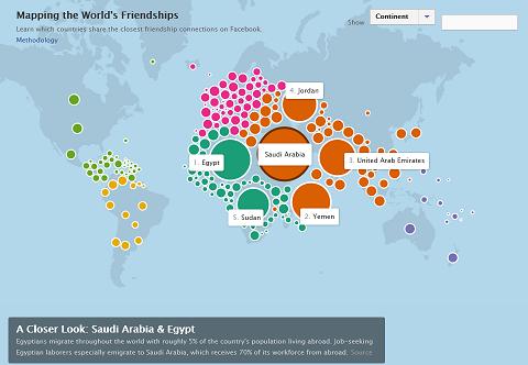
And finally, check out this interesting infographic from Facebook, “Mapping the world’s friendship.” The inforgraphic looks beyond individuals and lists connections between countries, with interesting facts from their history, migration, politics and economy. Explore this interactive infographic, and share with your friends, if you ‘Like’ it.


Join the Conversation