 Photo: Trinn Suwannapha / World Bank
December 12 each year is Universal Health Coverage (UHC) Day. The tradition dates back to 2012 when the United Nations General Assembly unanimously endorsed a resolution urging countries to accelerate progress toward universal health coverage – the idea that everyone should get the health services they need, and that families who get needed services should not suffer undue financial hardship in the process.
The theme of this year’s UHC Day is “Keep the Promise”. Which prompts the question: How well are countries doing in their efforts to achieve UHC? A paper by Sven Neelsen and me published in Lancet Global Health (LGH) today tries to answer exactly this question.
Tracking progress towards UHC
Except for two earlier studies, previous work asking this question has looked separately at the two dimensions of UHC: people getting the services they need (“service coverage”) and families not suffering undue financial hardship (“financial protection”). Our paper builds on the two earlier studies that bring the two dimensions together using an index that trades off achievement on one UHC dimension against achievement on the other. It extends the approach from 19 developing countries to 111 countries spanning all World Bank income groups.
Service coverage is measured by an index that captures both prevention and treatment, with prevention captured by antenatal visits, childhood immunization, and screening for breast and cervical cancer, while treatment is captured by skilled birth attendance, treatment for childhood acute respiratory infection and diarrhea, and inpatient admissions. Where the data permit it, the index is adjusted to take into account the inequality in these indicators between poor and less poor households. The paper explains why these indicators and not others were chosen.
Financial protection is captured by the incidence of catastrophic out-of-pocket health expenditures – expenditures exceeding 10% of a household’s total consumption or income. This is SDG indicator 3.8.2. The UHC index is an unweighted geometric average of the service coverage index (which ranges from 0 to 100) and 100 minus the incidence of catastrophic expenses. Most of the data come from the World Bank’s Health Equity and Financial Protection Indicators (HEFPI) database, with some supplementation from other sources (especially in high-income countries); a few datapoints are imputed.
The paper reports three types of analysis: a snapshot showing how well countries are doing using their latest available data; a trend analysis for a subset of countries with enough datapoints over time; and a regression analysis showing how macroeconomic and health system variables correlate with the indicators making up a country’s UHC index. This blog post focuses just on the first of these analyses.
How far have countries got toward the UHC goal?
Fig. 1 plots the two dimensions of UHC against one another, and also shows UHC “contours” – combinations of service coverage and catastrophic expenditure incidence that make for the same value of the UHC index (the index ranges from 0 to 100). Three points stand out.
Fig 1: UHC index
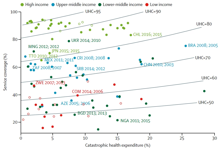
Source: Adam Wagstaff and Sven Neelsen, “A comprehensive assessment of universal health coverage in 111 countries: a retrospective observational study”, Lancet Global Health, Published online December 11, 2019 https://doi.org/10.1016/S2214-109X(19)30463-2. Notes: Data are based on the most recent one or two surveys from each country. The first date after each country code indicates the median year that the financial protection data refer to, and the second date indicates the median year that the service coverage data refer to. Incidence of catastrophic health is expenditure is shown at the 10% threshold. Contours show the combinations of service coverage and catastrophic expenses that produce the same value of UHC index. Unfilled datapoints are low-income and high-income countries for which missing data were replaced by median values for that income group for one or more indicators (cancer screening in low-income countries and skilled birth attendance in high-income countries). AZE=Azerbaijan. BGD=Bangladesh. BRA=Brazil. CHL=Chile. CHN=China. COM=Comoros. CRI=Costa Rica. JPN=Japan. MEX=Mexico. MNG=Mongolia. NGA=Nigeria. SRB=Serbia. THA=Thailand. TTO=Trinidad and Tobago. UHC=universal health coverage. UKR=Ukraine. ZAF=South Africa. ZWE=Zimbabwe.
First, achievement on one dimension varies across countries with a similar level of achievement on the other. Some countries (those at the bottom left) have achieved a low incidence of catastrophic expenses but at the expense of a low level of service coverage (mostly low-income countries) whereas others (those at the top left; mostly high-income countries) have achieved a low incidence of catastrophic expenses despite achieving a high rate of service coverage. Likewise, countries with a similar level of service coverage often have different levels of catastrophic expenditures – compare, for example, China, Mexico and South Africa. Fig 1 brings home the point that both dimensions of UHC need to be assessed simultaneously.
Second, countries vary in their mix of service coverage and financial protection for a given level of UHC. For example, Brazil and Serbia, both upper-middle-income countries, have the same UHC index value (75). Brazil’s service coverage score far exceeds Serbia’s (61%), but this is counterbalanced in the UHC index by Brazil’s substantially higher incidence of catastrophic expenditure (26% vs 8%).
Third, a country’s UHC index score tends to be higher the higher the country’s income group: the high-income countries tend to cluster at the top left of figure 1, while the low-income countries tend to cluster at the bottom left. Unsurprisingly, low-income countries have further to go before they achieve UHC than high-income countries. However, there are variations within income groups. Some high-income countries are faring less well than others: Chile, Japan, and Trinidad and Tobago stand out as weaker performers; in the case of Chile, the high rate of catastrophic health expenditure is largely to blame, whereas the poorer performance in Japan and Trinidad and Tobago reflects low inpatient admission rates and low cancer screening rates. Among the middle-income countries, there are also weaker and stronger performers, with countries like Azerbaijan achieving a lower UHC score than even some low-income countries, and countries like Costa Rica and Mexico achieving UHC scores on a par with some high-income countries. Likewise, we see variation within the low-income group, with some countries (eg, Comoros and Zimbabwe) achieving higher UHC scores than several lower-middle-income countries and others (eg, Bangladesh and Nigeria) faring much worse.

Join the Conversation