The time has come to bid a fond farewell to the open data website that has served us well for almost six years. Next week we will launch the most significant upgrade to the World Bank’s
Open Data website since its initial debut in 2010. We first announced this upgrade when we
launched the site as a public beta a few months ago. In keeping with the Bank’s new look for all websites, the open data website now features a clean blue look-and-feel in lieu of the previous dark red theme.
Check out the new open data website here .
The new site retains the characteristics that users have said they most appreciate; for instance, open access to over 1,400 development indicators that can be viewed in tables, charts, maps, or downloaded in one of several open formats. Indicators and metadata are available in English, Spanish, French, Arabic, and Chinese, and most country profiles are available in their native languages.
Beyond that, the new site is a major improvement in just about every way. Here are some of the big things to look for:
Of course, you can still access a complete list of indicators or countries; just look for the links just below the search box.
 The data site is now fully optimized for browsing on smartphones and tablets. So you can explore data no matter where you are.
For veteran users: nearly all the features of the existing site are available in the new site in some fashion. However, if you want to use the older system, you can still access it here for a limited time.
For widget users: if you used the “embed” feature to add a chart or map to your site, you will need to update the embed code. Simply return to the original indicator page, and click the “Share” button in the chart to access the latest embed code.
Please let us know what you think of the new website by posting a comment below or contacting our help desk.
Check out the new open data website here .
Check out the new open data website here .
The new site retains the characteristics that users have said they most appreciate; for instance, open access to over 1,400 development indicators that can be viewed in tables, charts, maps, or downloaded in one of several open formats. Indicators and metadata are available in English, Spanish, French, Arabic, and Chinese, and most country profiles are available in their native languages.
Beyond that, the new site is a major improvement in just about every way. Here are some of the big things to look for:
Search-based navigation
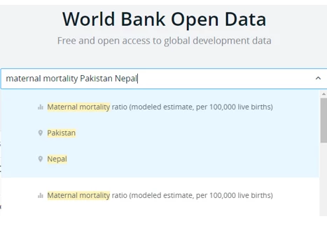
The new home page has a large search box similar to those in major search engines. The fastest way to find what you’re looking for is to type it into the search box. The site will give you a list of matching topics, indicators, countries, regions and combinations of these. Type “population” to quickly find the world population estimate, or “maternal mortality Pakistan Nepal” to display a few select countries. You can also use the search box to find datasets in the open data catalog.
Of course, you can still access a complete list of indicators or countries; just look for the links just below the search box.
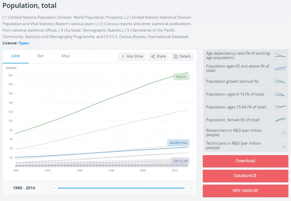
Graphs and maps get a major upgrade
Much-improved chart tools let you see much more data at once. Line charts let you visualize over 50 years of data in any combination of countries and regions, while bar charts and maps provide snapshots of a single point in time. Easily add countries or regions by adding them to the search box, or use the innovative “Also Show” feature to view data in several different contexts. Related indicators are listed in the right sidebar for easy browsing. And if you want more powerful data manipulation, the Databank tool is always available to the right of the chart.
More metadata
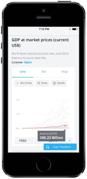
Need to know the exact definition of an indicator, where it came from, or how it was produced? Click the “Details” button on any chart. The new website provides in-depth information on the indicator’s origin, methodology, and other technical details.Mobile-friendly
The data site is now fully optimized for browsing on smartphones and tablets. So you can explore data no matter where you are.
For veteran users: nearly all the features of the existing site are available in the new site in some fashion. However, if you want to use the older system, you can still access it here for a limited time.
For widget users: if you used the “embed” feature to add a chart or map to your site, you will need to update the embed code. Simply return to the original indicator page, and click the “Share” button in the chart to access the latest embed code.
Please let us know what you think of the new website by posting a comment below or contacting our help desk.
Check out the new open data website here .


Join the Conversation