What comes to mind when we think of trade? Quite possibly, exports, imports and trade balance. Is there a quick way to get this information without having to look at tables? Most of us would like to see how much a country imports and exports, which are the major trade partners, and what is the trade balance. We have introduced a d3.js based interactive Chord diagram to quickly visualize this information.
For example, here is a visual of Australia’s Exports and Imports for 2015. The chart shows top countries to which Australia exported or imported that year, and the remaining are bundled as “others”. Here is how you can interpret the diagram.
Each country has a different color. The length of the arc for Australia represents Australia’s total imports and the other parts of the arc show Australia’s exports to various countries. We can see the Import arc is slightly bigger than the Export arc and hence Australia has an overall negative trade balance.
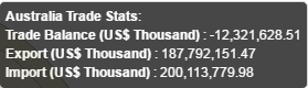
You can quickly verify this by holding the cursor over Australia to show the actual numbers.
Now let’s focus on an individual country. Let’s say Japan:

The size of the arc on the Australia side shows the imports of Australia from Japan and the size of the arc on Japan’s side shows Australia’s export to Japan. From this we can tell that Australia exports more to Japan than vice versa, and hence that it has a positive trade balance with Japan.
Another quick way to find out this information is by looking at the color of the band. The band takes the color of the country which imports more. So to depict the Australia-Japan trade relationship, the band is the same color as Japan showing that Japan imports more from Australia. If you check the United States or Thailand, the bands have the color of Australia indicating that Australia imports more from these countries than it exports, and therefore has a negative trade balance with these partners.
You can mouse over individual countries in the arc and see their data (total exports and imports and balance) or hold the cursor over a band to get the intra-country trade details.
Go ahead and explore the chart for your country.

Join the Conversation