For over a year now, we have been inundated by information on the pandemic’s health emergency, where the evolution of COVID-19 mortality has been of central interest. We have all witnessed the steady climb of the global mortality toll to the staggering level of 2.6 million people as of writing this blog. We have also witnessed the dramatic shifts from one epicenter to the next.
The chilling data have been accompanied by two typical reactions. The first is one of disbelief and the thought that the severity of COVID-19 is overstated (‘it’s just a bad flu”) – an argument that was particularly prominent in the initial stages of the pandemic but continues to persist and resonate with some. The second reaction is one of desensitization, which we think is more common as we all have grown more accustomed to the daily onslaught of mortality statistics.
Against this backdrop, we are launching on the World Bank’s data platform a new indicator of ‘relative severity’ to remind us in an intuitive fashion of the continued severity of this pandemic. Intuitive, because the indicator compares COVID-19 with the top causes of death that people are familiar with and can relate to. That helps convey the severity more clearly than through traditional mortality rates normalized by 100,000s of people. The new indicator can be found on our COVID-19 dashboard, with additional information and trackers available here.
What is relative severity?
The ‘relative severity ratio’ compares COVID-19 mortality to the pre-pandemic mortality profile of individual countries. This involves two comparisons. The first comparison is made through the severity ratio itself, which compares COVID-19 mortality with all-cause mortality in 2019. The second one is the comparison of the severity ratio with cause-specific proportionate mortality rates (the share of deaths due to a specific cause in total deaths).
These comparisons are useful as the expression of mortality in relative terms speaks to the fact that countries may have adapted to their specific patterns of mortality. Deviations from this pattern may create pressure points, such as, for example, on the health system. Comparisons with previous patterns give a country-specific flavor of the severity of the COVID-19 pandemic, which could be used to corroborate realities on the ground.
Comparisons with top causes of death are with reference to the 133 disease families of the 2019 Global Burden of Disease study (at the third level of ICD-10). We select the top nth cause of death, which most closely approximates the peak COVID-19 severity ratio from below. More details on the concept of relative severity are in the paper of Schellekens and Sourrouille (2020) that developed the concept, which can found here.
Global relative severity
Figure 1 illustrates what these comparisons mean at the global level. Consider first the blue line on the chart. The most recent observations show that over the last 7 days, COVID-19 claimed about 6% of the yearly death toll of 2019. This is the first comparison: a comparison of severity relative to all-cause mortality prior to the pandemic.
The second comparison is with the top causes of death at the global level during 2019. The top causes most relevant to this chart are the second and third causes of death—stroke and chronic obstructive pulmonary disease—representing 12% and 6% of 2019 deaths, respectively.
Figure 1. Global Snapshot
The chart shows that, for the world as a whole, weekly relative severity due to COVID-19 has remained until mid-November anchored to a level below the global third cause of death (chronic obstructive pulmonary disease). COVID-19 mortality saw a spike after that but never exceeded the second cause of death (stroke).
Relative severity by region
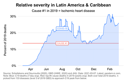
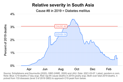
We can make similar comparisons at different levels of aggregation. We can compare by region, where we note stark contrasts between East Asia & the Pacific versus Latin America & the Caribbean (Figure 2). Note the different scales on the Y axis, where the interactive tool offers the functionality to compare up to four entities with a constant axis.
Figure 2. Relative Severity by Region
 |
 |
 |
 |
 |
 |
Relative severity by income group
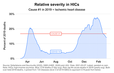
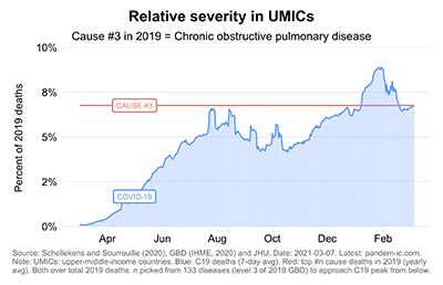
We can also make comparisons across the World Bank income classification, where we note the huge differences across income levels (Figure 3). The income classification provides a very useful prism to look at pandemic inequalities because it proxies for structural characteristics that in turn correlate with pandemic outcomes in terms of infection prevalence and infection fatality (for further analysis on the pandemic by income classification, see here).
Figure 3. Relative Severity by Income Classification
Relative severity by country
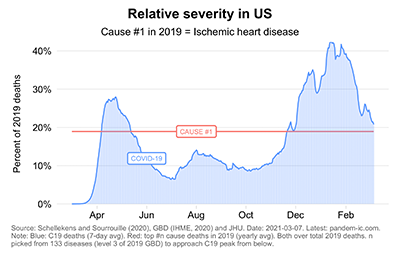
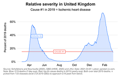
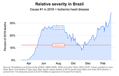
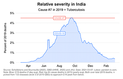
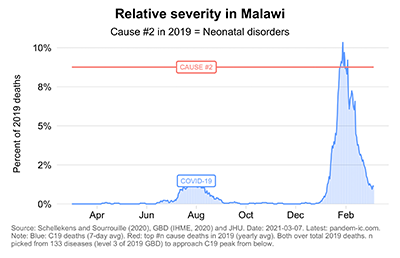
We can make these comparisons as well at the country level (Figure 4), where we provide the example of selected high-income countries (the United States and the United Kingdom), upper-middle Income countries (Brazil and South Africa), lower-middle income countries (India and Tunisia) and low-income countries (Afghanistan and Malawi). Once again, note in each of these comparisons the different scales on the Y-axis.
Figure 4. Relative Severity in Selected Countries
Finally, it should be noted that the indicator relies on reported mortality data. As such, the reported severity levels are likely to represent a lower bound due to data quality issues related to factors that include testing. Corrections based on excess deaths could, however, be easily introduced.
Relative severity offers a complementary lens to examining the progression of the pandemic across countries and over time. The COVID-19 dashboard on relative severity offers the functionality to calculate the indicator and corresponding top causes of death for any country, income group, or region.









Join the Conversation