You’ll find a large amount of data available through the World Bank’s Open Data Initiative: for time-series alone, there are some 8,000 indicators for around 200 countries. And we’re often asked: “what indicators do you have on topic X, and which should I use?” One way to find your way around is to start at our topical pages. Or, if you have some familiarity with our databases already, look at our full repository of time series data.
But we’ve also been working with some of the Bank’s sectoral and regional specialists to provide specialized dashboards and tools, to investigate and compare indicators, and reveal the stories behind the numbers. You’ll find creative visualizations and easy access to the underlying data, to help you get a better understanding of a range of development topics.
We’ve done six topics so far: poverty, gender, jobs, health, financial inclusion, and the policy and institutional framework in African countries. And we plan to do more, but we’d like your feedback – what topics would you like to see? Here’s a quick guide to these new resources.
Poverty & Equity data
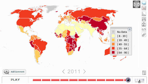
Country and regional dashboards help assess the extent of poverty and inequality. Users can see trends in poverty using both national and international poverty lines, and examine trends in inequality using income distributions and the Gini coefficient.
| Inequality in the World (GINI coefficient 1981-2011) |
 |
Gender Equality Data and Statistics
This is a one-stop shop for a wide range of gender-related and gender-disaggregated data. Country-level data are organized by six themes: economic structures and access to resources; education; health and related services; public life and decision-making; and human rights of women and young girls.
| Labor participation rate, female (% of female population ages 15+) |
 |
Health, Nutrition and Population Data and Statistics
HealthStats is the World Bank’s comprehensive database of Health, Nutrition and Population statistics. It provides access to more than 250 indicators for over 200 countries, covering topics such as health financing, systems, and facilities; immunization rates, prevalence of HIV/AIDs, malaria and tuberculosis; nutrition, reproductive health, population estimates and projections, cause of death, statistics on non-communicable diseases, and access to clean water and improved sanitation.
Tools include animated data visualizations demonstrating trends over decades – including population pyramids (and a new database) for every country in the world from 1960 to 2050.

Jobs data
Data dashboards use World Bank Open Data to visualize trends and relationships between indicators, such as GDP per capita and the percent of employed that are self-employed, ease of doing business scores and level of governance, new firms created per working age adults, and many other.
It focuses on:

Financial Inclusion data
Dashboards illustrate a new dataset, the Global Financial Inclusion (Global Findex) Database, collected through a project funded by the Bill & Melinda Gates Foundation. The database measures how people in 148 countries - including the poor, women, and rural residents - save, borrow, make payments and manage risk. Data are disaggregated by individual characteristics, region and country, and are organized around five themes:
Country Policy and Institutional Assessment (CPIA) for Sub-Saharan Africa
The CPIA is a diagnostic tool, developed by the World Bank, that is intended to capture the quality of a country’s policies and institutional arrangements—i.e., its focus is on the key elements that are within the country’s control, rather than on outcomes (such as growth rates) that are influenced by elements outside the country’s control. The CPIA assesses the quality of policies and institutions of the Bank’s borrowing countries – this website illustrates CPIA data from 38 countries in Sub-Saharan Africa, in four areas:
- Economic management;
- Structural policies;
- Policies for social inclusion and equity;
- Public sector management and institutions
It features the full rating criteria, cross-country comparisons and access to the raw data that underlies the assessment.
| The average CPIA score for fragile countries in SSA is much lower than that for non-fragile countries, 2.7 and 3.5 in 2011, respectively. Resource-rich countries tend to lag the non-resource-rich countries. |
 |
These are just a few of the resources that we’ve built using Open Data. Try our DataFinder mobile apps for iOS, Andriod and Blackberry, including the full World Development Indicators database, HealthStats, Poverty, and Jobs. And tell us what you think – we would love to hear from you.

Join the Conversation