These are questions we’ve been seeking to answer at the World Bank Group. And we’ve developed a new visualization tool, accessible through our World Integrated Trade Solution database, which allows the public to explore the quantifiable reality of GVCs.
To give you an example of how it works, let’s look at the automotive sector—a very prominent and commonly discussed GVC.
Sturgeon and Memedovic developed a methodology to break down the automotive production chain into final goods—those purchased by the consumer—and intermediate goods—those purchased by other manufacturers as inputs to be used in their own production. They identify three main GVC ‘nodes’: Automotive components (made by suppliers); engines, transmissions, and body assemblies (made by automakers); and finished motor vehicles. Table 1 shows the main exporting country within each of these nodes and its relative market share within that node.

Table 2 goes one step further. By digging into the trade data, we can identify the most important products for each GVC node, in terms of their relative weight on world trade. This also helps us, in part, to identify which products or activities along the production chain are most significant or add the most value.

Perhaps not surprisingly, the most exchanged automotive input ‘made by suppliers’ in 2014 falls under the classification HS870899—‘parts and accessories.’ Now, to better understand exactly how these parts and accessories move along the GVC, we can use our Global Trade Network tool on WITS to map all of the bilateral trade flows for HS870899. [1]

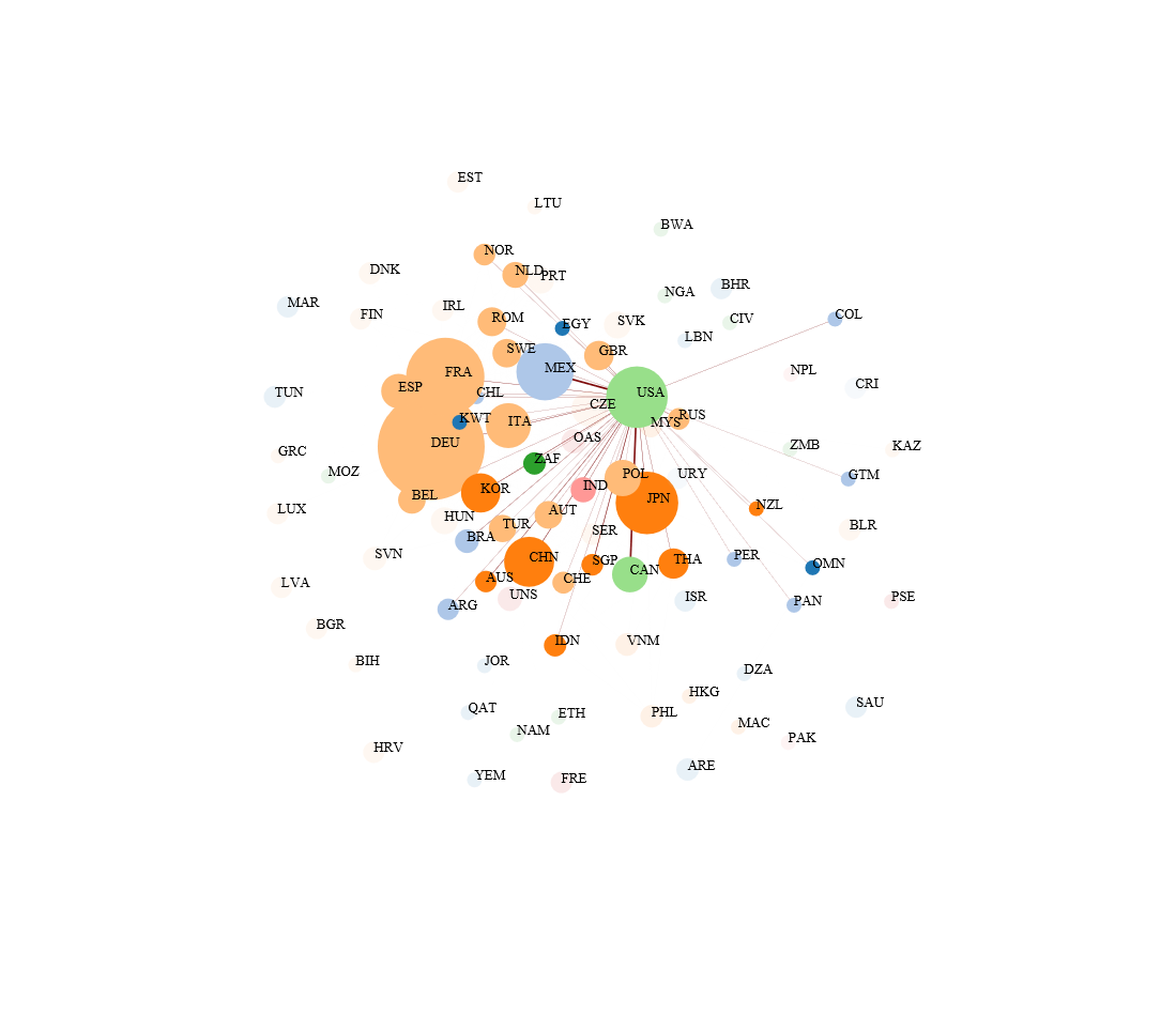
What you can clearly see is that this is a massive, truly global, network. Figure 1 shows us the ‘Seller’ perspective, meaning the size of each country’s node is proportional to its ‘Weighted OutDegree’, or export market share. The position in the network is determined by the number of bilateral trade flows from that country, and the strength of each flow is based on the value exchanged. So, here, Germany (DEU) has the most bilateral trade flows and the greatest strength of those flows, making it the largest central node. A full explanation of the methodology behind the algorithm can be found here.
Mapping this network shows that the market is relatively clustered around a few big suppliers: Germany 16.7% of world exports, France 11%, Japan 8%, United States 7.9% and Mexico 7%. We can also get a feel for how goods move within a region. Not surprisingly, European and Central Asian countries (depicted in the ochre color) are clustered together, showing a higher degree of intra-regional trade flows.
Figure 2 reports the same set of bilateral flows for the same product, but focuses on the role of each country as a ‘Buyer.’ In this case, the size of each node is proportional to the country’s ‘Weighted InDegree’, or import market share. Based on its relative size and position on the map, the United States is the main destination market for HS870899, alone absorbing 16.7% of world trade in 2014.[2]

In either Seller or Buyer perspective you can choose to hide links or node labels by selecting the “show edge” and “show label” [3 options from the menu below.

Moreover, a double click on any node will filter the network showing only the links for the selected country. Figure 3
reports the same network as in Figure 1 but shows only the flows from the United States. The thickness of a line reflects, as before, the individual flow’s share of global trade for the selected product.
Figure 3: Global Trade Network visualization for HS870899 - Supplier perspective, 2014 (USA connections)

You can select a specific country by double clicking on the node or using the search option of the main menu, which pulls up a summary table. Figure 4 shows the summary table for the United States from the network visualization above.

Here, you can easily find the Weighted OutDegree and Weighted InDegree, which tells you the respective market share of trade flows. And under “Export relation”, you can find a list of all destination markets with each percentage expressing the share of the flow of world trade.
Take a look at the Global Trade Network tool on WITS and create your own network map, by product and by country. And let us know what you think!
---
[1] Note that to improve the readability of the graph we display 95 percent of world trade dropping the bottom 5 percent of trade flows. The Network visualization tool allows the user to alter this threshold, however increasing the percentage of trade displayed higher values may slow down the force algorithm used to optimize the graph.
[2] Network visualizations for the other products can be found here: HS840820 (Seller and Buyer) and HS870323 (Seller and Buyer).
[3] Note that labels can be displayed as compact ISO3 code or full country name using the drop-down menu close to “Show Label” tab.


Join the Conversation