What would happen if we removed all signs from a public transport system? Daily commuters would probably be able to cope, but tourists or visitors would be totally lost, as well as anyone trying try to reach a new destination for the first time.
Online journey planners could help, but in a large city, with massive flows of people and various transport modes, a system only based on these would become impossible to manage.
And even though many transport networks do feature at least basic signage, it is often deficient or not accessible to everyone. That is why systems around the world are continuously working on the improvement and the simplification of their signage.
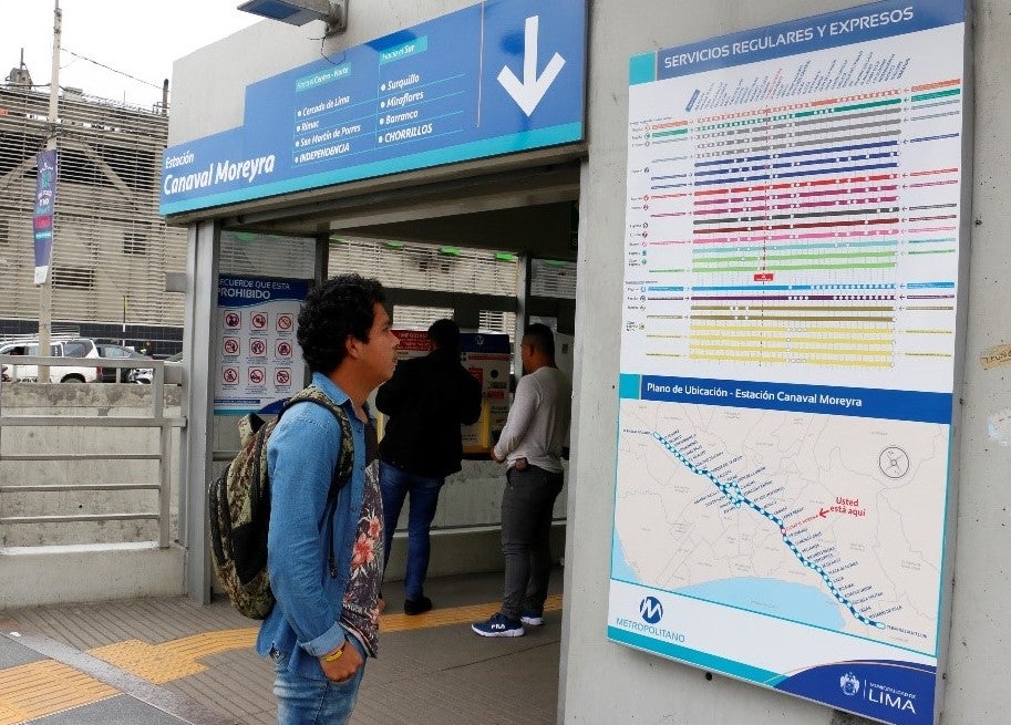
One example is the Metropolitano, the Bus Rapid Transport (BRT) of Lima. Poul Knudsen, commercial manager of ProTransporte, which operates the Metropolitano BRT, told us about his experience implementing a new signage across the system.
To improve passenger experience, the operator set out to fix old or dilapidated signage while progressively introducing a new visual identity across the system. The rollout started in the system’s busiest stations and in those that were being upgraded. It looks like riders have welcomed these changes. In user surveys conducted by ProTransporte, most respondents indicated that the new signage is more user-friendly, easier to understand and allows them to plan their journeys more easily.
But what exactly does it take to design good signage and make sure all passengers can find their way, especially those with reduced mobility? Any system should meet the following five key criteria:
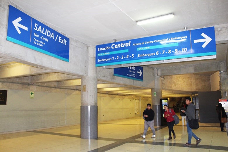
- Signs are useful only if they are visible. Even in dense, crowded environments, users should be able to identify them immediately. To make this happen, the best option is usually to cluster signposts and separate them from any other elements that may interfere with them, especially advertising. Likewise, voice announcements must be identifiable between all sounds and tactile signage between all tactile elements. When designing and positioning signs, the key reference point is always the moving passenger. You first need to determine which users you want to target with each sign (e.g. Are you trying to guide users coming from the street and making their way to a specific boarding area? Or are you targeting passengers who just got off a public transport vehicle and need to find the right exit?). Once your target group has been identified, you must then figure out in what direction they will be moving. Your sign should be perpendicular to the target flow and hanging overhead, so that it is clearly visible to anyone who may need it. Commercial communications, on the other hand, should be parallel to the passenger flow, and positioned lower than directional signage.
- Once you know where your signs should be located, you have to make sure they are legible. As part of this, lighting should be sufficient but not excessively bright, your signs and font should be large enough, and you should choose a color combination that provides a sharp contrast between the lettering and the background: typically, this means light letters (white or yellow) against a dark background (black or navy blue), or the other way around. Likewise, acoustic announcements need to be clearly audible and the tactile indicators of appropriate size.
- The third requirement is rather obvious, but is one of the hardest to comply with: the signage must be understandable to all. To achieve this, the message on each sign should be:
- Short, yet comprehensive. The main destinations should stand out prominently, but the secondary ones must be present, too.
- Clear: the signs should provide straightforward and prescriptive directions, without being overly technical.
- Basic so it can be quickly understood by everyone, including people who can’t read or don’t understand the local language. This will help prevent the formation of crowds near every panel or other guiding element.
In some cases, time indications and location maps can serve as a useful complement to traditional signage, especially if they are interactive and accessible. In addition, standardization is essential to ensuring consistency throughout the system and facilitating comprehension. That involves, for instance, resorting to pictograms or international color codes (e.g. green to show exits, red to communicate about hazards or restrictions).
- Naturally, signs must be consistent and relevant to the surrounding environment, the architectonic elements, and to the needs of users—keeping in mind that those needs may change as people work their way through the system. At entrances and exits, stairs and elevators, decision and intersection points, specific signage pattern will be expected. This consistence with the environment also implies the use of harmonized signs among the different communication media (maps, leaflets, websites…).
- The fifth and last requirement is the continuity through space and time. There should be a logical succession of signs throughout the station to direct passengers as easily and intuitively as possible. Redundant or repetitive directions can actually be helpful, especially in case users lose their way or make a mistake. In that regard, sequencing is key: What kind of information is most important to passengers when they approach a public transit stop? When they walk through a station? When they reach the boarding or disembarking area? In the example of Lima, the signs at the entrance of BRT stops used to list all the lines calling the station—think “line A, line B, express service 1,” etc.—but gave no indication of the destinations they served, making it impossible for new users to determine whether the BRT could even take them where they needed to go. By contrast, the new signage clearly indicates the main areas accessible from each station and guides users from the entrance of the BRT all the way to the platform they need with logical, step-by-step directions. Continuity is also temporal, in that signage needs to be maintained appropriately and evolve with the local environment in case of temporary or permanent changes (construction activity, new buildings, infrastructure upgrades, etc.).
Signage is a crucial component of public transport: it is essential to wayfinding, of course, but also contributes to giving transport systems around the world their own unique identity.
We’d love to hear from you, so don’t hesitate to tell us about the signage in your city using the comments section below…


Join the Conversation