The ‘nose count’ in poverty is one such measure which has little but its simplicity to recommend it.
Harold W. Watts, in “An Economic Definition of Poverty” (1969).
But the fact remains that [the Theil index] is an arbitrary formula, and the average of the logarithms of the reciprocals of income shares weighted by income is not a measure that is exactly overflowing with intuitive sense.
Amartya Sen in “Sen & Foster” (1973)
Giants in the field of measuring welfare, poverty, and inequality have been criticizing the most used measures for more than half a century but here we are, in 2023, still using average household income (or per capita GDP) and the poverty headcount to track progress in human wellbeing around the world. A simple keyword search for leading poverty and welfare measures reveals that the poverty headcount gets mentioned orders of magnitude more frequently than the squared poverty gap or the Watts Index (see Table 1.1 here). Things look even worse for the Sen index compared to mean income: these giants might have complained, but the world did not listen….
You might ask: “What’s the problem?” Well, each of these groups of measures has a big problem. The first group, including average income and the poverty headcount, are easy to understand, interpret, and communicate but they are not distribution sensitive: they are silent on the extent of inequality among all individuals (in the case of average income) and inequality among the poor (in the case of the headcount). The second group, containing measures that are more sensitive to changes that take place towards the bottom of the income distribution, suffers from exactly the opposite problem: they are not only difficult to explain in simple terms, but they also often have non-intuitive units. For example, the squared poverty gap is measured in squared percent deviations from the poverty line, while the Watts poverty index is measured in log-point differences from the poverty line that cannot easily be interpreted as percent differences unless they are small. What would be nice is a welfare index that is both easy to interpret and has desirable properties, such as distribution sensitivity and subgroup decomposability.
A new paper by Kraay ⓡ al. (2023) proposes to address this problem by introducing a new distribution sensitive welfare index with a simple mathematical formulation and intuitive units.
The proposed welfare index is simply “the average factor by which individual incomes need to be multiplied to reach the reference level of income.”
The proposed measure is the average across all individuals of , where
is the income of individual
and
is a reference income level. As an average, its formulation is simple to describe. Moreover, the average has very intuitive units. Each term in the average is the factor by which the income of the corresponding individual needs to be multiplied to attain the reference level of income, and the index simply is the average factor by which individual incomes need to be multiplied to reach the reference level of income.
For example, if we were to use $6.85 per person per day, corresponding to the World Bank’s poverty line for upper-middle income countries, as the reference income level , the value of the proposed index,
, would be 2.95 in 1990, meaning that individual incomes would have to increase nearly three-fold on average to reach the level of $6.85 per day. By 2019 the value of the index had fallen to 1.36, meaning that incomes would, on average, need to be multiplied by a factor of around 1.4 to reach the same standard.
What if I want to measure poverty, focusing only on those below my chosen poverty line?
The new index is inclusive in the sense that it is affected by the incomes of all individuals – a typical feature of welfare indices. By contrast, poverty indices conventionally focus exclusively on individuals who earn less than the reference income, i.e., the poverty line. Our proposed index can be modified if one desires to measure poverty more “conventionally.” We do this by censoring the incomes above the poverty line, , to be equal to
. Censoring incomes above
, instead of dropping them, ensures that the measure does not experience a discontinuity when an individual crosses the poverty threshold. The interpretation of the censored versions remains as simple as
: the average factor by which incomes need to be multiplied (or the average growth rate needed) to attain the standard of living defined by the threshold (with the small qualification that no increase is needed for those above the threshold). Please see Section 2.2 in the paper for details.
OK, so the new index is perhaps intuitive enough and might catch on. But does it have desirable properties? We highlight three features of the proposed index that are attractive:
Whose growth rates do we (implicitly) care about when we use different measures?
First, the new index satisfies all three main definitions of distribution sensitivity discussed in the literature:
- A measure is Pigou-Dalton sensitive if it improves when a progressive transfer is carried out between two individuals.
- A Pigou-Dalton sensitive measure is transfer sensitive if it gives more weight to equal-sized transfers taking place lower in the distribution.
- A Pigou-Dalton sensitive measure is growth sensitive if one percentage point of growth in income of a poorer person improves the welfare measure by a greater percentage amount than the same percentage point of growth for a richer person (Ray ⓡ and Genicot, 2023; Dollar, Kleineberg and Kraay, 2015).
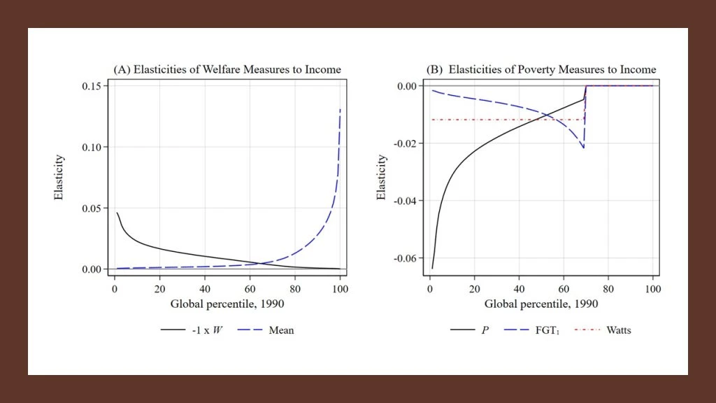
The distribution sensitivity of the proposed new index is perhaps best illustrated by comparing the income elasticities of various measures with the new indices. Panel A in the Figure below plots the elasticities of the new index, , and mean income,
, using the global income distribution circa 1990. The elasticity measures the percent change in the index due to a percent change in income at each point along the income distribution. Most people don’t realize that mean income weights growth of the rich more than growth of the poor until they see a plot like this. Why? Simply because a 1 percent change in a high income is a larger absolute change than a 1 percent change in a low income. In contrast, the proposed new index,
, has an income elasticity that is downward sloping and particularly steep at the very bottom of the distribution. Panel B shows income elasticities, this time for poverty measures: it’s eye-opening to see that the elasticity for the poverty gap, just like mean income, values growth more among the better off below the poverty line. The Watts index has a constant elasticity of income below
. Again, the new proposed censored measure,
, values growth among the poorest much more than those just below the poverty line.
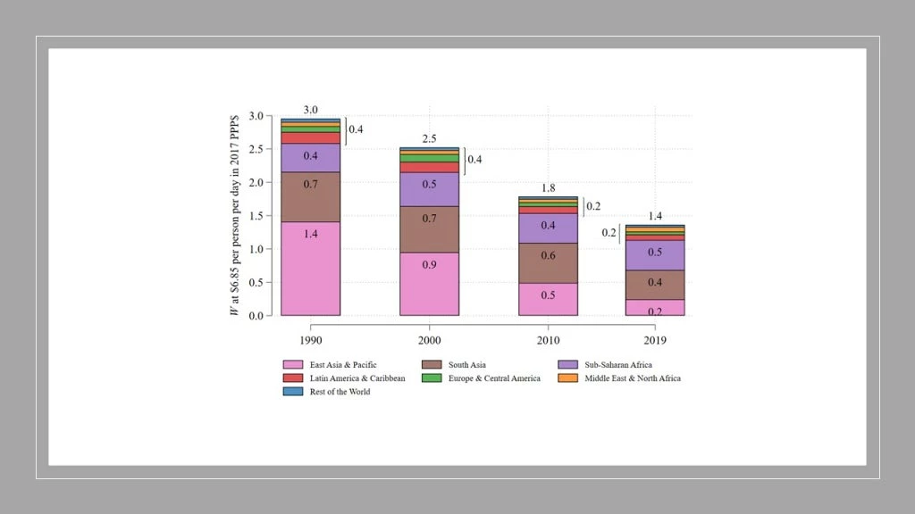
Second, the proposed new index is subgroup decomposable using population weights
This is an attractive property because we want to be able to describe the values of this index for different regions of the world and then be able to aggregate it in a simple manner to discuss its value for the whole world. For example, the figure below shows regional contributions to the global index over time. We can see that while the index improved substantially over time, the progress is unequal geographically: In contrast with East Asia & Pacific, the absolute contribution of Sub-Saharan Africa to the global prosperity gap has not declined since 1990, with its share increasing from less than 15% to more than 31%.
Third, we propose an associated inequality measure, I, which has a simple interpretation with intuitive units
is the average factor by which incomes must be multiplied to attain mean income
. It is closely related to the new index:
. As such, changes in the index,
, can be decomposed into changes in mean income,
, and changes in inequality,
. Specifically, the growth rate of
is the growth rate of our inequality measure,
, minus the growth rate of mean income,
.
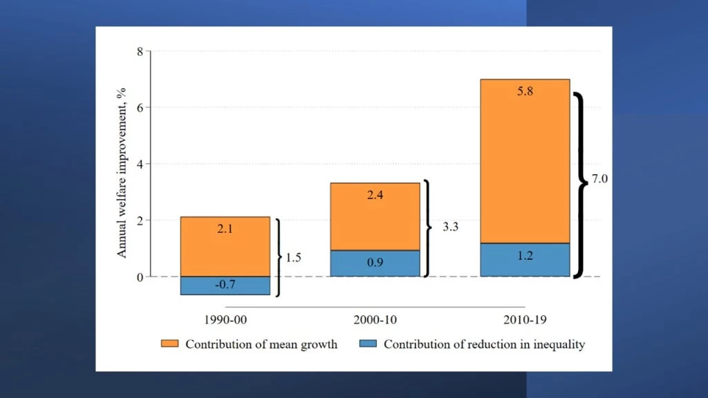
The graph below provides a useful example: like most of the rest of the world, Malaysia had slow growth in the 1990s. However, it also had increasing inequality, as a result of which improved little. However, Malaysia not only turned the inequality trend around during the next decade, but also experienced high growth accompanied by modest declines in inequality during the following one – between 2010 and 2019. The contribution of changes in inequality to improvements in
went from negative during the ‘90s to a share of more than a fifth of the gains over the next two decades:
Decomposing growth in W into growth in the mean and inequality.
The inequality measure, , is also decomposable into within- and between-group inequality. The graph below shows the evolution of global inequality over time since 1990, decomposing
into inequality within and between countries. Consistent with the evidence for the decomposition of global inequality using the generalized entropy index with
in Mahler ⓡ al. (2022), the figure indicates that most of the decline in global inequality, using the new proposed measure, between 1990 and 2019 is due to a narrowing of gaps between countries.
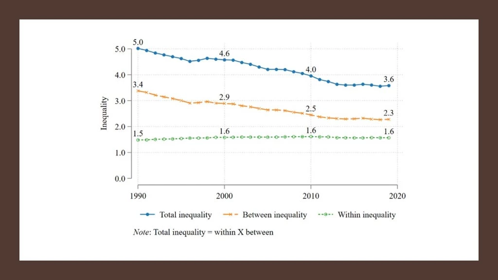
We emphasize again that the interpretation of the actual inequality numbers is simple and very intuitive in the case of : between-country inequality (the average factor by which country average incomes must be multiplied to reach world average income) was 3.4 in 1990, while within-country inequality (the average factor by which individual incomes in each country in the world need to increase to reach their corresponding country average) was 1.5. The product of these two, 3.4 x 1.5, gives overall inequality of
, as the decomposition of this ratio-based index is multiplicative, rather than additive. In contrast, as noted in our opening quote from Amartya Sen, the generalized entropy class, which is the only other class of subgroup decomposable inequality indices, lacks simple intuitive units.
We conclude the blog with a couple of thought experiments that are useful while considering adopting the new index in your day-to-day work:
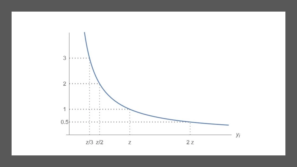
First, the new index captures the intuition that if person A has half the income of person B, person A is twice as “poor” as person B. The index is a simple average of individual contributions, where the contribution of a person at the threshold is 1, the contribution of a person with half the threshold
is 2, the contribution of someone with one-third of the threshold
is 3, and so on. In this way, individual contributions to the overall index are intuitively and transparently distribution sensitive:
Individual contribution (ratio ) as a function of income
Second, the concept of equally distributed equivalent income (EDEI), is helpful to interpret how the numerical value of the new proposed index, , reflects its distribution sensitivity. EDEI is the level of income that, if earned equally by all individuals, would generate the same level of social welfare as the actual distribution of income. For our new measure, EDEI has a particularly simple formulation:
. In 2019, the
for the world was
(
), representing 28 percent of world average income in 2019 and reflecting a considerable degree of inequality aversion. The degree of inequality aversion, along with the social welfare function to which the new proposed index is ordinally equivalent, provides an ethical justification for adopting the new index – in addition to the practical considerations of ease of interpretation and communication, distribution sensitivity, and subgroup decomposability discussed above. Please see Section 2.4 in the paper for details.
Did you make it easy for me to calculate this index in Stata or R?
If you want to use these new indices of welfare, poverty, and inequality in your work, we created an adofile for a command called welfarefactor in Stata, which you can install by typing:
net install awf, from (https://raw.githubusercontent.com/rrmaximiliano/awf/main) replace
[Please note that if you are behind a firewall that is preventing you from installing the command from the internet, you can “set sslrelax on,” run the command above, then “set sslrelax off.”]
This is an alpha version, which only has the basic functionings in it, so please be patient with us. There will soon be a beta version and beyond. We will also have the command coded in R and make that easily accessible as well.
Finally, we are also proposing that the World Bank adopt as a new indicator to monitor shared prosperity around the globe. You can see the details of that proposal in our companion blog, posted at Let’s Talk Development.


Join the Conversation