One of the potential advantages of the regression discontinuity design is that of visual transparency – many results can be clearly seen graphically before needing to do any estimation, as illustrated by Dave Evans in this post. On the other hand, many RDD designs, especially those with fitted polynomials, don’t always look so clear, and have been the subject of criticism (see e.g. Andrew Gelman’s blog part 1, part 2, part 3, part 4, part 5, etc.). The same data may seem to show a much stronger or weaker discontinuity depending on how data are binned, and what sort of polynomial curve is fitted. So how should researchers best display RDD data in order to help the reader make valid inferences?
A new paper by Christina Korting and co-authors, forthcoming in the QJE, experimentally investigates how to best graphically represent regression discontinuity designs. They use data generating processes based on 11 published RDD papers, and then conduct experiments with Cornell students, staff, and residents, to see which designs enable the best visual inference. Type I error in this context occurs when the graph is actually continuous and participants incorrectly classify it as having a discontinuity, and Type II errors occur when there is a discontinuity that participants incorrectly classify as being continuous.
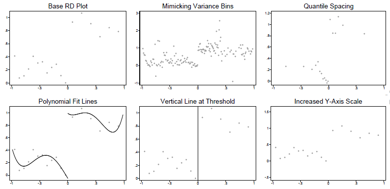
The key RDD graph plots the bivariate relationship between some outcome Y and running variable X. The standard approach is to divide X into bins, and then compute the average of Y within each bin, and then plot a scatterplot of these Y-averages against the midpoints of the bins. There are then a number of researcher choices which the authors experimentally vary:
· How many bins? They note the popular Calonico software and papers recommend two approaches based on different econometric criteria. One is to minimize the IMSE, which tends to result in fewer bins, with wide bin widths. This is labeled the “Base RD plot” in the graph below. The alternative, termed “mimicking variance”, aims to asymptotically have the variability in the binned sample approximately equal that in the raw data, and results in smaller bins with narrow widths.
· How to space the bins? If the data are not uniformly distributed, then taking equally-spaced X bins will result in taking averages over different numbers of observations in different bins. The alternative is to do “quantile spacing”, where each bin averages over the same number of observations.
· Which lines to add to the graph? Should fitted polynomial lines be added through the points? What about showing a vertical line at the threshold?
· Scaling of the Y-axis? A jump at the discontinuity may look visually bigger or smaller depending on the scale of the Y-axis -they compare the Stata axis default to one that extends the range by 50% in either direction.
This results in them randomly showing participants variants of the following versions of a scatterplot of each RDD, and then measuring how accurately readers can identify discontinuities in the graphs:
What do they find?
1. Lots of small bins are better than a few large bins – basically don’t over-smooth the data. The type I error rates were close to the desired 5% with small bins (the MV approach), but up to 20-25% with the IMSE large bins. That is, with large bins, people are much more likely to think there is a discontinuity even when there is not. This does mean fewer type II errors with large bins, but as the size of the discontinuity increases, the power functions converge.
2. It is better not to include fitted lines: these increase the type I error, consistent with the idea that they overly suggest discontinuities.
3. The other choices don’t matter much: evenly-spaced versus quantile-spaced bins perform similarly, it doesn’t make much difference whether you include a vertical line at 0, and the scaling of the Y-axis didn’t make much difference. They suggest even spacing, the default Y-axis scaling, and a vertical line at the policy threshold seem a sensible default to combine with small bins and no fitted lines.
They do use a sample of 143 NBER/IZA members to see whether experts do a lot better in interpreting these graphs, and find reasonably similar type I and type II error rates as the non-experts. One other choice researchers have is whether to show confidence bands around the binned averages, which might help alleviate some of the concerns about over-interpretation of apparent visual discontinuities. They note that they did not do this because they felt confidence intervals were too complex to explain to non-experts. But including confidence intervals seems like useful practice as well.

Join the Conversation