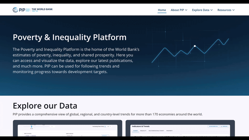
We’re excited to present the newly redesigned Poverty and Inequality Platform (PIP) website! While the data, methods and main structure remain unchanged, the site now offers a modern look, improved navigation, and a more intuitive user experience, including on mobile devices. The updated homepage offers clearer navigation and highlights key insights and resources, making it easier to explore data and tools that the PIP platform offers. The data and estimates remain unchanged from the PIP’s September 2025 update.
The improved layout of the Poverty & Inequality Indicators page makes better use of space and enhances visual appeal. The indicator selection tool, previously located on the left side of the page, has been replaced by a drop-down menu for easier access. Additional options such as interpolated and national-only values are now more prominently displayed.
The Country Profiles tool has transitioned from a long scroll-down format to a tab-based layout that allows for a smoother browsing experience. Two new visualizations have been added under the Multidimensional Poverty and Prosperity tabs:
· The Venn diagram on multidimensional poverty visualizes how deprivations in income, education, and access to services overlap within the same population.
· The Prosperity Gap chart highlights how far populations are from reaching the prosperity threshold and visualizes disparities both within and across countries.
Another major addition is the Chart Gallery, a curated collection of up-to-date frequently used graphs. It can be accessed under Explore Data, then by clicking on Other Indicators & Data, and finally on Chart Gallery. This gallery features key charts on poverty, inequality and shared prosperity, many of which appeared in last year’s Poverty, Prosperity and Planet report. Importantly, these charts will be automatically updated with each new PIP data release. Users can interact with each chart, expand visualizations, and download the underlying data in CSV format. PIP’s Chart Gallery is designed to support storytelling, analysis, and informed decision-making with up-to-date data. Suggestions for new key charts to be included can be sent to pip@worldbank.org.
We invite you to dive in and explore PIP’s modern interface, intuitive tools, and powerful visualizations!
Would you like to be updated with the latest news on PIP? Register to our newsletter here.
The authors gratefully acknowledge financial support from the UK Government through the Data and Evidence for Tackling Extreme Poverty (DEEP) Research Program.


Join the Conversation