Who are Spain's neighbors? Is Canada closer to Spain than Portugal? What about Estonia or Greece? The answer? Depends on the data you are looking at!
Earlier this week I crunched data based on a selected list of indicators from the new Open Trade and Competitiveness platform from the World Bank (TCdata360) and found some interesting trends[1]. In 2009 Spain was closer to economies like Estonia, Belgium, France and Canada while 6 years later in 2015, Spain's closest neighbors were Greece and Portugal. How and when did this shift happen?
Other trends I spotted using the same data? It seems the Sub-Saharan region ranks the lowest in Ease of Doing Business, that in 2007 Israel held the record for R&D expenditure as % of GDP, while in the same year Malta topped FDI net inflows as % GDP, and that the largest annual GDP growth in the last 20 years occurred in Equatorial Guinea in 1997.

Figure 1: Dots represent values for an economy at a given point in time for years 1996 to 2016 overlaying their box-plot distributions. Colors correspond to geographical regions.
These and other insights are possible thanks to TCdata360's API (which now offers almost 2000 indicators drawn from 25+ sources, and saves you the trouble of downloading/scraping and cleaning data individually from all these sources). To illustrate the point of what this API offers for data science, I developed a little exploratory data application in R: TCdatascoper. It works like a 3D map, where the 3rd dimension is not a spatial Z-axis but time. That's what the cloud of dots represents when you first access it:

What about the other 2 coordinates, the x and y axis in the 2D space? The difference from a regular map is that the proximity of dots is dictated by each country's Trade and Competitiveness numbers and not by their geographic proximity. A 'regular' map shows that USA borders Mexico and Canada and that Spain borders France and Portugal. However, in the Datascoper map, you might find situations like Spain being closer to Greece than to Portugal according to data for 2015.

This 2D cloud is laid out by the T-SNE algorithm, very popular for visualizing large dimensional datasets in 2 or 3 dimensions. A very good analysis of the T-SNE algorithm was recently published by Google if you are interested in learning more about it. To create my version of the T-SNE map I didn't use all of the indicators available on the site (It's possible, but you would need more than a 8GB RAM 2 Processor laptop to generate the cloud out of the more than 2,000 indicators available, I'd love to see it so please try and let me know).
What I did instead was use the ranking system the API provides. All the indicators in the site have been ranked according to their "relevance". This relevance metric was defined by surveying subject matter experts combined with data availability, somewhat subjective, but good enough because it allows users like myself to reduce the number of indicators I need to analyze for a given country and plot them using my personal laptop.
The ranking system works like this: Each of the top categories get two #1 ranked indicators, for instance Trade features Exports and Imports of Goods and Services in Current $US. Then each of the sub-categories get another two #2 ranked indicators: Competition and Competition Policy features Intensity of Local Competition and Export Market Share Growth. And so on. Sticking to #1 and #2 ranked indicators I basically created a basket of around 40 "all-star" indicators. These indicators define the dimensions that are used to calculate the 2D distances between dots. It's not perfect but it's a good approximation.
This T-SNE map offers many data mining possibilities for users. I will illustrate this with the following examples:
Crisis in Spain
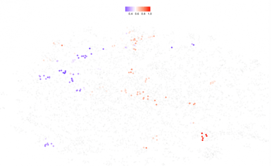
Let's pretend I didn't know there was a major economic crisis a few years ago from which we're still recovering or maybe I just woke up from a coma after 20 years. If we look at the time map for Spain in TCdatascoper we can see 3 clusters. This means that some or all of the indicators considered (remember the 40 all-star) change dramatically over 3 distinct periods of time (I have deliberately left out Spain 2016 and 2005 out of this picture as they are outliers, 2016 is clearly missing data but 2005 might be worth exploring).
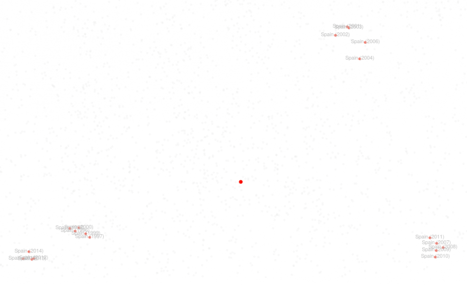 Figure 3: Zoomed in T-SNE map for Spain. Big red dot in the center is the center of mass for Spain.
In order to shed light on this particular behavior we can try to solve the question:
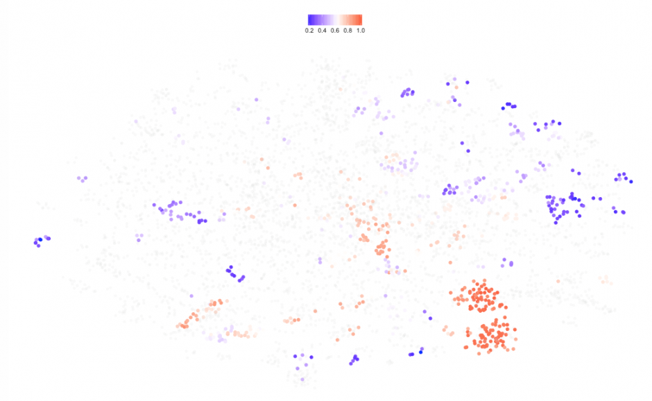
Does the position of the dots relative to the cloud mean anything? Because of the way the map is formed, we can try to color the dots according to one of the indicators: If I suspect GDP has something to do with this, then I can color the cloud by GDP per capita: 
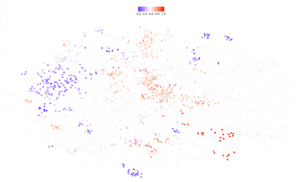
This tells us that the rich countries concentrate on the right hand side or East of the cloud. It seems that Spain was richer between2007 and 2011, but this is just one way to see it. We could color the dots by, say, unemployment rate:
 Figure 5: T-SNE map for all countries and years colored by unemployment rate (Read = high unemployment).
We could interpret unemployment as one of the variables driving one of the other clusters for Spain. We can systematically continue with this approach coloring the dots one by one for each of the 40 indicators or check out 10 of them at the same time via box-plots:

Figure 6: Box-plots for top ranked indicators plus Global Competitiveness Index and Exports of goods and services in %GDP. Dots correspond to Spain at different periods.

To produce these charts in Figure 7, I picked a representative of each of the clusters 6 years apart: 2003, 2009 and 2015. By looking at 10 box-plots at the same time we can form a better opinion about their differences. We see Spain was poorer in 2015 than in 2009, it was actually almost at the same level as 2003. On the other hand, Spain's exports seems to have grown as well as its rank in the Competitiveness Index, above the third quartile but still far from the most competitive countries (#1: Switzerland, 2016).
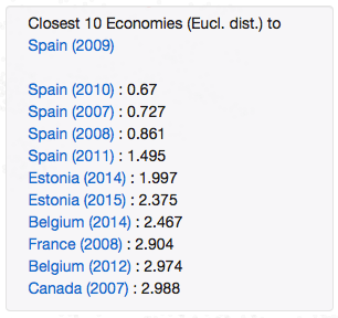
One more piece of analysis we could produce: Which were the economies more closely related to Spain for each of the 3 clusters? Clicking on any of the dots will show a pop up with this information:
|
|

|
Figure 7: Closest economies to Spain for 3 different years according to 2D Euclidean distance
In the 2009 cluster Spain was closer to rich economies like France or Canada, the 2003 cluster seems to be a transition period in which Spain was closer to growing economies like Turkey or Croatia. In the 2015 cluster, Spain's neighbors are Greece and Portugal. Are you surprised?
In hindsight all this makes sense because we knew well what to expect but if you didn't, as I pretended initially, this tool allows you to get to similar conclusions. The problem with these data and in general with macroeconomic data is the lag with actual events. We know that by 2009, Spain was already immersed in a serious economic crisis. This tool detects the shift but cannot do anything about the lag. Where is big data when you need it the most?
Let's look at the data from a different angle:
The Shape of Data
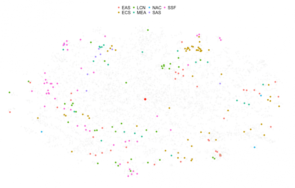
As I explained before, the T-SNE map represents all economies (intentional use of the word economy as some entities in the dataset like Greenland are not really considered countries) for all years (back to 1996, I could have gone further back in time but the data begins to be very scarce) so it's really like looking at a superposition of 20 maps. You may want to start by looking at the most current map of the world. This is how the T-SNE map looks for 2016:
Figure 8: Distribution of economies according to T-SNE map for 2016 period. Colors represent geographical region.

Except for a few outliers, most of the countries are bunched together in the same region of the map. This looks interesting but, a quick glance at the box-plot chart right below, provides a hint of what is going on here:
Figure 9: Box-plots for top ranked (Rank #1) indicators in TCdata360. Colors represent geographical region.

First of all, the ease of doing business boxplot shows that the SSF, or Sub Saharan economies are clearly ranked the lowest in Ease of Doing Business (pink dots). But, most importantly, we see that the rest of the selected indicators show no variation. This can only mean the data is missing (or constant for all countries at all times, really?) and, bear with me here, the way I dealt with missing values was to impute them by the global mean (global in the sense of including all the 20 years considered) of each indicator. I know, why the mean for all periods and all countries? Well, I considered other options but visually this one worked better and doesn't really change the data exploration which is based in the shape of the data or topology, for those familiar with the concept.
When and where is the missing data?
An alternative way to appreciate this idea is to color the dots by the variable missing values that I intentionally created precisely to help me identify data availability pit holes:
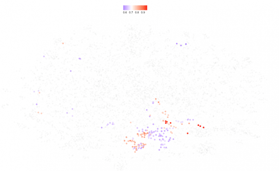
Figure 10: T-SNE map where period is 2016 and colors represent data availability in percentage of indicators with reported data. Red indicates lower data availability.
Notice how the bluish dots - those economies with the best data coverage in 2016 - feature data for fewer than 40 % of the 40 selected indicators creating the accumulation of dots in one place as most of their values are alike. This behavior is inherent in the nature of aggregated annual data. Some indicators have projections available such as IMF's World Economic Outlook (WEO) which would help complete this picture, although my preference would be to complement these traditional sources of data with Big Data.
I can do the same for earlier years for which I expect the coverage to be better. The following maps correspond to data for the past 4 years:
|

|
| Figure 11 : T-SNE map in 2013 | Figure 12 : T-SNE map in 2014 |

|

|
| Figure 13 : T-SNE map in 2015 | Figure 14 : T-SNE map in 2016 |
It's interesting how the dots concentrate on the outside of the cloud, forming a ring, except for the mentioned case of 2016. Excluding 2016, the rest of the years displayed above should be data-rich for most countries. This is confirmed if I color them all by missing values as before:
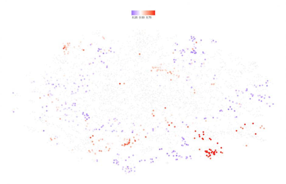
Figure 15: T-SNE map for years 2013 to 2016. Colors represent data availability (red = low, blue = high).
We still see pockets of red (low data availability) but coverage has improved compared to 2016 with all the blue dots representing economies with 50% or more data coverage. This is how the data coverage map looks for the last 20 years:
Figure 16: T-SNE map for years 1996 to 2016. Colors represent data availability (red = low, blue = high).

Here is where we can truly see the shape of the data, and the beauty of how T-SNE works, one can even image how this would look in 3D (Note to myself: Code 3D maps). But who are the economies in the center, or more accurately, "when" are the economies in the center? Let's brush over the central region and take a look:
Figure 17: Zoomed in view of the T-SNE map around the center. Colors correspond to geographical regions. The bigger red dot right below the center represents the center of mass for all the dots.

Most of the years in the selection go back to the 1990s and early 2000s. The dominant color is pink, corresponding to South Saharan economies. Now according to the map in Figure 18, the reddest cluster is located on the southwest region of the map and corresponds to economies in years where pretty much no data was available, and if we look closely, these correspond to small islands, kingdoms and the likes with almost no data available except for GDP. Notice also how in Figure 19 below the brown dots stick together in their own sub-cluster (Liechtenstein, San Marino, etc) plus a few blue dots: Bermuda, Cayman Islands.

If we choose to color the map by GDP per capita in current $US:
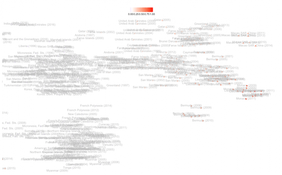
Figure 19: Zoomed in T-SNE map around the bottom right corner where data availability is the lowest (reddest). Colored by GDP per capita in current $US (red = high GDP)
Or let's look at the boxplots by brushing over the right-most cluster: Mostly missing data, GDP in the higher tier of the distribution and, for a blue dot economy, Bermuda, really low expenditure in research and development and exports of creative services that's what pulling Bermuda apart from the main "rich small country" sub-cluster. So much can be explored by following similar argument lines.
Figure 20: Box-plots for the top ranked indicators. Dots represent economies with the lowest data availability colored according to geographical region.

Regional differences in data availability
One last thing, in the same way that I colored dots according to their data availability, I could look at how different regions fall on the T-SNE map just to get the idea of variation or inequality measured by my 40 indicators within each region (dots are colored according to data availability, where blue represents more data available) and by Figure 23 we see that the richer economies lie on the right hand side of the cloud):
|

|
| Figure 21: East Asia and Pacific region (EAS) | Figure 22: European and Central Asia region (ECS) |

|

|
| Figure 23: Latin America and Caribbean region (LCN) | Figure 24: Mid. East and N. Africa region (MEA) |
|
|
| Figure 25: South Asia region (SAS) | Figure 26: South Saharan region (SSF) |

|

|
| Figure 22: North America (NAC) | Figure 23: GDP per capita in $US (red = higher GDP) |
Even though the above maps only show data availability, we get a more complex picture. See how South Saharan dots are mostly located to the left of the map (poorer economies) while European countries span from south to east (richer). But, wait a minute, I would expect all North American economies (US, Canada and Bermuda) to be on the right hand side of the map. United States is clearly a special case (See Figures 22 and 23) and the T-SNE algorithm gives it its own cluster which deserves further inspection, as an appetizer: A quick look at the boxplots shows the US being the champion of imports, exports (including creative services) and Scientific and technical publications.
Figure 27: Boxplots for the top 8 ranked indicators plus Scientific and technical journal articles and Tariff rate applied simple mean. Dots represent USA and Canada.

Conclusion
I have presented some examples of data exploratory analysis that anyone can do with this simple tool and even as I was writing this I realized how much more could still be done: different imputation methods, predictions based on the shape of the data and or clusters, thematic clouds based only on innovation or investment climate, 3D maps, etc. Not a hard thing to do for a data scientist but definitely much harder if you have to find all the data, process the data and clean it up. TCdata360 has done this for you already, which in my own experience takes 75%-80% of the time in any given data project. So, no excuses, jump straight to the fun part, whether you use R or Python or Stata, you have the Open Trade and Competitiveness data at your fingertips.
I hope this blog provides new and better ideas for other data scientists to improve TCdata360. We definitely need more and better data for sure and that is why we have started a Data Science page in TCdata360. Check it out and if you have ideas, questions, please email the TCdata360 team at: tcdata360@worldbank.org or myself: asanchezrodelgo@ifc.org. You can find the code for TCdatascoper in my github account. And for a great source of R related projects please check: https://www.r-bloggers.com
The conclusions and opinions expressed in this blog do not represent the views of the World Bank Group.

Join the Conversation