A showcase of the winners of this first-ever disaster data and map design challenge.
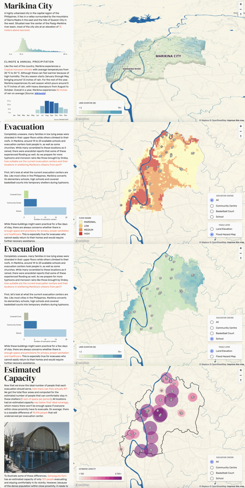
Imagine you live in a beautiful city in the Philippines, in a lush river valley. You know that the area has a history of seasonal floods and typhoons, but how well do you understand and talk about the risk that these natural hazards pose? Where is your nearest evacuation point? How will you get there? How do local officials plan for evacuations to ensure everyone has somewhere safe to go? These were the key questions at the heart of Riesgo, the grand prize winner of the 2019 VizRisk Challenge, hosted by the World Bank’s Global Facility for Disaster Reduction and Recovery (GFDRR) and the Understanding Risk Community, in partnership with Mapbox and the Data Visualization Society.
GRAND PRIZE:
RIESGO, by Briane Paul V. Samson and Unisse C. Chua
Read their blog to learn about their motivation and process for this project.

A unique challenge
The first-ever VizRisk Challenge started with a question: how could we use maps and data visualization techniques differently to more creatively and effectively communicate the risk of natural hazards and disasters? To explore this, we launched a global call to data visualization professionals, designers, developers, and researchers.
The challenge was designed to appeal to both experts and beginners, including those who maybe were familiar with one aspect of the challenge but new to another - exposing data scientists to designing interactive visualizations, or web developers to the data of risk assessment models. This made the challenge both unique and not for the faint of heart!
The dozens of projects submitted by a total of 42 participants from 25 countries use data and geographic context to tell compelling stories about risk, deconstruct past disasters, and inspire possibilities for a safer world in the future. The international panel of expert judges faced a tall task in evaluating the many thought-provoking, captivating designs. Here we showcase the nine winners of the challenge, following along the process involved in the development of each project. The full list of submissions is available on the VizRisk website.
Where in the world...
Participants first had to decide which data they wanted to work with - not only selecting a location of interest, but also identifying sufficient sources of quality data on hazards and vulnerabilities from which to assess risk. Participants were invited to start with datasets with help from World Bank teams for four locations at different scales (Monrovia, Liberia; Chiang Mai, Thailand; Nepal; and the Caribbean) but could also opt to choose their own location and data of interest, using open data and the ThinkHazard! portal as much as possible.
What’s the story?
The first step to any effective data visualization is finding the compelling insights or narratives buried in your data. This can be a long and exploratory process, as many VizRisk participants discovered, even with VizRisk resources.
Designing for a map
Visualizing data on a map provides context that helps make data more accessible and relatable. But maps can also introduce new visual complexities, making the design of the basemap an important part of the design process. Many challenge participants took advantage of recommended resources and the styling control available in Mapbox Studio to create custom basemaps to complement their datasets and amplify the message of their visualizations.
Engaging data
Making a digital map-based visualization opens up a ton of options for letting your audience explore data in an interactive way. But too much interactivity can also be confusing and obscure the clarity of a visualization. Challenge participants applied best practices from suggested resources to create streamlined, coherent interactive experiences.
The journey
Finally, the last part of the VizRisk Challenge asked participants to explain the process they followed to create their visualizations. Not only did this have participants reflect on and explain how they created their projects, but it helps others to learn from their experiences, challenges, and successes as well as build on their code snippets, design insights, and data analysis methods. All of the VizRisk submission blogs contain valuable information about what it takes to create these finished visualizations - read them to get a headstart on a visualization of your own!
A growing community
A huge congratulations and thank you to the over 260 people from close to 60 countries who participated in the 2019 VizRisk challenge - from tuning in to webinars, to attending in-person events, to joining the (ongoing!) discussion in the Data Visualization Society Slack, to following the weekly newsletter. We are inspired by your enthusiasm to be involved in these important conversations about disaster risk and we look forward to continuing the discussion at the 2020 Understanding Risk Forum in May and in future data visualization challenges.
To see all nine category winners, as well as the full list of submissions, please visit: https://understandrisk.org/vizrisk-winners-and-submissions/


Join the Conversation