Note: This is the first blog of a series of blog posts on data availability within the context of TCdata360, wherein each post will focus on a different aspect of data availability.
With open data comes missing data. We know that all indicators are not created equal and some are better covered than others. Ditto for countries in which coverage can range from near universal such as the United States of America to very sparse indeed such as Saint Martin (French part).
TCdata360 is no exception. While our data spans across over 200 countries and 2000+ indicators, our data suffers from some of the same gaps as many other datasets do: uneven coverage and quality. With that basic fact in mind, we have set about exploring what our data gaps tell us — we have 'data-fied' our data gaps so to speak.
In the next few blogs we'll explore our data gaps to identify any patterns we can find within the context of the TCdata360 platform[1] — which countries and regions throw up surprises, which topics are better covered than others, which datasets and indicators grow more 'fashionable' when, and the like. In this first blog, we’ll look at data availability at the country level.
The Big Picture
TCdata360 classifies its data into four high-level topics: Innovation, Investment, Sectors, and Trade (plus Economy). We’ll be looking at the indicators and datasets under these 4 topics for this whole blog series.
Overall, data availability has increased over time at a compound annual growth rate (CAGR)[2] of 6.8%. CAGR can be thought of as the growth rate which allows the initial value to grow to the latest value, assuming that the growth rate is compounded throughout the entire time period.
To get a sense of the overall increase across countries (and to be able to compare them somewhat consistently), we computed for data availability over time by taking the percent of available indicators per country per year. This is what the pattern looks like when we take the median across all countries.
What can we take away from this high-level time series plot?
- 1955: For the earliest data points, there are very few countries with data. In fact, there were only two countries with data in 1955 — France and United Kingdom.
- 1960: There’s a marked increase in data availability from only 4 countries with data in 1959 to 203 countries with data in 1960. (Notice the plateau-like bump around that period in the time series plot.)
- 2005: Data availability growth starts accelerating, with a 27% increase in average country-level number of indicators in the following year.
- 2005-2016: We experience some peaks and dips in data availability, ranging from as high as 27% increase and as low as 20% decrease in terms of country-level number of indicators.
- 2016: As of 2016, we’ve achieved the second highest overall data availability since 1955. In first is 2014.
Now let’s break this line chart down per country. Note that once individual country growth is visualized, concentrations of and differences among country lines can be detected.
Although line charts are great at showing the overall trends over time, it’s hard to appreciate the timeline takeaways and the differences among country lines on such an abstract level. We wanted to see each country change over time using more concrete variables. Inspired by the famous Gapminder visualization, we made our own interactive, motion bubble plot with a TCdata360 twist.

In the bubble plot above, each bubble represents a country, and it size is proportional to the number of datasets covering that country on TCdata360. The x-axis represents the number of TCdata360 indicators which have data on that country, and the y-axis represents the number of TCdata360 subtopics which have data on that country. The bubbles are color-coded based on their regions, and the time slider at the bottom allows the user to toggle between different time periods to see how the by-country data coverage looks like at that time.
Explore the interactive, motion bubble plot yourself!
You can explore the interactive, motion bubble plot yourself! This will help you better understand the differences between by-country data availability.
Here are some things you can do with the interactive, motion bubble plot:
- Click on a circle to check which country it is, and the x- and y-values attached to it at that point in time
- Double-click on any region name in the legend to see only countries in that specified region
- Turn a whole region on/off by double-clicking on the legend
- Use the time slider to toggle which year you want to see data coverage for
- Press “play” or “pause” to have the bubble plot move across time
- Use the tool box in the upper right corner for the whole array of plot.ly interactive tools. Hover over each tool to see what it does:
To interact with it as a full browser page, go to this page hosted via Github pages: https://mrpsonglao.github.io/tcdata360-data-census-country/
Frame by Frame: The Growth of By-Country Data Availability
Now let’s break down the results and look at them in smaller chunks of time.
1955: For the earliest data points, there are very few countries with data. In fact, there were only two countries with data in 1955 — France and United Kingdom.

1960s: There’s a marked increase in data availability from only 4 countries with data in 1959 to 203 countries with data in 1960. (Notice that there are definitely more countries on the bubble plot compared to the previous periods.)

2005: Data availability growth starts accelerating, with a 27% increase in average country-level number of indicators in the following year. (We wonder whether this accelerated growth was influenced by the founding of Paris21 in 1999, placing a priority on global statistics. What do you think?)

2005-2016: We experience some peaks and dips in data availability, ranging from as high as 27% increase and as low as 20% decrease in terms of country-level number of indicators. (You can see this with the worm-like back-and-forth movement of the whole bubble plot!)
2016: As of 2016, we’ve achieved the second highest overall data availability since 1955. In first is 2014.

You can watch the full bubble plot timelapse from 1955 to 2016 as a GIF here:
Data Availability Today: A Close Look at 2016
Data Availability Laggers in 2016
Zooming into the laggers — that is, countries with 25 or less indicators in 2016 — we see that most of them come from the Latin America Caribbean region (Sint Maarten, British Virgin Islands, Cayman Islands, and Aruba) and the East Asia & Pacific region (Guam, New Caledonia, Nauru, and Tuvalu). On the other hand, there are no laggers which come from the South Asia, Sub-Saharan Africa, and Middle East & North Africa regions.

The country with the lowest overall data availability is Sint Maarten (Dutch part), with only 2 indicators and 1 subtopic from TCdata360 in 2016. What’s interesting is that most of the laggers are small island developing states (SIDS) or newly-formed countries. Stay tuned for our next blog post wherein we look at these country characteristics and classifications a bit closer.
Data Availability Leader in 2016
At the front of the pack last 2016 is El Salvador, with 806 indicators and 18 subtopics on TCdata360. It is followed closely by Thailand with 756 indicators and 17 subtopics, and Cambodia with 733 indicators and 17 subtopics.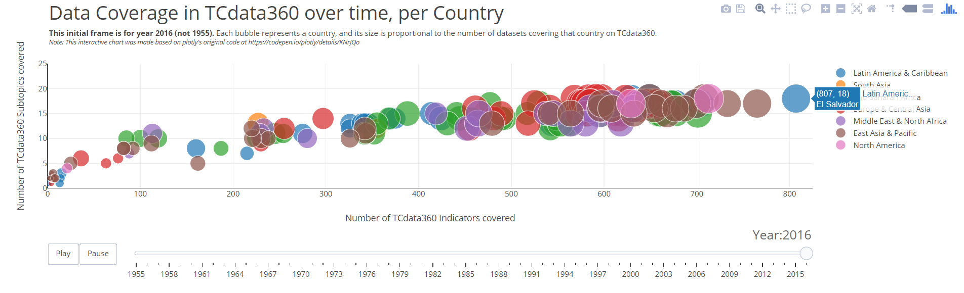
So why did El Salvador lead in terms of number of indicators for 2016? Let’s have a deeper look by taking a dataset-level perspective, and compare El Salvador’s number of TCdata360 indicators against the median number of TCdata360 indicators across all countries.
We notice that El Salvador is close to the median for most datasets, except for two wherein it has a huge lead from the median:
1. World Bank Group’s World Development Indicators: El Salvador has 75 indicators, compared to the median of 27 and mean of 36.4. Although this isn’t the highest number of indicators for this dataset — Portugal takes the lead here with 82 indicators in WDI — El Salvador is still part of the top 27 countries with the highest number of indicators covered for this dataset. However, this still doesn’t explain why El Salvador took the lead.
2. WTO’s I-TIP Services dataset: El Salvador has 168 indicators compared to the median of 112 and mean of 110.6. This is the highest number of indicators for this dataset, and only 18 other countries have 168 indicators as well.
Interestingly, all countries can be bucketed into exactly 3 levels of indicator count for this dataset — countries with 168 indicators, with 112 indicators, and with 56 indicators. Notice that the buckets are in multiples of 56, and this can be explained by checking the underlying indicator data of the I-TIP Services dataset. It has 3 sets with 56 indicators each — the 56 indicators are differentiated by service classification — namely:
- Applied regimes affecting market access for trade in services
- GATS trade in services commitments (by member/sector)
- Regional Trade Agreement (RTA) trade in services commitments
It’s no surprise then that the countries can only fall under 3 buckets, since either they have the entire 56-indicator set, or they don’t.
But because this dataset has a huge number of indicators compared to other TCdata360 datasets, the huge differences between the count “buckets” have a substantial impact on overall data availability per country. This observation — combined with the fact that we only have I-TIP Services data for 2016 — easily puts El Salvador as the lead for 2016.
However, note that the leaders tend to change per year — for the past several years, there’s no consistent leader over a period of time. For instance, the leaders were Vietnam and Philippines in 2015, Sweden in 2014, and Turkey in 2013, and the Russian Federation in 2012. Stay tuned for our next blog post wherein we look at the data availability leaders a bit closer.
If you have ideas, theories, or questions regarding our blog or the TCdata360 platform itself, we’d be more than happy to get your feedback! Drop us a message at tcdata360@worldbank.org, or tweet with the hashtag #tcdata360.
The conclusions and opinions expressed in this blog do not represent the views of the World Bank Group.
[1]CAVEAT: The analysis conducted for this blog series is limited to the indicators and data ingested into TCdata360 under the four high-level topics of Innovation, Investment, Sectors, and Trade. We are continuously ingesting and curating datasets and indicators into our platform based on feedback from subject matter experts and data owners. However, throughout this process it is possible that:
- Not all indicators of a dataset are ingested into TCdata360, especially if these are not relevant to the topics covered by TCdata360. As much as possible, we try to ingest all indicators relevant to Trade, Innovation, Sectors, Investment, and Economy when a dataset is ingested based on feedback from subject matter experts and data owners.
- Not all years with data available for an indicator are ingested into TCdata360. As much as possible, we try to ingest all years available for any ingested indicator; however, some factors may lead us to partially ingesting available time series data for that indicator, such as — if there are years where the indicator data is not readily available in a structured format, we opt to prioritize ingesting years whose structured data is available; and if there are years where the dataset underwent methodological changes, we opt to ingest the most recent data of the dataset since presenting the indicator data as a time series may be misleading.
CAGR = (EV / BV)^(1/n) - 1, where:
- EV = Ending value
- BV = Beginning value
- n = Number of periods (years, in the case of this blog post)

Join the Conversation