Many of you ask what the most popular resources on the open data sites are. I can usually offer a rough answer, but I thought I'd take a moment to respond to the question properly. There's more analysis below, but here's the summary of most popular pages and downloads from the data site:
| Most Popular Pages | |
|---|---|
| 1 | The Indicator, Country and Topic pages |
| 2 | GDP, GNI and GINI (Inequality) related pages |
| 3 | The Data Catalog & World Development Indicators page |
| 4 | Individual country pages: China, USA, India, Brazil, Mexico, Indonesia |
| 5 | Topic pages: including education, health and poverty |
| 6 | Economic statistics: goods exports, foreign investment and inflation |
| 7 | Country income classifications and methodology |
| 8 | Population, population growth and life expectancy |
| Most Popular Data Downloads | |
|---|---|
| 1 | GDP and GNI Related Data |
| 2 | World Development Indicators XLS/CSV/PDF |
| 3 | Country Data: China, USA, India, Brazil, Indonesia |
| 4 | Foreign Direct Investment & Exports Data |
| 5 | Population Data |
| 6 | Inflation Data |
| 7 | African Development Indicators |
| 8 | Country Income Classifications Data |
Is this what you were expecting? Does it correspond with how you use the site?
How am I doing this analysis?
For context: since launch in April 2010, the data site has had over 17 million visits, and over the last 6 months, averaged 740,000 visits per month. Additionally over the last year, the DataBank query tool received 2.8 million visits and the API was used by about 250,000 unique IPs - these last two resources won't factor into the analysis.
First, here's the raw data (628KB XLS) I'm working from. I've pulled the last 12 months of usage data for data.worldbank.org and done some light processing to produce the indicative rankings in this post.
For both the pages and download rankings below, I've done some rough aggregating for highly visited pages that are similar e.g. GDP and GDP Growth or the same pages in different languages. I've left out the numbers of pageviews and percentages from the tables because to get numbers beyond the "rough aggregating of popular pages" I'm doing would take more time and cleaning of the data that comes out of our analytics software.
The most popular site sections

Tim quickly put together this breakdown of page views by site section which are the areas listed at the top of the data site. The percentages in the table below refer to all pages under that section e.g. "Countries" means all country pages:
| Site Section | Pageviews |
|---|---|
| Indicators | 45% |
| Countries | 20% |
| Topics | 8% |
| Data Catalog | 6% |
| News / About / Developers / Products | 4% |
The remainder of page views are accounted for by the home page - the microdata site and blog are tracked in different systems. OK, let's dig a bit deeper.
How are the data distributed?
I like to start exercises like this by drawing a picture and seeing what it tells me. Here's a bar chart of pages (x) against page views (y):

Yes, that's plotted correctly. It's showing a "long tail" distribution - the highest page view value is 3.7 million (on the left) and the lowest is 177 - the linear y-scale is really not helping matters. Just looking at the graph though, if you rotated the vertical bit by 90 degrees about the origin, it would just about cover the tail - I'd estimate that around 50% of our page views go to the top 50 pages or so.
Let's see what it looks like on a logarithmic scale:
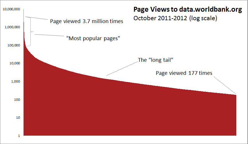
Now we're talking. As we expected, the huge range in the y-axis distorted the earlier chart, and we see that most pages on data.worldbank.org received less than 10,000 views per year. Importantly, any "Top X" ranking we do is going to miss out about 50% of the pages on the site.
Having said that, let's rank them anyway.
What are the most popular data pages?
| Most Popular Pages | |
|---|---|
| 1 | The Indicator, Country and Topic pages |
| 2 | GDP, GNI and GINI (Inequality) related pages |
| 3 | The Data Catalog & World Development Indicators page |
| 4 | Individual country pages: China, USA, India, Brazil, Mexico, Indonesia |
| 5 | Topic pages: including education, health and poverty |
| 6 | Economic statistics: goods exports, foreign investment and inflation |
| 7 | Country income classifications and methodology |
| 8 | Population, population growth and life expectancy |
Any surprises there? Some points I noted:
- This list represents the 50 most visited pages on the data site.
- These 50 pages account for 46% of page views across the entire site
- I appear to be a good estimator.
- Numbers #1, #2 and #3 all include the Spanish versions of the pages.
What are the most popular data downloads?
| Most Popular Data Downloads | |
|---|---|
| 1 | GDP and GNI Related Data |
| 2 | World Development Indicators XLS/CSV/PDF |
| 3 | Country Data: China, USA, India, Brazil, Indonesia |
| 4 | Foreign Direct Investment & Exports Data |
| 5 | Population Data |
| 6 | Inflation Data |
| 7 | African Development Indicators |
| 8 | Country Income Classifications Data |
I’ve again aggregated similar files together (e.g. different file formats of the same data, topically similar downloads and just the most popular single-country downloads) but some things to note:
- About 6 different GDP / GNI related downloads together take the top spot
- Most pages on the data site let you download something, so many of the downloads are for individual data series on an indicator or country
- Bulk downloads of complete data sets (lots of data series) like the World Development Indicators and the African Development Indicators are popular too
- In both page views and downloads country income classifications data stands out as a popular "reference dataset" and not an indicator.
What about downloads from the World Bank as a whole?
Adam wrote a great blog a couple of weeks ago looking at the most popular (non-data) downloads from the World Bank as a whole. Like him I agree that "If someone downloads a file, we can reasonably infer they're going to take a look at its contents. A download is an indicator of intent to use." He puts the data into more context than I have done and explains what this analysis captures and misses.
Above, we have most popular downloads from just the data site, and when you look at the most popular downloads from all World Bank web properties over the last 12 months, there's a similar story:
| Most Popular Downloads (All World Bank) | |
|---|---|
| 1 | GDP and GNI Related Data |
| 2 | The World Development Indicators Database |
| 3 | The Doing Business Report (English and Spanish) |
| 4 | Procurement & Consultancy Guidelines |
| 5 | The World Governance Indicators Database |
| 6 | The China 2030 Report |
| 7 | Global Economic Prospects Report |
| 8 | World Development Report |
| 9 | The "Pink Sheet" of Commodity Price Data |
Data and data-heavy reports feature prominently in the most popular World Bank downloads as a whole, but as with the page views data, you can see in the XLS file that downloads are distributed with a long tail, and about 40% of files were downloaded less than 1,000 times over the last 12 months.
Interestingly, Neil points out that when you look at the data from 2007-2012, two of the most popular downloads are for the introductions to the 2008 and 2009 World Development Indicators "Economy" section. I can see why - they're short, accessible and highly visual summaries of a big topic; perhaps we should do more?.
What does it all mean?
This is just a quick analysis to get us started - I've put all the data up here and you're welcome to have a play with it.
But what have I taken away from this, and what would I do next?
- I was expecting but still surprised to see such a "long tail" of page views - the main explanation for this is how people reach our site. Just over 70% of visitors come from one of 184 international Google search sites or Google Public Data Explorer. The site is heavily optimised to be search engine friendly and this shows.
- I'd like to investigate what proportion of "successful visits" start with a navigation from our homepage vs. landing directly from search. Are the people landing on our pages from search engines looking for the same sorts of data that people browsing our site are? Can we optimise the navigation of the site without disrupting searching users?
- I spotted about 350,000 "Page not found" hits which, although accounts for less than 1% of the total, is still a little alarming. One colleague suggested these could be partially accounted for by a problem with the analytics software but I have seen some issues related to the caching we do for performance reasons that may also be contributing.
- To do a meaningful analysis of what data most people want, you'd have to invest a little bit more time in cleaning and aggregating this data - it's not always easy to do this with web analytics software, so a bit of Excel work is usually called for. That, or learning how to better use web analytics software...
- There's a lot this analysis and the web usage logs don't cover. Is the site's navigation optimal? Do people find the tables, charts and maps on the site useful? Can we learn more from the feedback we receive on our helpdesk and use it to improve the site? These questions probably require some more careful testing or usability studies.
So, does this analysis correspond with how you use our data site? Is there anything you think we should be doing differently? Anything else you'd like to know? I'd love to hear your thoughts.

Join the Conversation