From time to time, everyone encounters sleek products whose form seems to eclipse their function—an image-heavy website that fails to provide basic information, or a shiny gadget with an all-too-brief usable life. Many of us are occasionally guilty of creating such products, but we also shouldn’t underestimate the importance of design, especially when trying to reach a general audience with an initiative or service.
The World Bank’s open government team works to address the explosion of interest around the world in finding new ways to get people involved in the political and policymaking process. Although the concept of open government does not depend on technology, most of the initiatives that are taking off right now rely heavily on websites and apps. As a team, we seek to use visual design and branding as tools to make these kinds of programs more successful.
Take crowdsourcing, for example. With a website or an app, governments can gather huge amounts of data on citizen opinions or preferences, or collect actual information on the status of streets or schools. This puts interface design right at the center of the process. If users don’t believe, don’t understand, or aren’t compelled by a website, they won’t participate.
Open data initiatives that merely place information online are less likely to reach a general audience than those designing from a user perspective. Snazzy or clever designs can even offer a way to increase the coolness factor of engaging in public policy.
“If you think good design is expensive, you should look at the cost of bad design .” – Dr. Ralf Speth
For example:
Here’s one example of how we attempted to apply design concepts to a new initiative in the Bank’s open government group.
The World Bank’s Data Analytics in Procurement program :
First, to tackle the visual identity, we wanted to create a logo that would communicate the program’s core components of data analysis, procurement, results, and development. The goal was to create a brand identity that would have a fairly corporate look and feel while also reflecting an innovative approach to procurement.
We settled on a stylized logo (more on the design concept here) meant to evoke a bird’s eye view of a three dimensional bar graph. A bar graph conveys complex data in a simple visual format.
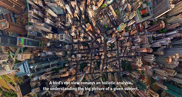
A bird’s eye view of something suggests a holistic analysis, a big-picture understanding of a subject. By combining the two, we hope to suggest the idea of taking the analysis of procurement data to the next level. The incremental increase in the size of the bars (from left to right) is a nod to the concepts of evolution and development. A contemporary typography (using a freely available typeface—a must, given the open source nature of the project) accompanies the graphic to suggest the program’s leading-edge nature. The cool jade and gray palette gives it a professional personality in order to inspire trust and confidence in the information.
The program focuses on improving procurement outcomes through data analysis. Great online products are built on simplicity. In partnership with Development Seed, we created an interface that aims to be an intuitive tool both for capturing snapshots and digging into the numbers. The color palette reinforces the corporate feel of the logo but the clean, crisp charts are meant to feel familiar to users accustomed to uncluttered apps that distill information to its essence.
As this example illustrates, one could think of three broad goals of design for public good initiatives such as those in the open government arena:
- Building Trust and Credibility (Visual Identity and Branding);
- Explaining Concepts (Information Design and Infographics); and
- Building the Products (Interface and Web Design).
Comments and suggestions, as well as links to relevant examples, are welcome.
Tweet these:
Visuals matter: public goods and effective design
If you think good design is expensive, you should look at the cost of bad design.
Most #opengov initiatives rely heavily on websites and apps.
#DYK ways design can impact the reach and relevance of #opengov programs?


Join the Conversation