The World Bank’s President called it “best news in the world” when the 2015 forecast of extreme poverty rates was released in October, showing that less than 10% of the world’s population now live in extreme poverty. It is great news indeed and it was widely reported in the press.

Some colleagues circulated the New Yorker magazine’s “Four Charts That Defined the World in 2015” from last week - their inclusion of the fall in global extreme poverty is very welcome.
However, some of us found the chart they used to be a little tricky to interpret, and because we see the issues below quite regularly, we thought doing a quick remake and explanation would be worthwhile.
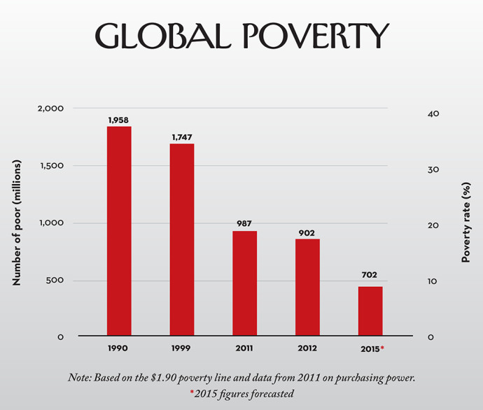
Via The New Yorker
What’s wrong with this picture? A few things stand out:
- It has two vertical axes (a “dual-axis” chart), the left-hand side is showing the “number of poor” with the right-hand side showing the “poverty rate”. But, wait - there is only one set of bars, so what exactly are they showing?
- If you look at the label on the 2015 bar, it says “702”, so it probably has nothing to do with the “10” on the right axis. But reading off the left axis it seems the red bar is just below the “500” line. Which… doesn’t make much sense either.
- OK. Looking more carefully, the bars must be showing the extreme poverty rate (the rate was below 10% in 2015 and that’s where the 2015 bar sits) and the labels are talking about the number of extremely poor people, but neither the label positions nor the bars correspond with the axis on the left - so why is the left axis there at all?
- Then, we saw another problem - this one is a bit more subtle. Look at the years at the bottom. The first gap is 9 years apart, the next is 11, the next gap is 1 year, and the final gap is 3 years. But they are all represented by equal spaces on the chart. Showing it this way hugely distorts the trend; the impression you get is that the rate of progress slowed dramatically in 2012 - but that’s not really the case.
- And another question: is a series of bars a good way of representing the change in a rate over time?
How could you remake this chart?
This chart is trying to show both the fall in the number of extremely poor people and the overall extreme poverty rate at the same time - that’s a bit harder to do than it sounds because these two variables have different units. But let’s see what we can do:
Step 1. Fix the two-axis and spacing problems
Using two charts to show the two variables (number of extreme poor, and extreme poverty rate) , and making it easy to switch between them seems like a good place to start:
Step 2. Add the rest of the data
It turns out that there is data available for some of the other years from the original source (PovcalNet), so let’s add that in:
Notice how the spacing of the bars now reflects the time between the years - it might look a bit weird but that’s the reality of the situation; up until 2011, the global extreme poverty numbers have been estimated every three years (going forward, they’ll be estimated every year). You can also read this blog to learn more about the updated $1.90/day poverty line.
Step 3. Use line charts instead
The next adjustment is more debatable, but we think the data are better presented as line charts. One reason to do this is because it seems reasonable to join up the data points, to show where the levels are likely to be in between years.
Step 4. Showing both the number of extreme poor and extreme poverty rates
But we’re still not completely happy with this: we’re not really illustrating both the drop in poverty rate and the fall in the number of poor on a single chart. We thought about it a bit, and it occurred to us that that the share of the world’s population living in extreme poverty is just the total number of poor people in the world divided by the total world population. So let’s try a chart with both variables on it.
We rather like this version - it could do with some annotation and housekeeping (e.g. labelling that red chunk at the bottom of the 2015 bar as 9.6% and removing some clutter) Here’s a quick non-interactive version:
We also think it helps to show the context of the drop in extreme poverty - that of an increasing world population, which has grown since 1990 from about 5 billion to over 7 billion today. Yet the number and share of people who live in extreme poverty poor has still been going down. This chart makes it much clearer that the number of people who are not living in extreme poverty has really increased quite dramatically, by over 3.5 billion people - from just over 3 billion in 1990 to over 6.5 billion at the end of 2015. This is also really great news!


Join the Conversation