Are countries becoming more unequal? Can booming economies simultaneously drive growth in average incomes and keep inequality in check?
The World Bank has long been publishing a wealth of inequality data through its Poverty and Inequality Platform (PIP). The new PIP Key Inequality Indicators Dashboard provides a set of interactive visualizations that make it easier to access these inequality data and answer inequality-related questions like the above.
PIP, whose estimates are based on country-level household data that use either a consumption or income welfare aggregate, offers the most complete collection of inequality indicators that are estimated directly from household surveys. The new PIP Key Inequality Indicators Dashboard’s data visualizations allow users to distinguish between income- and consumption-based surveys, which is important because income-based inequality measures are systematically greater than consumption-based measures.
This blog provides guidance on how to use the dashboard and briefly describes its charts. Users can view and download a range of figures and tables, as well as the data underlying the visualizations by selecting their countries, time period, and inequality metrics of interest.
Comparing trends across countries
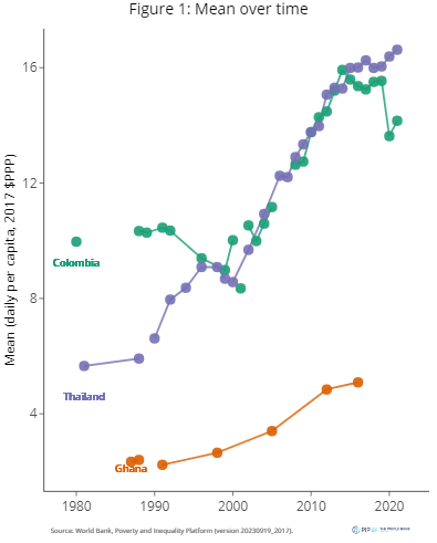
The first chart in the dashboard allows users to compare the trend for selected indicators across economies. The first figure below compares Colombia, Ghana, and Thailand. The chart offers the flexibility to plot data across all years or within specified intervals, with solid lines linking data points from comparable surveys for each economy.
Right until the start of the COVID-19 pandemic, Colombia and Thailand saw a parallel improvement in average welfare. While levels of inequality are difficult to compare since they use different welfare measures (Colombia uses income and consumption is used for Thailand), the trend is interesting: Thailand has managed to reduce inequality very consistently since 1990, whereas Colombia has seen some reversals in recent years (even before the pandemic). Ghana, on the other hand, witnessed a consistent increase in inequality despite a simultaneous rise in mean welfare during the same period.
Comparing changes over time across countries
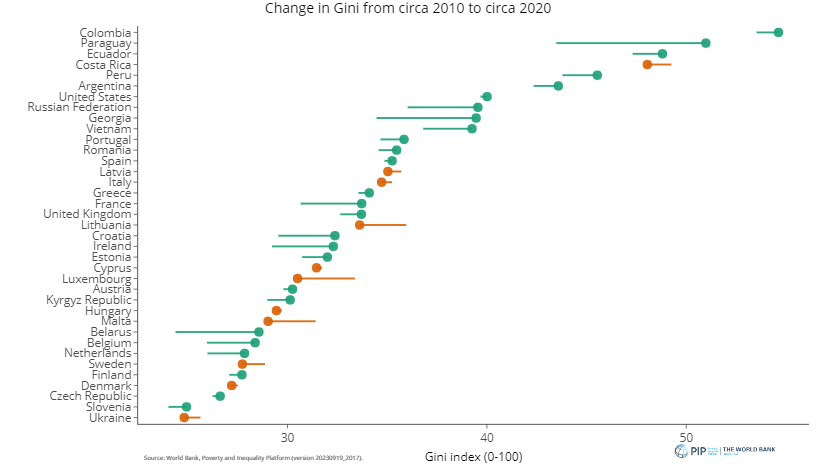
The second chart focusses on the changes in inequality over time, using comparable surveys for each economy. Users start by selecting the preferred inequality measure and specifying the initial year. The example below illustrates how the Gini index has changed in the decade after 2010 (this can be varied using the interval length slider and initial year option). The figure sorts countries according to their initial Gini value and the horizontal lines depict changes in the Gini index from 2010 to 2020 for each economy. Green lines imply an improvement: a decrease in inequality or an increase in average income.
The chart is sensitive to data availability; countries lacking survey data for either the starting or ending year are excluded. However, this limitation can be mitigated by increasing the circa years window parameter, which is set to zero by default. Setting this parameter equal to 1 means that if there is no data for 2010 (and similarly for the final year), data for 2011 or 2009 is used. Hovering over the points shows the initial Gini values per economy, as well as their corresponding annualized change.
Scatterplot to look at relationships between indicators
The third chart in the dashboard offers a look at the relationship between selected inequality indicators. The next figure shows the Gini index on the vertical axis and mean welfare on the horizontal axis for all countries and years for which there is data. Here the Europe and Central Asia (ECA) and Latin American and Caribbean (LAC) regions are selected, and plotted in green and purple respectively. Users can choose whether the color of datapoints should be based on regions or income level.
The example shows that ECA countries exhibit greater dispersion in mean welfare levels and markedly lower average inequality compared to their LAC counterparts. The grey background points (users can select what to show in the background) plotting data on all countries and years suggests that countries with lower mean daily welfare exhibit greater variation in inequality levels. The chart also has some advanced options. For example, the data can be plotted on logarithmic scales. Also, users can add a fitted line indicating the conditional mean, estimated using Locally Estimated Scatterplot Smoothing (LOESS).
Extracting data for further use: the table view
The dashboard also includes a table that allows users to select the economies, years (whether all years, latest survey per economy, or a custom selection), and indicators. The table, as with each of the charts, is downloadable as an image and as a .csv file. The data download allows users to extract the data and create their own figures.
The PIP Key Inequality Indicators Dashboard provides a new look at the rich set of inequality indicators that the World Bank curates for as many countries around the world as possible. It bridges the gap between the complexity of inequality data and the necessity for accessible, interactive, and comprehensive information. More information on its visualizations and the definitions of important indicators can be found in the About page of the dashboard. The PIP Methodological Handbook contains additional technical details on the indicators.
We would like to invite all potential users to explore the dashboard and engage in the important discussions on inequality. If something is missing, we also encourage you to help us improve (please let us know at pip@worldbank.org).
The authors gratefully acknowledge financial support from the UK Government through the Data and Evidence for Tackling Extreme Poverty (DEEP) Research Program.


Join the Conversation