If you’re a regular visitor to Worldbank.org, you might notice something different today – especially if you’re using your phone: We work better!
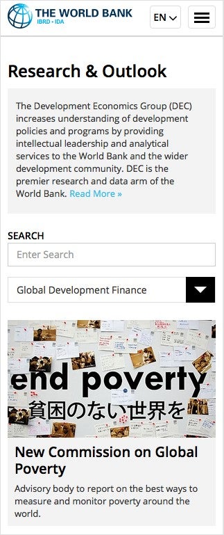
We’ve been rolling out a new “responsive” website that automatically adjusts to any screen size, making it just as easy to navigate with a mouse as your finger. Fonts are larger, social media sharing buttons are better integrated, and the design got a tweak to help it adapt to any browser size automatically. When you use the site on your phone or tablet, you’ll find all the navigation elements “tucked” in the upper right hand corner of the screen and a dropdown list to select your language.
So far we’ve launched the homepage and major landing sections such as News, Research, Countries and Topics in English, Spanish, French, Arabic, Russian and Chinese. We’ll rollout more sections over the next several months, culminating with our Data site by the end of December.
Why does this matter? It probably wouldn’t surprise you to hear there are more mobile phones in the world than there are toilets. And while only about 22% of Worldbank.org audiences currently visit us from a mobile device, that’s grown exponentially over the last couple of years. More than half of our mobile audience comes from a developing country where mobile phones are increasingly the primary way people access the Internet – an important fact for the work we do to end poverty and boost shared prosperity.
So please “pardon our dust” and maybe some inconsistencies in design and navigation as we renovate our website to a more modern structure. And thanks for visiting.

Join the Conversation