As part of the push for universal access to electricity, the World Bank is making a concerted effort to support the most cost-effective systems and technologies to provide electricity to those most in need. An implicit assumption is that we know where the people are who do and do not have electricity access, and how they get it — often we don’t. A new tool promises to make electrification planning cheaper and faster by predicting the locations of existing infrastructure and connections.
Lack of good data strains any community’s ability to take advantage of modern technology and developments. Fortunately, advancements in remote sensing, machine learning and big data are chipping away at this problem. Today, we turn these tools to the problem of mapping connected populations and the systems that support them.
One way to track electricity access is to use “night lights” imagery from the Suomi NPP satellite. This satellite crosses nearly every point on earth at around 1:30 am local time, and takes high resolution photographs that give an indication of the amount of light being emitted all over the globe. This approach has been used before to estimate electricity access in remote areas and guide grid extension programs.

The hypothesis is that locations that show up at night (after clouds, reflections, and fires are removed) are settlements that have electricity access, and that their electricity is most likely supplied from an electrical grid. This assumes that small off-grid systems don’t emit enough light to show up, but larger isolated power networks certainly do.
This raises an additional question: where is the existing electricity infrastructure? Many countries lack up-to-date data on these assets, and efforts to map them on the ground can be expensive and time consuming. Now, for the first time, a collaboration between ESMAP, Facebook, KTH, WRI and the University of Massachusetts Amherst has created an algorithm for estimating the location of existing medium-voltage infrastructure.
To do this, it combines many monthly night lights images and applies a filter to highlight points that are significantly brighter than their surroundings. Everything above a certain threshold is then assumed to be grid-connected. This is refined by combining other satellite-based data (such as the High Resolution Settlement Layer) and including only areas with evidence of human activity.
A simpler approach might connect these electrified points with straight lines, but this new algorithm goes one step further: it assumes that medium voltage lines are more likely to follow (or be followed by) roads, and more likely to follow bigger roads than smaller. It starts at a single electrified point, and spreads outwards, following road networks where possible, until all points are connected by a network of grid lines. This process is shown in action in the animation below.
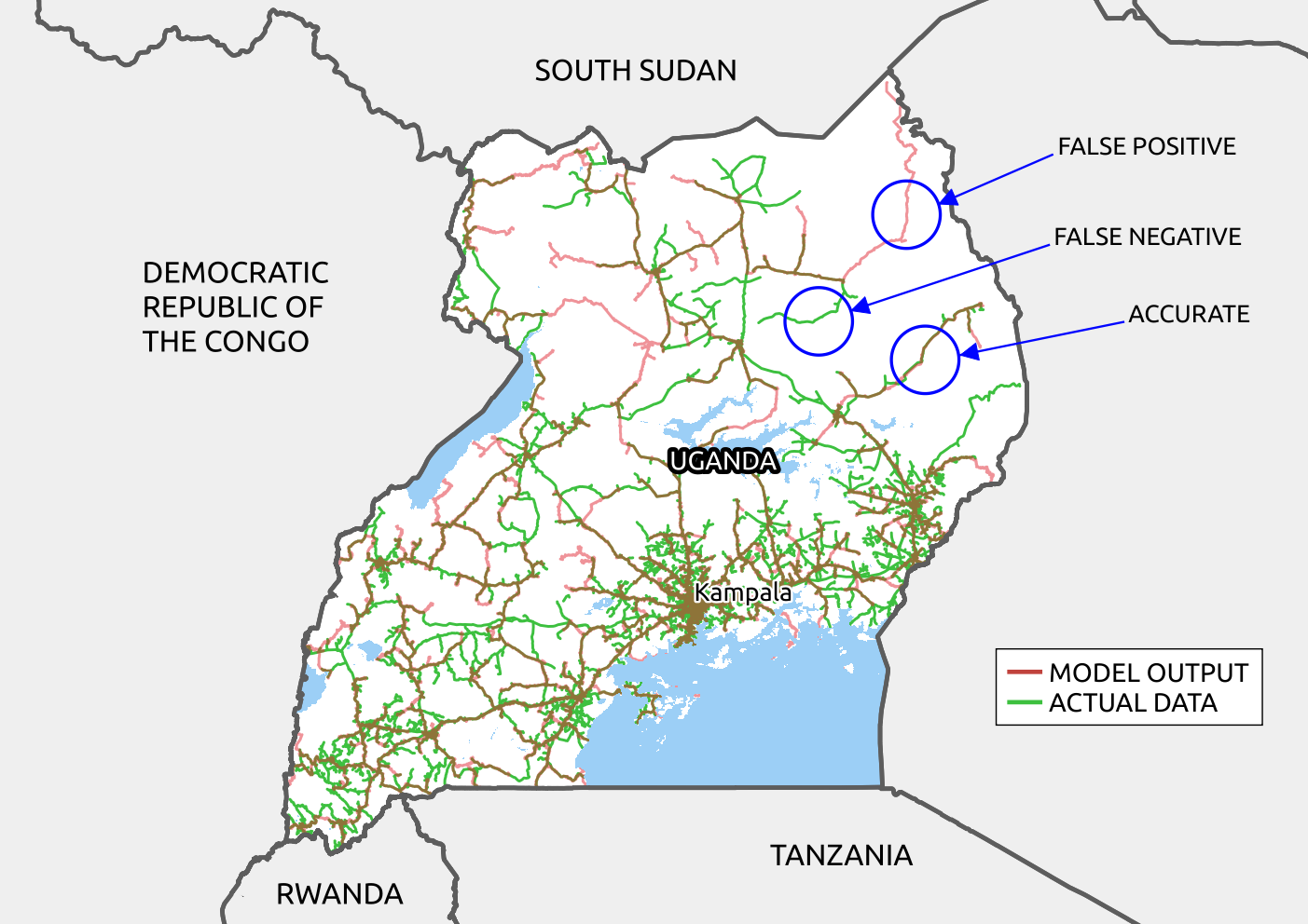
For this test case in Uganda, the final result is shown on the map below, where red is the predicted grid and green is actual grid data. Early tests have resulted in accurately identifying about 70% of actual grid lines. False positives (grid predicted where there is none) are caused by night lights that weren’t caught by the filters, out-of-date official data, or independent power systems that don’t form a national grid. False negatives (real grid lines that are missed) are often caused by small villages that aren’t emitting enough light to be recognized. Both will be improved by further refinements in the algorithm, but are highly dependent on variations between countries and areas. For example, in countries with many isolated power networks, the algorithm performs poorly and should be used with care.
It is important to recognize the limitations in this type of approach, and there is no substitute for local knowledge and on-the-ground surveying. However, this new tool gives countries and lenders the opportunity to make reasonably detailed first assessments and better target further interventions. For example, one of the most cost-effective ways to increase access is grid densification in areas that are already ‘under’ the grid, but this is difficult to do at scale without knowing where these areas are.
An open source tool based on this algorithm is available at this GitHub repository. This has already been used to produce grid data for most of East Africa; some samples are available here. Its development is explained in more depth in this blog post from Facebook, along with the core code and additional output results.
Full research paper available at Nature SciData here: https://www.nature.com/articles/s41597-019-0347-4


Join the Conversation