In 2019, around 80% of the world lived on less than $25 per day, which is around the value of the typical poverty line of high-income countries. $25 per day is also very close to the income or consumption of a typical person living in a country that moves from middle income to high income status. The Prosperity Gap is a new measure that helps us track how far the world, or any society, is from the $25 per day income threshold. It can be used to measure the World Bank’s goal of promoting shared prosperity. Formally, the Prosperity Gap is the average factor by which individuals’ incomes must be multiplied to attain a prosperity standard of $25 per day for all.
You can access the Prosperity Gap dashboard here!
The Prosperity Gap is a distribution sensitive welfare measure: the gap improves (narrows) when all incomes increase, and it improves faster when incomes of poorer people increase. In 1990, individuals’ incomes globally needed to increase on average almost 11-fold to get everyone to the $25 threshold. Put differently, in 1990 the typical person in the world needed 11 days to earn what a person at the poverty line in rich countries earned in a day. The last three decades have seen tremendous progress around the world, such that the average factor necessary for everyone to reach the same threshold in 2019 has more than halved to 5-fold. However, the gap remains large – today the typical person in the world would still need 5 days to earn what a person at the poverty line in rich countries earns in a day.
Over the same time, global average per capita income improved by 35% compared to the 54% improvement in the Prosperity Gap. The larger improvement in the Prosperity Gap reflects the larger improvement in incomes of those at the bottom compared to those at the top of the world income distribution, largely driven by rapid growth in large developing countries such as China and India. In other words, the Prosperity Gap captures not just the improvement in the global mean, but also the sharp reduction in global interpersonal income inequality over this period.
Updated Prosperity Gap estimates at the global, regional, and country level are now available in a new dashboard. These estimates update the earlier estimates released together with the working paper that defined the Prosperity Gap. They are based on more than 2,200 household surveys in the Poverty and Inequality Platform (PIP) covering 167 countries and over 97% of the global population. The updated estimates presented here use the most up-to-date version of PIP released in September 2023. It is important to note that these estimates are preliminary, as they are estimated on a grouped version of the income distributions instead of the micro data directly. Furthermore, since the Prosperity Gap is sensitive to low values of consumption, additional analytical work is being done to refine an appropriate censoring threshold (currently set at $0.50 per day). Finally, when survey data is missing, the poverty estimates reported in PIP are based on interpolations and extrapolations of the available surveys which requires additional assumptions. The estimates of the Prosperity Gap reported in this blog follow the same methodology when survey data are not available. For more details on the prosperity gap, see this blog on its technical properties, another blog on how it measures shared prosperity, as well as the technical paper.
This blog briefly describes the indicator and the charts in the dashboard. Users select the country (or region or the world) of interest, the indicators to plot, and the time frame. Users have the option to view and download the figures and tables, as well as the underlying data. For more details on the definition of each indicator, see this page.
The trends for countries or regions across time
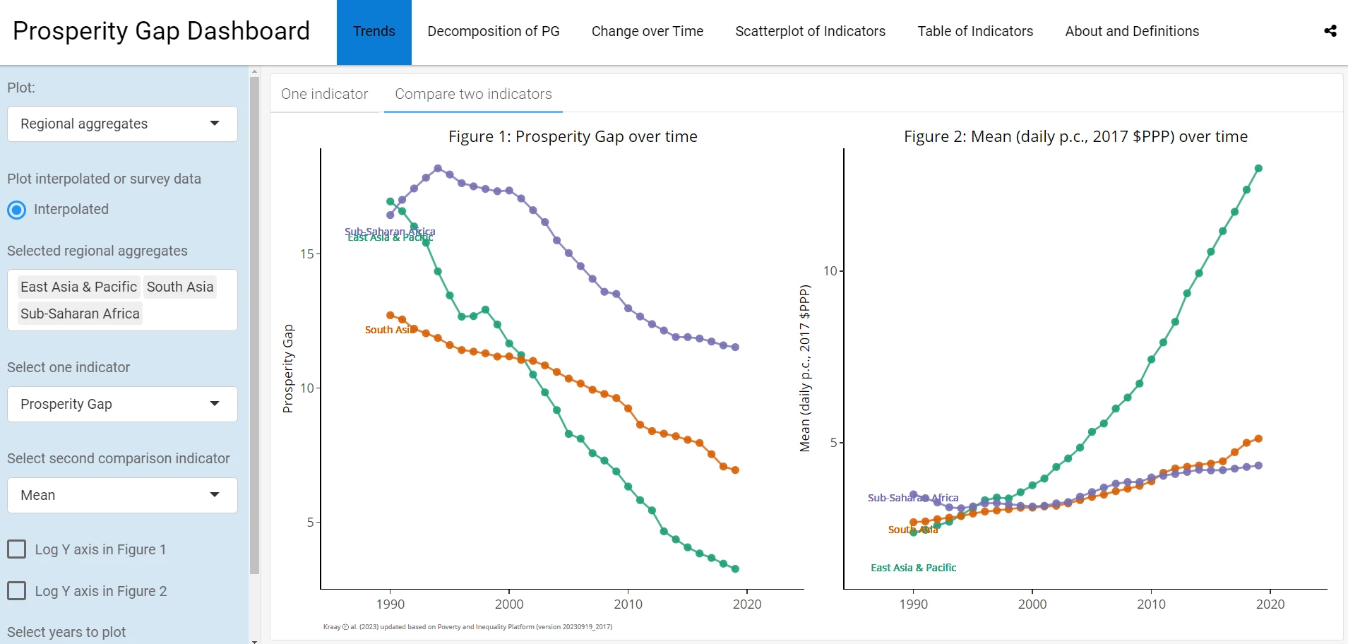
The first chart compares the trend in the Prosperity Gap for countries, regions or the world. Users have the option of either plotting the country and/or regional data that underlies the global estimates [Interpolated data] or the country data from the surveys [Survey data]. Additional options allow the trends in the Prosperity Gap to be compared with the mean (or another measure) as shown below. Users can choose from various indicators such as the Prosperity Gap, poverty rates at $2.15, $3.65, and $6.85-per-day thresholds, an inequality measure with similar properties as the Prosperity Gap [(PG) Inequality], the Mean of the overall distribution, and, for surveys, the mean of the bottom 40% of the distribution [Mean - Bottom 40].
The left panel of the below chart highlights the trends in the Prosperity Gap for East Asia (green), South Asia (orange), and Sub-Saharan Africa (purple) and the right panel shows the average income for the three regions from 1990 to 2019. Note the relatively faster progress of East Asia shown as the faster improvement (decline) in Prosperity Gap and the faster increase in the mean income. East Asia has been the driver of the improvement for the world in the last 3 decades.
Decomposing the Prosperity Gap
An important property of the Prosperity Gap is that it is subgroup decomposable, which means, for example, that the level of the global Prosperity Gap can be easily decomposed into the contribution coming from each region.
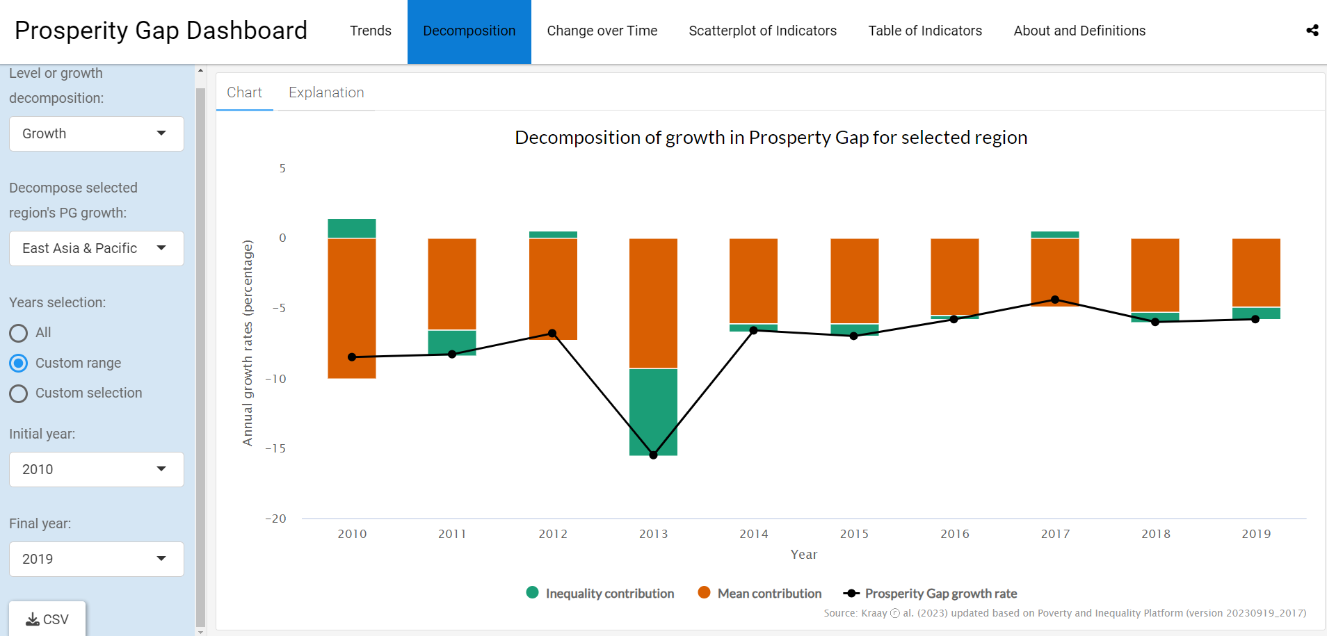
Another property allows the decomposition of the decline in the global or regional Prosperity Gap into contribution from the growth of the average income and contribution from the reduction in inequality. The chart below highlights this decomposition of the annual growth of the Prosperity Gap in East Asia from 2010 to 2019. Compared to the previous year, in 2010 Prosperity Gap in East Asia improved by 8.5% (solid line). In the same period, average incomes (orange bars) grew by 10.0%. The shortfall in the welfare improvement compared to the mean improvement is explained by the increase in inequality (green bar) of 1.4%, which dampened the improvement in welfare. On the other hand, the Prosperity Gap improved by 15.5% from 2012 to 2013 driven by a 9.3% improvement in the mean and 6.2% reduction in inequality.
The first dropdown menu on the left-hand panel of this chart can be used to see the decomposition of the global Prosperity Gap into regional contributions.
Changes over time
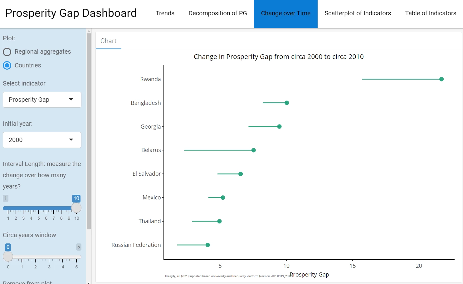
For comparable surveys, users can use the third graph to compare the annual growth of various measures. Users start by selecting the measure of interest, a starting year, and the number of years over which to calculate growth. For example, the next chart shows the change in the Prosperity Gaps for countries with surveys in 2000 (starting year, solid dot) and 2010 (ending year). The countries are sorted by their starting level of the measure. Hovering over the points shows the initial values per economy, as well as their corresponding annualized change over this period.
The chart is sensitive to data availability; countries lacking survey data for either the starting or ending year are excluded. However, this limitation can be mitigated by increasing the circa years window parameter, which is set to zero in the below example. Setting this parameter equal to 1, for instance, would imply that when no data is available for 2000 (and similarly for the final year), data for 2011 or 2009 is used (with preference for data from the most recent year).
Scatterplot of Indicators
Indicators can also be compared using a scatter plot option. The user can pick a pair of indicators to compare along with the time frame and the country or regions to compare. The use of a similar chart is defined in detail here.
Obtaining the data
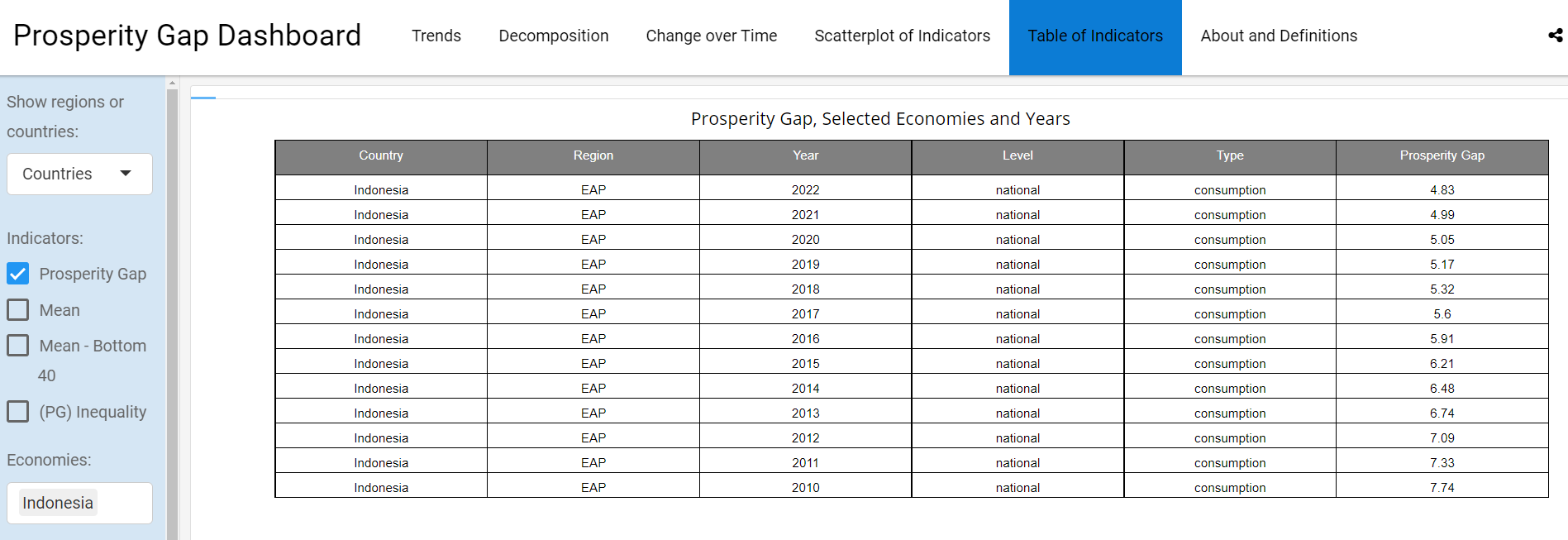
The data underlying each chart can be downloaded by using the download option next to each chart. Data is also available from the Data Table page where users have the option to choose the years, countries, regions and indicators. The below table shows the Prosperity Gap in Indonesia from household surveys from 2010 to 2022. The table can be downloaded as a .png picture or a .csv table.
This dashboard provides access to preliminary estimates of the Prosperity Gap. Over the next year, work will continue to implement the Prosperity Gap in the World Bank’s official repository, the Poverty and Inequality Platform.
The authors gratefully acknowledge financial support from the UK Government through the Data and Evidence for Tackling Extreme Poverty (DEEP) Research Program.
Access the Prosperity Gap dashboard here.



Join the Conversation